Header visualization from “maischberger” (see my note below)
Table of Content
- Introduction
- Data Preparation
- Create a Basic Bar Chart
- Style the Visualization
- Place Category Labels on the Top
- Bonus: Style the Bars
- Alternative Approach
- Conclusion
Introduction
Yes, I have written about creating bar charts with {ggplot2} before. As one of the most common chart types, creating bar charts is a task that thousands of people likely face every day. In an old blog post I’ve shown various ways
- how to calculate the percentage values,
- how to position the percentage labels inside, and
- how to color the bars using different colors.
Inspired by a question by one of my clients, I am now extending that list by showcasing
- how to place the category labels above the bars.
Data Preparation
I am using the diamonds data set from the {ggplot2} package to generate shares of diamonds for five different categories describing the quality of the cut. In a first step, I am calculating the shares per quality and turn the categories into a factor ordered by that metric.
library(dplyr)
library(ggplot2)

diamonds |>
  summarize(prop = n() / nrow(diamonds), .by = cut) |>
  mutate(cut = forcats::fct_reorder(cut, prop))
## # A tibble: 5 × 2
## cut prop
## <ord> <dbl>
## 1 Ideal 0.400
## 2 Premium 0.256
## 3 Good 0.0910
## 4 Very Good 0.224
## 5 Fair 0.0298There are multiple other ways to calculate the shares, including diamonds |> mutate(n = n()) |> summarize(prop = n() / unique(n), .by = cut). Instead of using the experimental .by argument you can also group your data first with group_by(cut) before summarizing per cut quality.
The last step is not needed in our example case here as the ranking by shares follows the defined order of the cut qualities. However, in most other cases you likely have to sort your categories on your own.
Create a Basic Bar Chart
Now, I can easily pass the summarized data set to ggplot() and create a simple horizontal bar graph:
diamonds |>
  summarize(prop = n() / nrow(diamonds), .by = cut) |>
  mutate(cut = forcats::fct_reorder(cut, prop)) |>
  ggplot(aes(prop, cut)) +
  geom_col()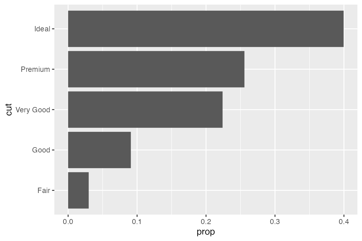
Alternatively, you can transform the complete data set on the fly instead of calculating shares first:
ggplot(diamonds, aes(y = cut, x = after_stat(count / sum(count)))) +
  geom_bar()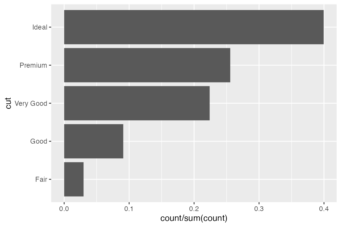
geom_bar() and after_stat().
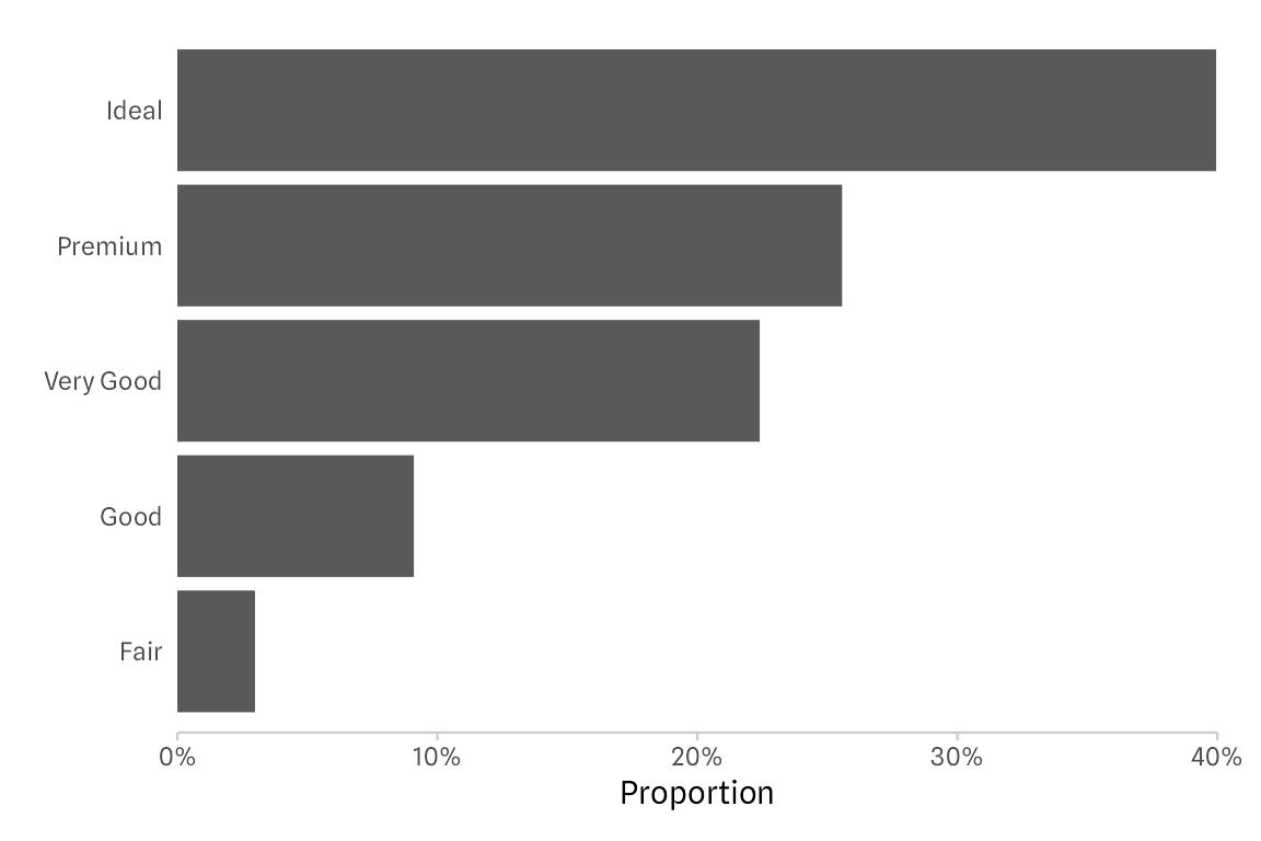
Style the Visualization
If you know me a bit, you know that before moving on I have to modify the theme and fix the grid lines (read: remove them all together in this case).
Also, I am modifying the x axis range and labels. Instead of showing proportions, I decide to show percentages (0-100). Also, to follow good practice I am adding the percentage label to the axis using label_percent() from the {scales} package. I am also removing the padding on the left and right of the bars and adjust the limits so that the 40% label is shown as well.
theme_set(theme_minimal(base_family = "Spline Sans"))
theme_update(
panel.grid.minor = element_blank(),
panel.grid.major = element_blank(),
axis.line.x = element_line(color = "grey80", linewidth = .4),
axis.ticks.x = element_line(color = "grey80", linewidth = .4),
axis.title.y = element_blank(),
plot.margin = margin(10, 15, 10, 15)
)
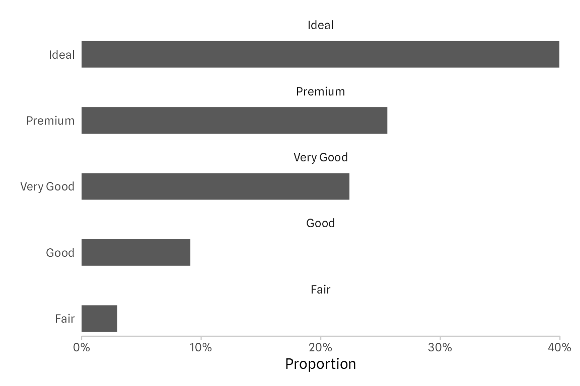
diamonds |>
summarize(prop = n() / nrow(diamonds), .by = cut) |>
mutate(cut = forcats::fct_reorder(cut, prop)) |>
ggplot(aes(prop, cut)) +
geom_col() +
scale_x_continuous(
expand = c(0, 0), limits = c(0, .4),
labels = scales::label_percent(),
name = "Proportion"
) 
Place Category Labels on the Top
The approach I take to now to move the labels to the top of the bars is: faceting!
There are multiple options including placing the labels with geom_text and shifting them upwards. But by far the fastest way (and also likely the one that breaks last when the number of bars changes) is using the facet functionality of {ggplot2}.
diamonds |>
  summarize(prop = n() / nrow(diamonds), .by = cut) |>
  mutate(cut = forcats::fct_reorder(cut, prop)) |>
  ggplot(aes(prop, cut)) +
  geom_col() +
  facet_wrap(~ cut) +
  scale_x_continuous(
    expand = c(0, 0), limits = c(0, .4),
    labels = scales::label_percent(),
  )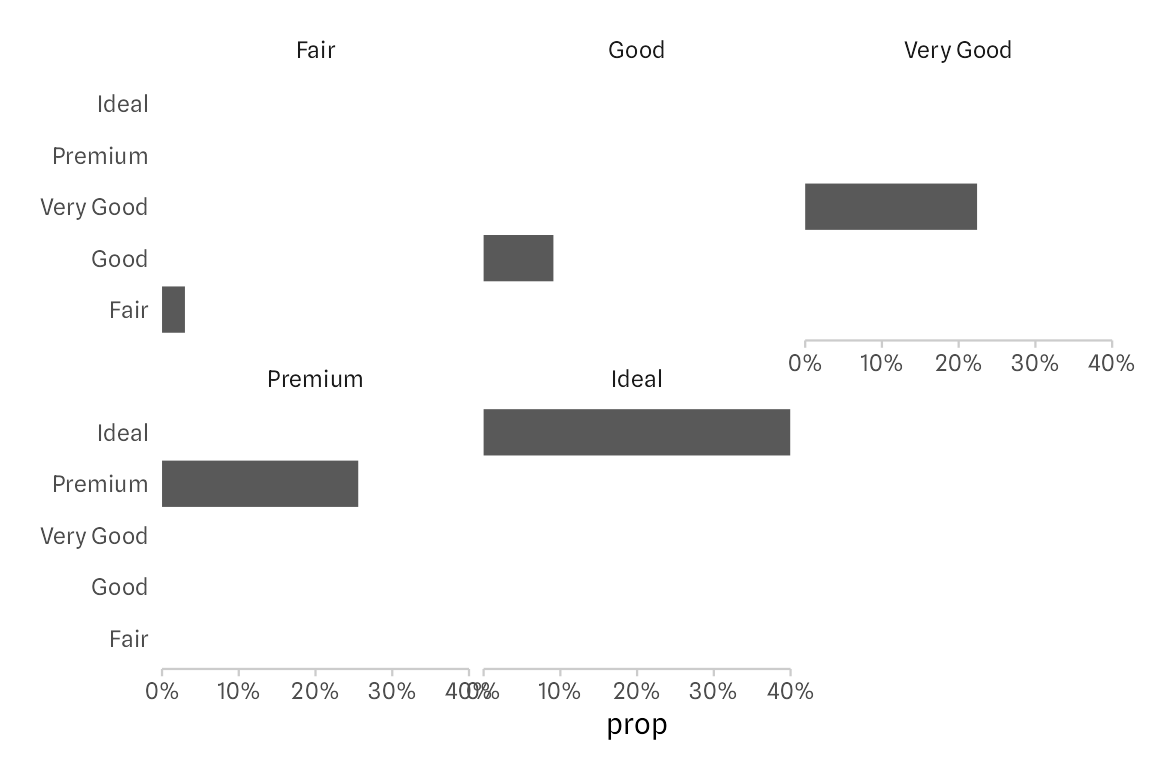
It doesn’t work “out of the box”, however. But that’s a quick fix if you know about the ncol and the scales arguments in the facet_wrap() function! The trick is that we force all small multiples in a single column (so that bars share a common baseline again) by setting ncol = 1. By default, the axis ranges are kept constant across small multiples. By setting scales = "free_y" we can free the axis range which removes redundant, empty groups and all the resulting white space.
diamonds |>
  summarize(prop = n() / nrow(diamonds), .by = cut) |>
  mutate(cut = forcats::fct_reorder(cut, -prop)) |>
  ggplot(aes(prop, cut)) +
  geom_col() +
  facet_wrap(~ cut, ncol = 1, scales = "free_y") +
  scale_x_continuous(
    name = "Proportion", expand = c(0, 0),
    limits = c(0, .4), labels = scales::label_percent()
  )
Note that we also have to flip the order of our categories as now they’re ordered top to bottom, not bottom to top anymore.
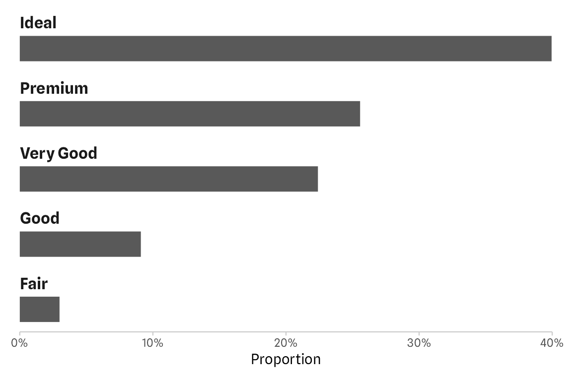
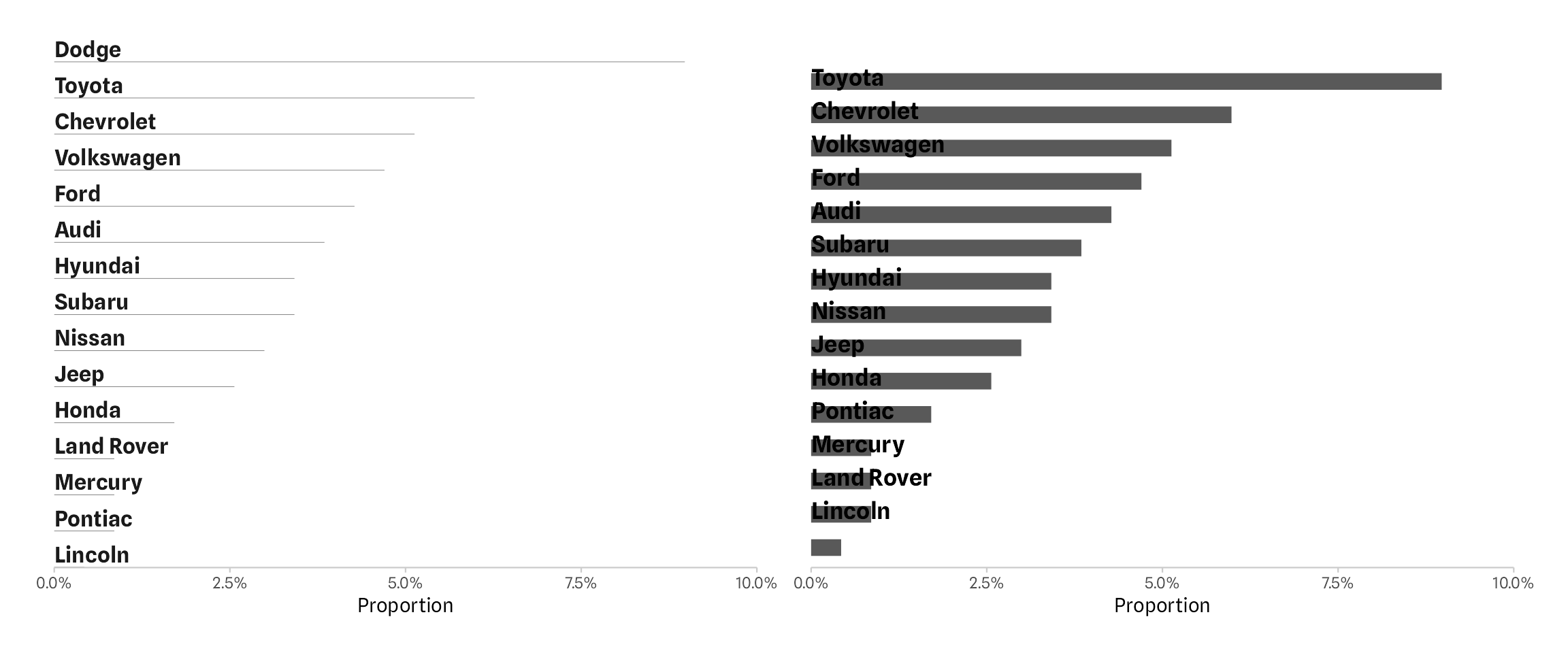
The final step is cleaning up the labels. First, let’s remove the category names on the y axis by passing guide = "none" in scale_y_discrete().
To modify the new labels, the so-called strip texts, we address the text element strip.text via theme(). The margin of zero on the left ensures that, together with the horizontal justification (hjust = 0) that the strip text labels are full left-aligned with the baseline of the bars. The small margin at the top and the bottom ensure that the labels are not clipped (e.g. that the descender of y is shown completely).
diamonds |>
  summarize(prop = n() / nrow(diamonds), .by = cut) |>
  mutate(cut = forcats::fct_reorder(cut, -prop)) |>
  ggplot(aes(prop, cut)) +
  geom_col() +
  facet_wrap(~ cut, ncol = 1, scales = "free_y") +
  scale_x_continuous(
    name = "Proportion", expand = c(0, 0),
    limits = c(0, .4), labels = scales::label_percent()
  ) +
  scale_y_discrete(guide = "none") +
  theme(strip.text = element_text(
    hjust = 0, margin = margin(1, 0, 1, 0),
    size = rel(1.1), face = "bold"
  ))
To add some spacing between the last bar and the axis line, one can adjust the vertical padding of each panel by passing expansion(add = c(.8, .6) to the expand argument in scale_y_discrete().
diamonds |>
  summarize(prop = n() / nrow(diamonds), .by = cut) |>
  mutate(cut = forcats::fct_reorder(cut, -prop)) |>
  ggplot(aes(prop, cut)) +
  geom_col() +
  facet_wrap(~ cut, ncol = 1, scales = "free_y") +
  scale_x_continuous(
    name = "Proportion", expand = c(0, 0),
    limits = c(0, .4), labels = scales::label_percent()
  ) +
  scale_y_discrete(
    guide = "none", expand = expansion(add = c(.8, .6))
  ) +
  theme(strip.text = element_text(
    hjust = 0, margin = margin(1, 0, 1, 0),
    size = rel(1.1), face = "bold"
  ))
Bonus: Style the Bars
Let’s merge this new approach with some of the tricks from my previous blog post. We add direct labels and highlight the top-ranked category.
Highlight Top-Ranked Category
By mapping the cut variable to fill, bars would be colored by categories. To color only the first, top ranked bar, I am making use of the rank which is equal to the factor level. Thus, mapping the fill to as.numeric(cut) == 1) returns TRUE for “Ideal” and FALSE otherwise. To customize the fill colors, we add scale_fill_manual() to pass a vector of two custom colors. As we don’t need a legend, we also set guide = "none".
p <-
  diamonds |>
  summarize(prop = n() / nrow(diamonds), .by = cut) |>
  mutate(cut = forcats::fct_reorder(cut, -prop)) |>
  ggplot(aes(prop, cut)) +
  geom_col(aes(fill = as.numeric(cut) == 1)) +
  facet_wrap(~ cut, ncol = 1, scales = "free_y") +
  scale_x_continuous(
    name = "Proportion", expand = c(0, 0),
    limits = c(0, .4), labels = scales::label_percent()
  ) +
  scale_y_discrete(guide = "none", expand = expansion(add = c(.8, .6))) +
  scale_fill_manual(values = c("grey50", "#1D785A"), guide = "none") +
  theme(strip.text = element_text(
    hjust = 0, margin = margin(1, 0, 1, 0),
    size = rel(1.1), face = "bold"
  ))

p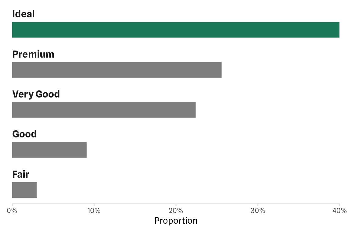
Add Percentages as Direct Labels
Similarly, we can pass an expression to color and hjust inside the geom_text() component that we use to add the direct labels. As TRUE is encoded as 1, all group that have a share lower than 5% are right-aligned while all others are left-aligned (as FALSE = 0). To move the labels a bit more inside and outside, respectively, I am cheating by adding some spaces before and after the label.
p +
  geom_text(
    aes(label = paste0("  ", sprintf("%2.1f", prop * 100), "%  "),
        color = prop > .05, hjust = prop > .05),
    size = 4, fontface = "bold", family = "Spline Sans"
  ) +
  scale_color_manual(values = c("black", "white"), guide = "none")
Alternatively, you can pass the value for hjust directly by using an ifelseor if_else condition: hjust = if_else(prop > .05, 1.2, -.2):
p +
  geom_text(
    aes(label = paste0(sprintf("%2.1f", prop * 100), "%"),
        color = prop > .05, hjust = if_else(prop > .05, 1.2, -.2)),
    size = 4, fontface = "bold", family = "Spline Sans"
  ) +
  scale_color_manual(values = c("black", "white"), guide = "none")
The same logic applies when we want to control the text color, which is recommended here to increase the contrast. With the final scale_color_manual() I change the text color to white in case the label is placed inside the bar and black otherwise.
Another way to style the labels would be scales::label_percent(accuracy = .1, prefix = " ", suffix = "% ")(prop) (or make use of the superseded scales::percent()) but that’s rather long and also not that easy to remember.
One could of course also remove the x axis as the values are now shown as direct labels.
p +
  geom_text(
    aes(label = paste0("  ", sprintf("%2.1f", prop * 100), "%  "),
        color = prop > .05, hjust = prop > .05),
    size = 4, fontface = "bold", family = "Spline Sans"
  ) +
  scale_x_continuous(guide = "none", name = NULL, expand = c(0, 0)) +
  scale_color_manual(values = c("black", "white"), guide = "none")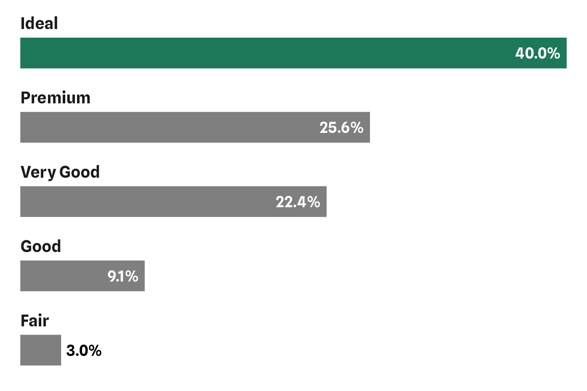
Alternative Approach
Here is an approach using geom_text(). The trick here is to (i) reduce the width (read: height in our case) of the bars to allow for space for the labels and (ii) add the labels with geom_text() in combination with a custom vjust or nudge_y setting.
diamonds |>
  summarize(prop = n() / nrow(diamonds), .by = cut) |>
  mutate(cut = forcats::fct_reorder(cut, prop)) |>
  ggplot(aes(prop, cut)) +
  geom_col(width = .5) +
  geom_text(
    aes(label = cut, x = 0),
    family = "Spline Sans", fontface = "bold",
    hjust = 0, vjust = -1.7, size = 4.5
  ) +
  scale_x_continuous(
    expand = c(0, 0), limits = c(0, .4),
    labels = scales::label_percent(),
    name = "Proportion"
  ) +
  scale_y_discrete(guide = "none")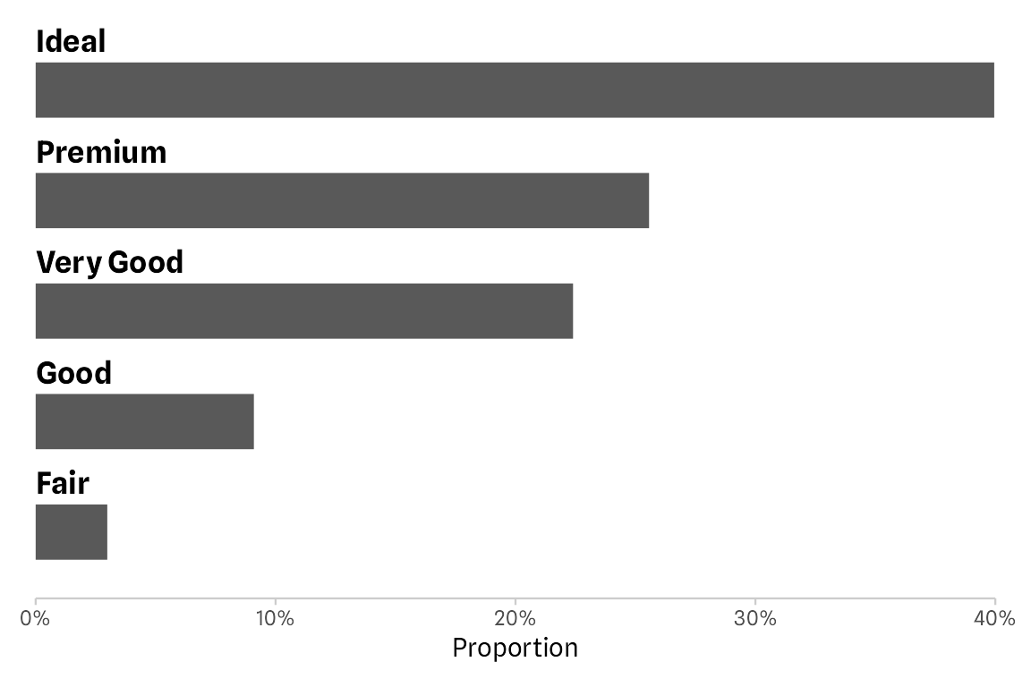
geom_text() to place the category labels in combination with vjust.
That’s a great solution, too. I see some potential issues coming up here, for example problems in case the labels become larger (can be fixed by removing the clipping and adding some margin) or the number of bars increases (and that may be especially a problem in an automated workflow). In the latter case, the space between bars may become too small and/or the placement of the labels, adjusted via vjust or nudge_y, is not perfectly above the bars anymore.
Conclusion
To illustrate the different behavior of the two approaches, let’s run the exact same codes on a new data set with more categories:
p1 <-
  mpg |>
  filter(year == "2008") |>
  summarize(prop = n() / nrow(mpg), .by = manufacturer) |>
  mutate(manufacturer = forcats::fct_reorder(stringr::str_to_title(manufacturer), -prop)) |>
  ggplot(aes(prop, manufacturer)) +
  geom_col() +
  facet_wrap(~ manufacturer, ncol = 1, scales = "free_y") +
  scale_x_continuous(
    name = "Proportion", expand = c(0, 0),
    limits = c(0, .1), labels = scales::label_percent()
  ) +
  scale_y_discrete(
    guide = "none", expand = expansion(add = c(.8, .6))
  ) +
  theme(strip.text = element_text(
    hjust = 0, margin = margin(1, 0, 1, 0),
    size = rel(1.1), face = "bold"
  ))

p2 <-
  mpg |>
  filter(year == "2008") |>
  summarize(prop = n() / nrow(mpg), .by = manufacturer) |>
  mutate(manufacturer = forcats::fct_reorder(stringr::str_to_title(manufacturer), prop)) |>
  ggplot(aes(prop, manufacturer)) +
  geom_col(width = .5) +
  geom_text(
    aes(label = manufacturer, x = 0),
    family = "Spline Sans", fontface = "bold",
    hjust = 0, vjust = -1.7, size = 4.5
  ) +
  scale_x_continuous(
    name = "Proportion", expand = c(0, 0),
    limits = c(0, .1), labels = scales::label_percent()
  ) +
  scale_y_discrete(guide = "none")

library(patchwork)
p1 + p2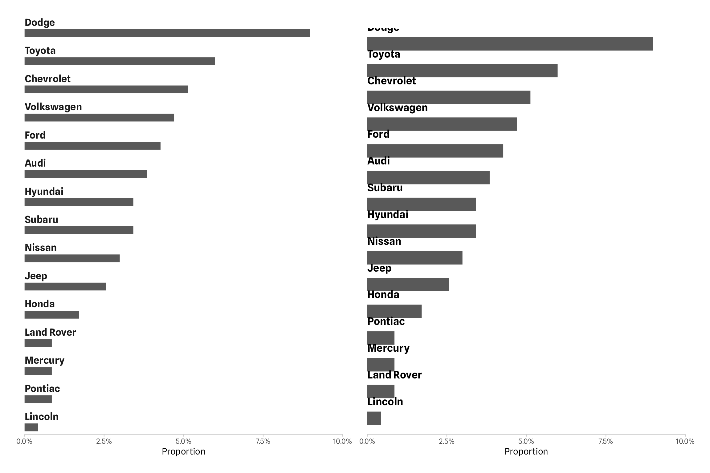
Both approaches have their pros and cons. In circumstances, where you can tweak the exact setting of bar widths, font sizes, and vertical justification, the geom_text() approach might be easier to set up.
Using the facet_wrap() approach ensures that the labels are always above the bars and that the labels are not clipped by the panel or plot border. This is especially powerful in case the data changes and charts need to be updated without any further modifications. Or if you want to apply a function to multiple data sets without the need to include further arguments to modify the widths and spacing. At the same time, the thinner bars make it more difficult to place labels inside the bars. However, the same issue would pop up when adjusting the widths and font sizes in the geom_text() example.
Finally, I should note that also the facet approach will break at some point: if the figure height is not sufficient, no bars are visible at all. But scaling the figure height based on the number of categories is something one can easy automate as well.
Note on the Header Image
I’ve seen this bar chart on the german TV talk show “maischberger”, airing on September 27, 2023. A wonderful revival of 3D-bars, combined with a glossy, transparent gradient style. It shows the number of newly constructed apartments per year over time.
R Session Info
## R version 4.3.0 (2023-04-21)
## Platform: aarch64-apple-darwin20 (64-bit)
## Running under: macOS Ventura 13.2.1
##
## Matrix products: default
## BLAS:   /Library/Frameworks/R.framework/Versions/4.3-arm64/Resources/lib/libRblas.0.dylib
## LAPACK: /Library/Frameworks/R.framework/Versions/4.3-arm64/Resources/lib/libRlapack.dylib;  LAPACK version 3.11.0
##
## locale:
## [1] en_US.UTF-8/en_US.UTF-8/en_US.UTF-8/C/en_US.UTF-8/en_US.UTF-8
##
## time zone: Europe/Berlin
## tzcode source: internal
##
## attached base packages:
## [1] stats     graphics  grDevices utils     datasets  methods   base
##
## other attached packages:
## [1] patchwork_1.1.2   ggplot2_3.4.3     dplyr_1.1.0       systemfonts_1.0.4
##
## loaded via a namespace (and not attached):
##  [1] gtable_0.3.4      jsonlite_1.8.7    highr_0.10        compiler_4.3.0    tidyselect_1.2.0  stringr_1.5.0     jquerylib_0.1.4   scales_1.2.1
##  [9] textshaping_0.3.6 yaml_2.3.7        fastmap_1.1.1     R6_2.5.1          labeling_0.4.2    generics_0.1.3    knitr_1.42        forcats_1.0.0
## [17] tibble_3.2.1      bookdown_0.35     munsell_0.5.0     bslib_0.5.1       pillar_1.9.0      rlang_1.1.1       utf8_1.2.3        stringi_1.7.12
## [25] cachem_1.0.8      xfun_0.40         sass_0.4.7        cli_3.6.1         withr_2.5.0       magrittr_2.0.3    digest_0.6.33     grid_4.3.0
## [33] rstudioapi_0.15.0 lifecycle_1.0.3   vctrs_0.6.3       evaluate_0.20     glue_1.6.2        farver_2.1.1      blogdown_1.18     ragg_1.2.5
## [41] fansi_1.0.4       colorspace_2.1-0  rmarkdown_2.20    tools_4.3.0       pkgconfig_2.0.3   htmltools_0.5.6