Header image by Richard Strozynski
Introduction
Bar charts are likely the most common chart type out there and come in several varieties. Most notably, direct labels can increase accessibility of a bar graph and reduce the “chart junk” since grid lines, axis labels, and even axis titles become obsolete. Ordering your bar charts make sense in case the categorical value has no internal order and helps focusing on the largest and smallest groups. In addition, one can highlight specific bars with use of custom colors. It is pretty easy to improve your ggplot with a few lines of code. And this short tutorial shows you multiple ways how to do so.
A few days ago, I got a request on some code creating bar charts with individual colors and percentage labels with the {ggplot2} package.
Watching your webinar about ggplot2 on UseR Oslo YouTube Channel, I noticed some charts you made for a project called ‘Survey on contract termination during the COVID-19 pandemic for kuendigung.org’.
Because they have many interesting aesthetic features, I started looking for source code on your GitHub repo, but I didn’t find anything. So, I kindly ask you if you can share the code you used to create those charts (or share its location), hoping that it is not copyrighted material.

Specifically, the main things of interest where:
- How to calculate the percentage values?
(Did you use a{ggplot2}function or calculate them manually?) - How to position the percentage labels inside the bars?
- How to color the bars using different colors?
Unfortunately, the code is under lock but it’s a simple bar chart with some labels, so I will walk you through a short toy example using the manufacturers data set mpg that comes with {ggplot2}.
Data Preparation with the tidyverse
First, let’s prepare the data for the bar chart. We are going to use the data from 2008 only and summarize the number of car model variants in the data per manufacturer. We also adjust the manufacturer labels and order them as they should appear in the final plot. Here are some notes on some of the functions used:
count()from the{dplyr}package is a wrapper ofgroup_by(var) |> summarize(n = n())). It allows you to sort the values which is useful here because we want to order the bars based on their value in our visualization.str_to_title()from the{stringr}package is a quick way to capitalize labels.fct_lump(),fct_inorder(),fct_rev(), andfct_relevel()are all from the{forcats}package that provides helpers for reordering factor levels.- First, we group all manufacturers together that do not belong to the top 10 with
fct_lump(). - Since our data set is sorted in descending order thanks to
count(), we first order them by appearance withfct_inorder(). - Afterwards, we reverse them with
fct_rev()(so that the bar with the highest value is on top). - Finally, we move the category “Other” to the end (as the first level) with
fct_relevel().
- First, we group all manufacturers together that do not belong to the top 10 with
library(tidyverse)

mpg_sum <- mpg |>
  ## just use 2008 data
  dplyr::filter(year == 2008) |>
  ## turn into lumped factors with capitalized names
  dplyr::mutate(
    manufacturer = stringr::str_to_title(manufacturer),
    manufacturer = forcats::fct_lump(manufacturer, n = 10)
  ) |>
  ## add counts
  dplyr::count(manufacturer, sort = TRUE) |>
  ## order factor levels by number, put "Other" to end
  dplyr::mutate(
    manufacturer = forcats::fct_rev(forcats::fct_inorder(manufacturer)),
    manufacturer = forcats::fct_relevel(manufacturer, "Other", after = 0)
  )

mpg_sum
## # A tibble: 11 × 2
## manufacturer n
## <fct> <int>
## 1 Dodge 21
## 2 Toyota 14
## 3 Chevrolet 12
## 4 Volkswagen 11
## 5 Other 11
## 6 Ford 10
## 7 Audi 9
## 8 Hyundai 8
## 9 Subaru 8
## 10 Nissan 7
## 11 Jeep 6Let’s check if our factor reordering worked:
levels(mpg_sum$manufacturer)## [1] "Other" "Jeep" "Nissan" "Subaru" "Hyundai" "Audi" "Ford" "Volkswagen" "Chevrolet" "Toyota" "Dodge"Keep in mind that we have reversed the ordering since {ggplot2} plots factors from bottom to top when being mapped to y.
Data Visualization with ggplot2
First, let’s draw the basic bar chart using our aggregated and ordered data set called mpg_sum:
ggplot(mpg_sum, aes(x = n, y = manufacturer)) +
  ## draw bars
  geom_col(fill = "gray70") +
  ## change plot appearance
  theme_minimal()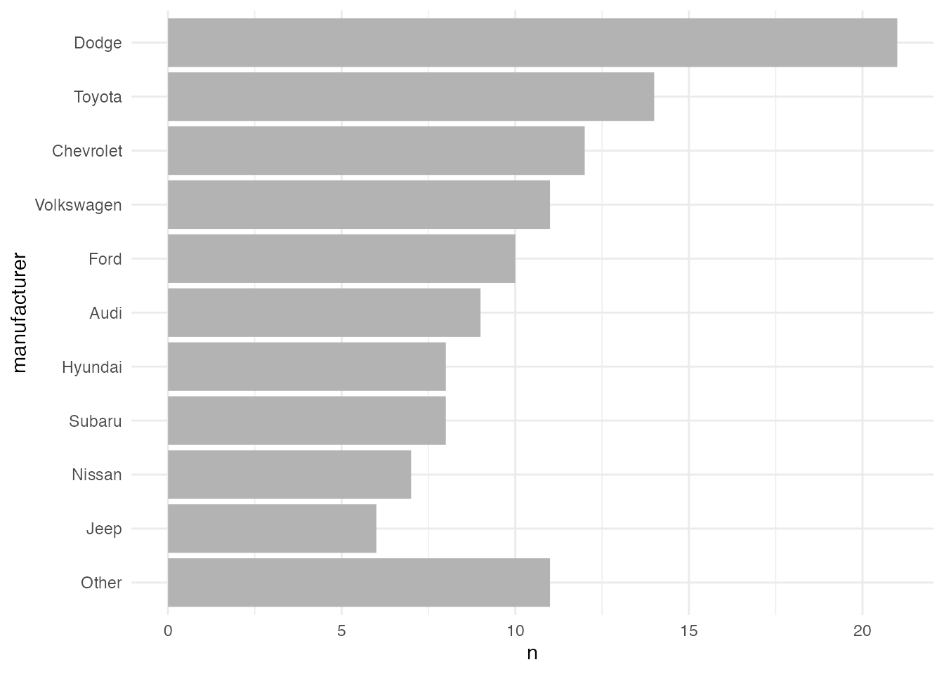
How to Calculate the Percentage Values
We can go both routes, either creating the labels first or on the fly. However, creating the bars and labels with the help of geom_bar() and stat_summary(geom = "text") is a bit more difficult and I prefer to build a temporary data frame for that task. The benefit is that you always can control and check the output, i.e. the sorting of the factor and the formatting of the labels.
Here are two ways how to quickly add the percentage labels to your data set. The percentage can be easily calculated by dividing the number of cars per manufacturer n by the total number of cars sum(n), times 100. sprintf() is a handy function to format text and variables. sprintf() allows you to include for example leading spaces (not important here but useful for left-aligned labels) and zero digits (e.g. 12.0% instead of 12% which is useful here). The syntax is likely confusing for you because it relies on the C library of the same name. Here, we want to retrieve 4 characters in total, 1 of the to the right of the decimal. See here for more about the parameters one can use. Using paste0, or alternatively the glue() function from the {glue} package, we add the percentage symbol to that number.
mpg_sum <- mpg_sum |>
  ## add percentage label with `sprintf()`
  dplyr::mutate(perc = paste0(sprintf("%4.1f", n / sum(n) * 100), "%"))

mpg_sum
## # A tibble: 11 × 3
## manufacturer n perc
## <fct> <int> <chr>
## 1 Dodge 21 "17.9%"
## 2 Toyota 14 "12.0%"
## 3 Chevrolet 12 "10.3%"
## 4 Volkswagen 11 " 9.4%"
## 5 Other 11 " 9.4%"
## 6 Ford 10 " 8.5%"
## 7 Audi 9 " 7.7%"
## 8 Hyundai 8 " 6.8%"
## 9 Subaru 8 " 6.8%"
## 10 Nissan 7 " 6.0%"
## 11 Jeep 6 " 5.1%"One could also use the percent() function from the {scales} package. The accuracy determines the number of digits (here .1) and we can similarly add the leading white space by setting trim to FALSE.
mpg_sum |>
  ## add percentage label with `scales::percent()`
  dplyr::mutate(perc = scales::percent(n / sum(n), accuracy = .1, trim = FALSE))
## # A tibble: 11 × 3
## manufacturer n perc
## <fct> <int> <chr>
## 1 Dodge 21 "17.9%"
## 2 Toyota 14 "12.0%"
## 3 Chevrolet 12 "10.3%"
## 4 Volkswagen 11 " 9.4%"
## 5 Other 11 " 9.4%"
## 6 Ford 10 " 8.5%"
## 7 Audi 9 " 7.7%"
## 8 Hyundai 8 " 6.8%"
## 9 Subaru 8 " 6.8%"
## 10 Nissan 7 " 6.0%"
## 11 Jeep 6 " 5.1%"So let’s add the prepared percentage label to our bar graph with geom_text():
ggplot(mpg_sum, aes(x = n, y = manufacturer)) +
  geom_col(fill = "gray70") +
  ## add percentage labels
  geom_text(aes(label = perc)) +
  theme_minimal()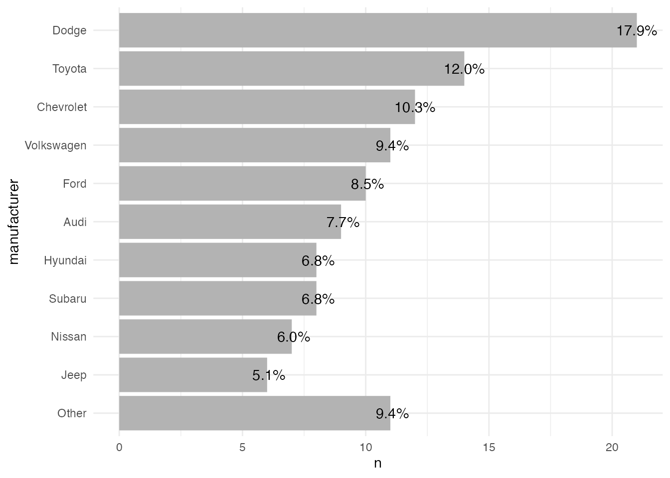
And in case you want to add some more description to one of the bars, you can use an if_else() (or an ifelse()) statement like this:
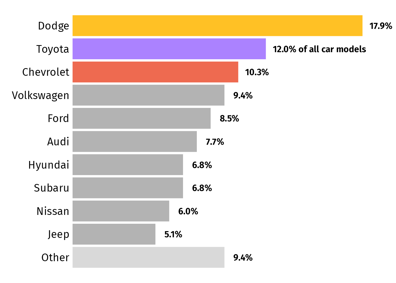
mpg_sum <- mpg_sum |>
  dplyr::mutate(
    perc = paste0(sprintf("%4.1f", n / sum(n) * 100), "%"),
    ## customize label for the first category
    perc = if_else(row_number() == 1, paste(perc, "of all car models"), perc)
  )

ggplot(mpg_sum, aes(x = n, y = manufacturer)) +
  geom_col(fill = "gray70") +
  geom_text(aes(label = perc)) +
  ## make sure labels doesn't get cut
  scale_x_continuous(limits = c(NA, 24)) +
  theme_minimal()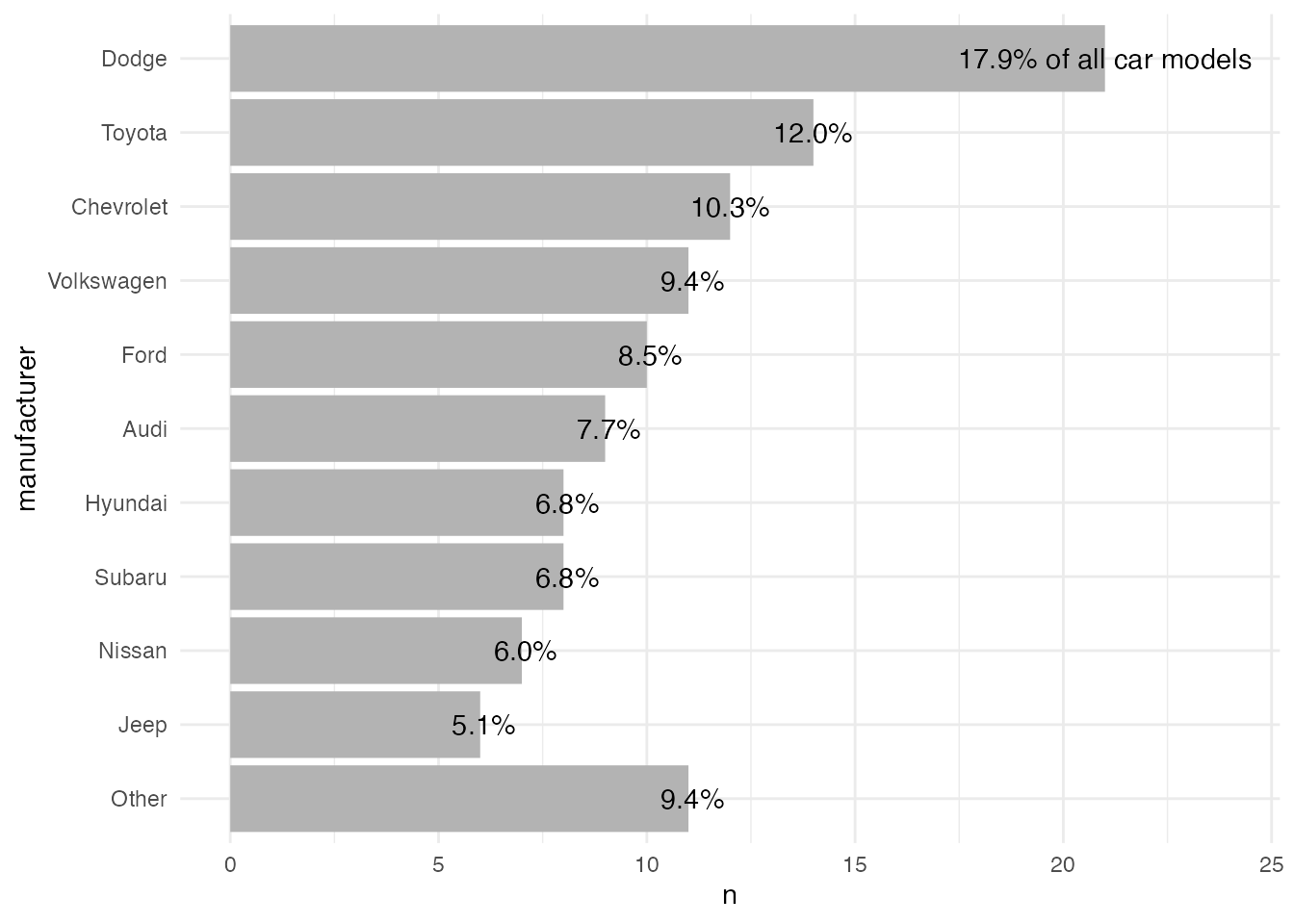
To illustrate how to create and place the labels on the fly, here is an example with labels showing counts per manufacturer (with percentage labels it gets a bit more complicated). We use geom_bar() instead of geom_col() which takes not two but only one variable and calculates counts by default. To add the labels, we again use geom_text() but this time we overwrite the default statistical transformation stat = "identity" with stat = "count" (the same as the default for geom_bar()).
## prepare non-aggregated data set with lumped and ordered factors
mpg_fct <- mpg |>
  dplyr::filter(year == 2008) |>
  dplyr::mutate(
    ## add count to calculate percentages later
    total = dplyr::n(),
    ## turn into lumped factors with capitalized names
    manufacturer = stringr::str_to_title(manufacturer),
    manufacturer = forcats::fct_lump(manufacturer, n = 10),
    ## order factor levels by number, put "Other" to end
    manufacturer = forcats::fct_rev(forcats::fct_infreq(manufacturer)),
    manufacturer = forcats::fct_relevel(manufacturer, "Other", after = 0)
  )

ggplot(mpg_fct, aes(x = manufacturer)) +
  geom_bar(fill = "gray70") +
  ## add count labels
  geom_text(
    stat = "count",
    aes(label = ..count..)
  ) +
  ## rotate plot
  coord_flip()  +
  theme_minimal()
As you can see, the default settings of geom_text() place the labels exactly on the border. To make it look good, we need to adjust the positioning of the labels. So let’s move on to the next question!
How to Position the Percentage Labels Inside the Bars
The geom_text() function comes with arguments that help you to align and position text labels:
hjustandvjust: the horizontal and vertical justification to align text.nudge_xandnudge_y: the horizontal and vertical adjustment to offset text from points.
To put the labels inside, we first need to right-align the labels with hjust = 1. We also add some negative horizontal adjustment via nudge_x = -.5 to add some spacing between the end of the bar and the label.
ggplot(mpg_sum, aes(x = n, y = manufacturer)) +
  geom_col(fill = "gray70") +
  geom_text(
    aes(label = perc),
    ## make labels left-aligned
    hjust = 1, nudge_x = -.5
  ) +
  theme_minimal()
In case you want to put the next to the bars, you often need to adjust the plot margin and/or the limits to avoid that the labels are cut off. The drawback of using limits is that you have to define them manually. Thus, I prefer to use the first approach. You can make sure that labels are not truncated by the panel by adding clip = "off" to any coordinate system.
💁 Expand to see examples with labels next to the bars.
Increase space on the right via theme(plot.margin):
ggplot(mpg_sum, aes(x = n, y = manufacturer)) +
  geom_col(fill = "gray70") +
  geom_text(
    aes(label = perc),
    hjust = 0, nudge_x = .5
  ) +
  ## make sure labels doesn't get cut, part 1
  coord_cartesian(clip = "off") +
  theme_minimal() +
  ## make sure labels doesn't get cut, part 2
  theme(plot.margin = margin(r = 120))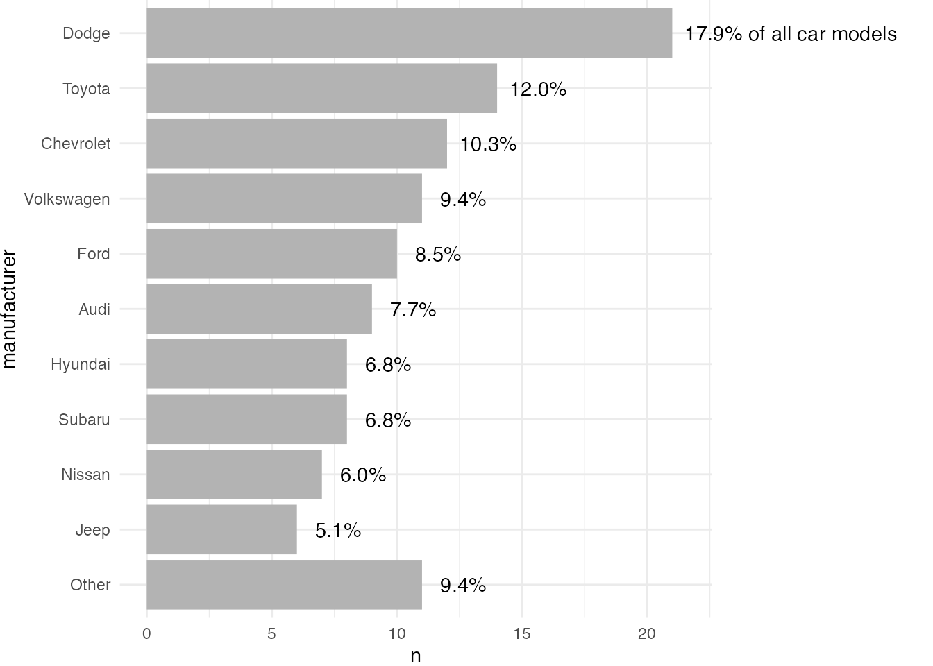
Increase space on the right via scale_x_continuous(limits):
ggplot(mpg_sum, aes(x = n, y = manufacturer)) +
  geom_col(fill = "gray70") +
  geom_text(
    aes(label = perc),
    hjust = 0, nudge_x = .5
  ) +
  ## make sure labels doesn't get cut
  scale_x_continuous(limits = c(NA, 30)) +
  theme_minimal()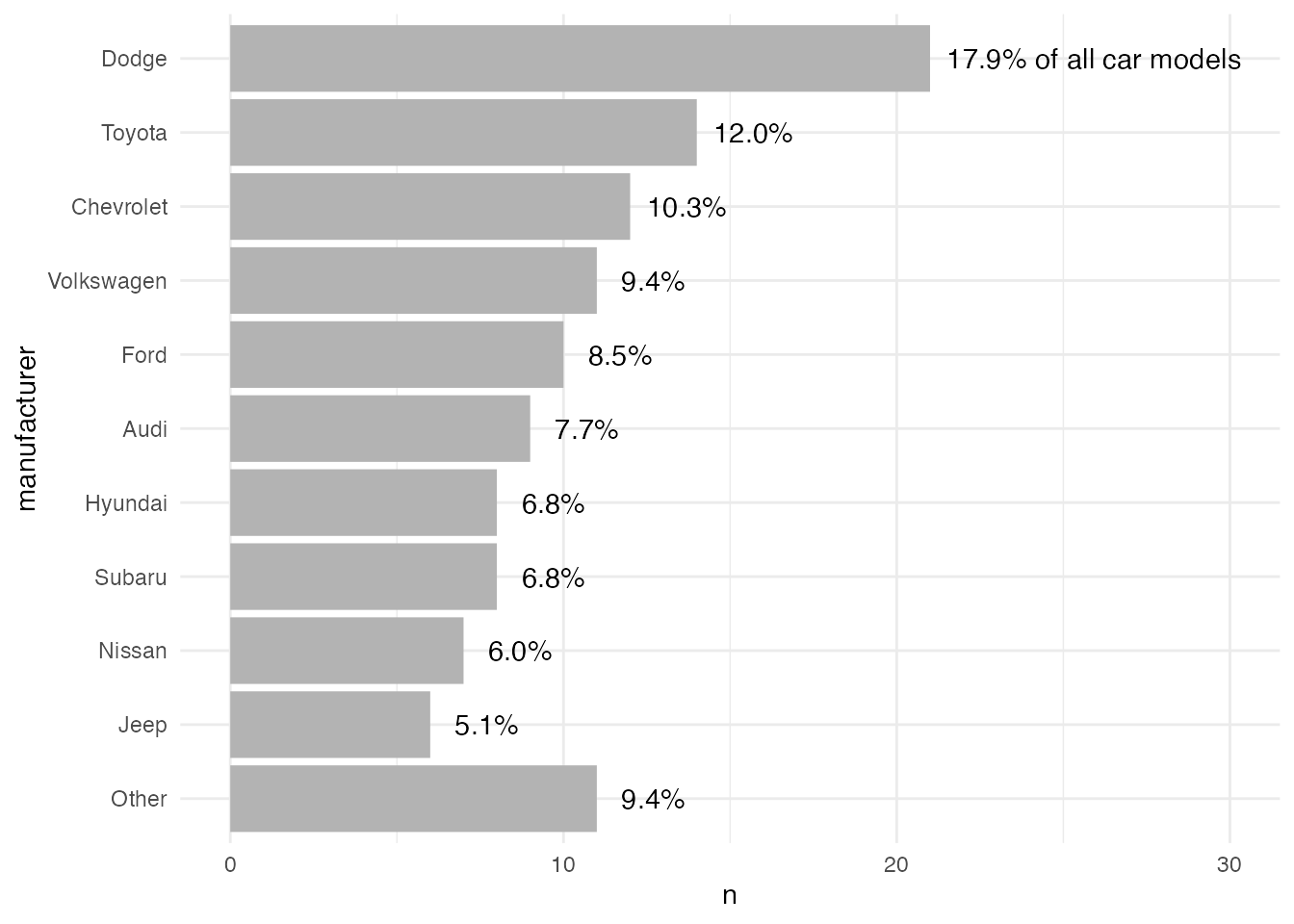
How to Color the Bars Using Different Colors
Again, there are many ways how to add custom colors. As the first approach, we create the color palette as a vector based on our summarized data set. Let’s pick some colors that are similar to the original plot we started with:
## create color palette based on input data
pal <- c(
  "gray85",
  rep("gray70", length(mpg_sum$manufacturer) - 4),
  "coral2", "mediumpurple1", "goldenrod1"
)
In this approach, we create a vector that holds the colors for each of the levels—from the lowest bar to the bar with the most values.
We can use the length of the manufacturer column for all non-highlighted bars and subtract the number of bars we want to highlight. Here, we have a colorful top 3 and a lighter “Other” category. The vector can then be used in combination with scale_color|fill_manual().
Now, we can use the custom palette to color each bar by mapping manufacturer to the bar’s fill property and by passing the pals vector to scale_fill_manual():
ggplot(mpg_sum, aes(x = n, y = manufacturer,
                    fill = manufacturer)) +
  geom_col() +
  geom_text(
    aes(label = perc),
    hjust = 1, nudge_x = -.5
  ) +
  ## add custom colors
  scale_fill_manual(values = pal, guide = "none") +
  theme_minimal()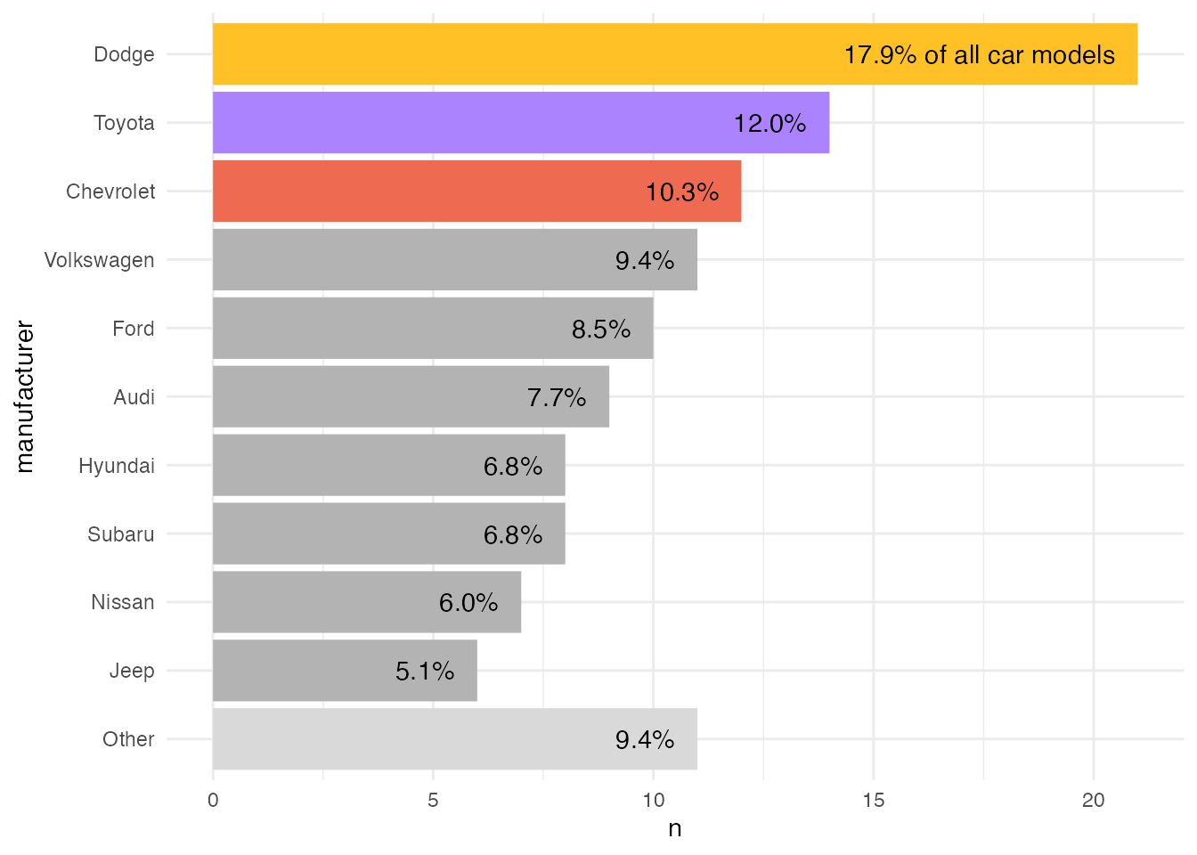
One could also add the color to the data set and map the fill to that column and use scale_fill_identity().
mpg_sum <-
  mpg_sum |>
  mutate(
    color = case_when(
      row_number() == 1 ~ "goldenrod1",
      row_number() == 2 ~ "mediumpurple1",
      row_number() == 3 ~ "coral2",
      manufacturer == "Other" ~ "gray85",
      ## all others should be gray
      TRUE ~ "gray70"
    )
  )

ggplot(mpg_sum, aes(x = n, y = manufacturer, fill = color)) +
  geom_col() +
  geom_text(
    aes(label = perc),
    hjust = 1, nudge_x = -.5
  ) +
  ## add custom colors
  scale_fill_identity(guide = "none") +
  theme_minimal()
This approach is less error-prone since the color is tied to the properties of the data. Thus, in case we update the data, the colors are still applied correctly.
💁 Expand to see that it still works with “updated” data.
mpg |>
  ## use 1999 data now
  dplyr::filter(year == 1999) |>
  dplyr::mutate(
    manufacturer = stringr::str_to_title(manufacturer),
    manufacturer = forcats::fct_lump(manufacturer, n = 10)
  ) |>
  dplyr::count(manufacturer, sort = TRUE) |>
  dplyr::mutate(
    manufacturer = forcats::fct_rev(forcats::fct_inorder(manufacturer)),
    manufacturer = forcats::fct_relevel(manufacturer, "Other", after = 0),
    perc = paste0(sprintf("%4.1f", n / sum(n) * 100), "%"),
    perc = if_else(row_number() == 1, paste(perc, "of all car models"), perc),
    color = case_when(
      row_number() == 1 ~ "goldenrod1",
      row_number() == 2 ~ "mediumpurple1",
      row_number() == 3 ~ "coral2",
      manufacturer == "Other" ~ "gray85",
      TRUE ~ "gray70"
    )
  ) |>
  ggplot(aes(x = n, y = manufacturer, fill = color)) +
  geom_col() +
  geom_text(
    aes(label = perc),
    hjust = 1, nudge_x = -.5
  ) +
  scale_fill_identity(guide = "none") +
  theme_minimal()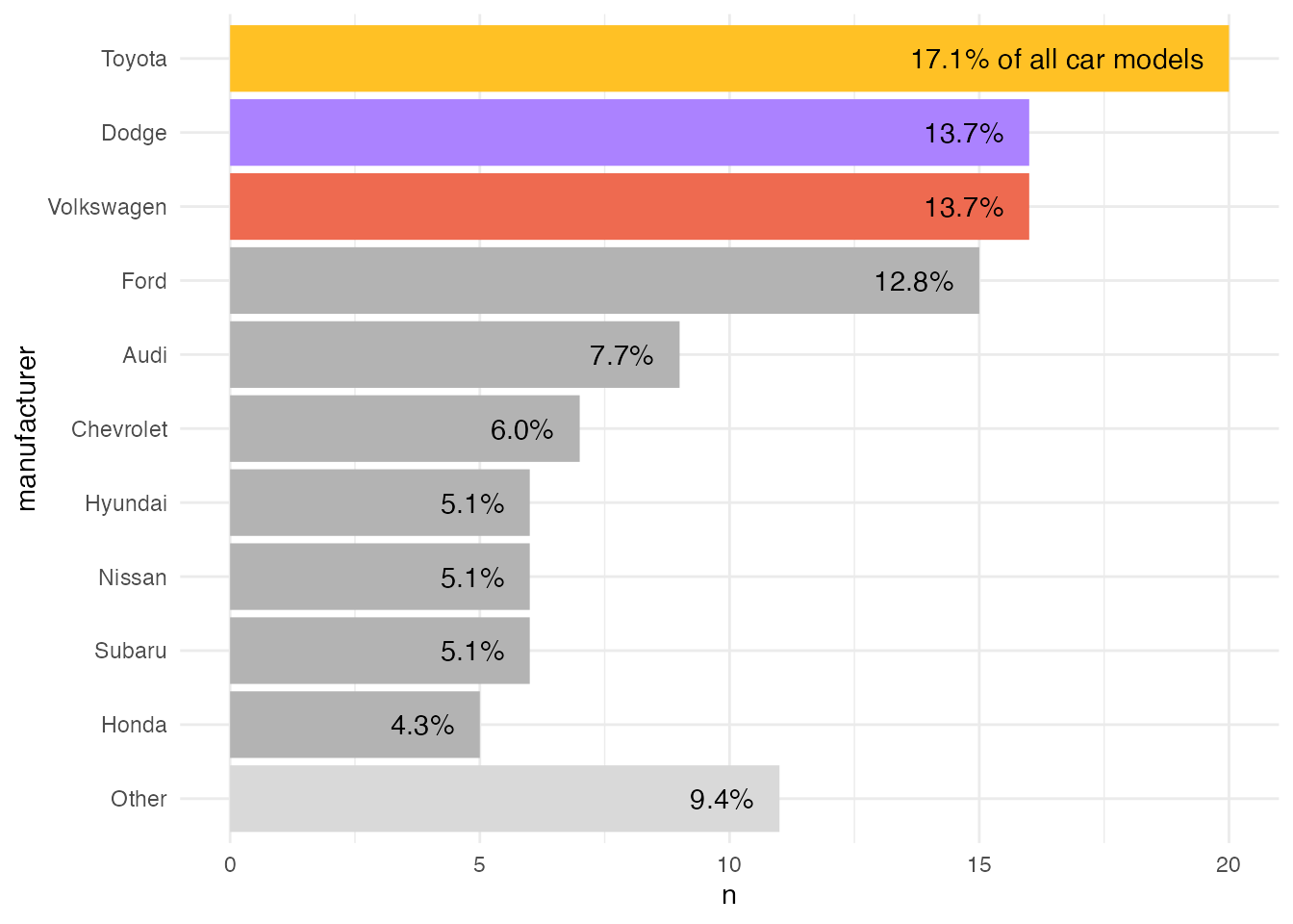
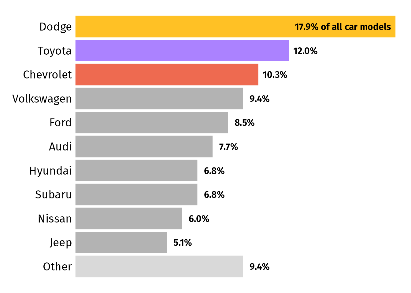
Polish Your Plot
Finally, we can adjust the visual appearance a bit, most importantly reduce redundancy. Since I only want to keep the labels on the y axis, I use theme_void() and add the axis text afterwards again. Here, I use a custom font for both the axis text and the percentage labels and adjust the font size. (I am not going to cover it here but in case you want to include custom fonts, check the {systemfonts} package.)
By default, {ggplot2} adds some padding to each axis which results in labels that are a bit off. To decrease the distance between the y axis text and the bars, adjust the expansion argument expand in the according scale, here scale_x_continuous(). I also add some white space around the plot by setting a plot.margin which is of type element_rect().
ggplot(mpg_sum, aes(x = n, y = manufacturer, fill = color)) +
  geom_col() +
  geom_text(
    aes(label = perc),
    hjust = 1, nudge_x = -.5,
    size = 4, fontface = "bold", family = "Fira Sans"
  ) +
  ## reduce spacing between labels and bars
  scale_x_continuous(expand = c(.01, .01)) +
  scale_fill_identity(guide = "none") +
  ## get rid of all elements except y axis labels + adjust plot margin
  theme_void() +
  theme(axis.text.y = element_text(size = 14, hjust = 1, family = "Fira Sans"),
        plot.margin = margin(rep(15, 4)))
You can find the full code to create the final plot in this gist.
Alternatives Improving the Accessibility
Update: Some feedback suggested that placing labels inside the bars can hinder accessibility due to contrast issues. I fully agree, so I want to present some approaches to decrease that barrier without the need to increase the white space towards the right when placing labels next to the bars.
Version with label boxes instead of pure text:
We can replace geom_text() with geom_label() which adds a box around each label. While it doesn’t look as good, the high contrast of black labels on white ground maximizes readability.
ggplot(mpg_sum, aes(x = n, y = manufacturer, fill = color)) +
  geom_col() +
  geom_label(
    aes(label = perc),
    hjust = 1, nudge_x = -.5,
    size = 4, fontface = "bold", family = "Fira Sans",
    ## turn into white box without outline
    fill = "white", label.size = 0
  ) +
  scale_x_continuous(expand = c(.01, .01)) +
  scale_fill_identity(guide = "none") +
  theme_void() +
  theme(
    axis.text.y = element_text(size = 14, hjust = 1, family = "Fira Sans"),
    plot.margin = margin(rep(15, 4))
  )
Version with different label placement:
I like the idea of placing only those labels inside that mess up the aspect ratio due to their length. In our case, that’s only the first entry. We can place the labels differently by mapping a new created column place to the hjust argument. Since we cannot map a variable to nudge_x, we cannot use it to offset the labels. To add some spacing, I simply add some white space to the begin and end of each percentage label.
mpg_sum |>
  mutate(
    ## set justification based on data
    ## so that only the first label is placed inside
    place = if_else(row_number() == 1, 1, 0),
    ## add some spacing to labels since we cant use nudge_x anymore
    perc = paste(" ", perc, " ")
  ) |>
  ggplot(aes(x = n, y = manufacturer, fill = color)) +
  geom_col() +
  geom_text(
    aes(label = perc, hjust = place),
    size = 4, fontface = "bold", family = "Fira Sans"
  ) +
  scale_x_continuous(expand = c(.01, .01)) +
  scale_fill_identity(guide = "none") +
  theme_void() +
  theme(
    axis.text.y = element_text(size = 14, hjust = 1, family = "Fira Sans"),
    plot.margin = margin(rep(15, 4))
  )
Version placing the long label not at the top: We could also add the “of all car models” bit to a bar that is short enough to ensure that the label does not extend beyond the usual width of the plot. In our example, the second bar in our case fulfills this condition:
mpg_sum |>
  ## overwrite old percentage labels
  mutate(
    perc = paste0(sprintf("%4.1f", n / sum(n) * 100), "%"),
    perc = if_else(row_number() == 2, paste(perc, "of all car models"), perc)
  ) |>
  ggplot(aes(x = n, y = manufacturer, fill = color)) +
  geom_col() +
  geom_text(
    aes(label = perc,),
    hjust = 0, nudge_x = .5,
    size = 4, fontface = "bold", family = "Fira Sans"
  ) +
  ## make sure labels doesn't get cut, part 1
  coord_cartesian(clip = "off") +
  scale_x_continuous(expand = c(.01, .01)) +
  scale_fill_identity(guide = "none") +
  theme_void() +
  theme(
    axis.text.y = element_text(size = 14, hjust = 1, family = "Fira Sans"),
    ## make sure labels doesn't get cut, part 2
    plot.margin = margin(15, 30, 15, 15)
  )
Of course, you could add that information also to the title, figure caption or simply leave it out. But that’s not what the request was about 🤷
R Session Info
## R version 4.2.3 (2023-03-15)
## Platform: x86_64-apple-darwin17.0 (64-bit)
## Running under: macOS Big Sur ... 10.16
##
## Matrix products: default
## BLAS:   /Library/Frameworks/R.framework/Versions/4.2/Resources/lib/libRblas.0.dylib
## LAPACK: /Library/Frameworks/R.framework/Versions/4.2/Resources/lib/libRlapack.dylib
##
## locale:
## [1] en_US.UTF-8/en_US.UTF-8/en_US.UTF-8/C/en_US.UTF-8/en_US.UTF-8
##
## attached base packages:
## [1] stats     graphics  grDevices utils     datasets  methods   base
##
## other attached packages:
##  [1] lubridate_1.9.2   forcats_1.0.0     stringr_1.5.0     dplyr_1.1.2       purrr_1.0.1       readr_2.1.4       tidyr_1.3.0       tibble_3.2.1
##  [9] ggplot2_3.4.2     tidyverse_2.0.0   systemfonts_1.0.4
##
## loaded via a namespace (and not attached):
##  [1] tidyselect_1.2.0  xfun_0.39         bslib_0.5.0       colorspace_2.1-0  vctrs_0.6.2       generics_0.1.3    htmltools_0.5.4   yaml_2.3.7
##  [9] utf8_1.2.3        rlang_1.1.1       jquerylib_0.1.4   pillar_1.9.0      glue_1.6.2        withr_2.5.0       lifecycle_1.0.3   munsell_0.5.0
## [17] blogdown_1.18     gtable_0.3.1      ragg_1.2.5        evaluate_0.20     labeling_0.4.2    knitr_1.42        tzdb_0.3.0        fastmap_1.1.1
## [25] fansi_1.0.4       highr_0.10        scales_1.2.1      cachem_1.0.7      jsonlite_1.8.4    farver_2.1.1      textshaping_0.3.6 hms_1.1.2
## [33] digest_0.6.31     stringi_1.7.12    bookdown_0.34     grid_4.2.3        cli_3.6.0         tools_4.2.3       magrittr_2.0.3    sass_0.4.5
## [41] pkgconfig_2.0.3   ellipsis_0.3.2    timechange_0.2.0  rmarkdown_2.20    rstudioapi_0.14   R6_2.5.1          compiler_4.2.3