What’s the Challenge About?
The #30DayChartChallenge is a data visualization challenge with the aim to create a data visualization on a certain topic for each day of April. Anyone is welcome to contribute, no matter which data source or tool is used to create the visualizations. This year, Dominic and I are hosting the fourth edition with a new set of prompts:
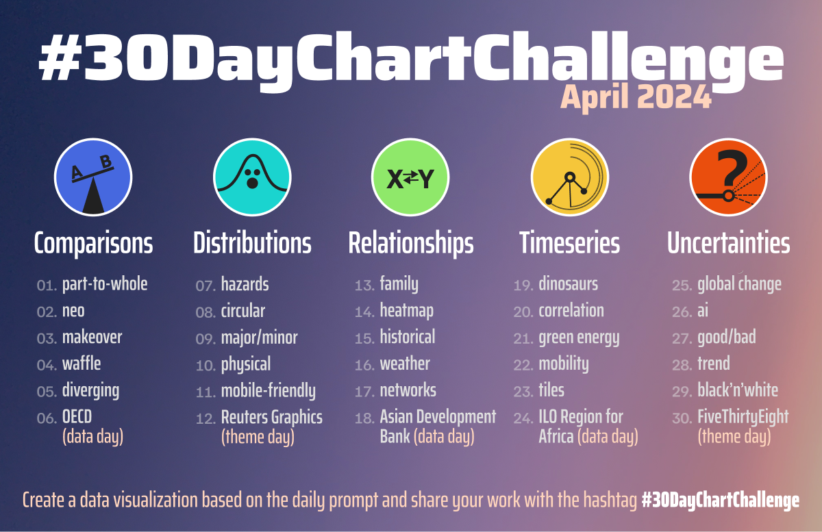
Find out more about the history of the challenge and explore inspirational contributions in my Nightingale article from last year.
I will not participate on every day this year as there are too many other responsibilities I am involved in currently. But for the few prompts I am participating in, my goal is to explore the possibilities to create interactive, responsive visualizations with DataWrapper. And to keep it simple so I’ve decided to set some constraints for my contributions.
Self-Imposed Rules
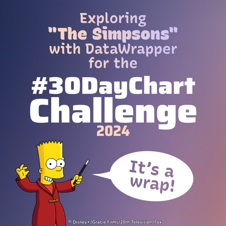
- Data: visualize a “The Simpsons” data set (1, 2, and 3)
- Tool: use DataWrapper to create the charts (and resist to use ggplot2 👀)
- Colors: pick colors from “The Simpsons” (1 and 2)
- Fun: choose a suitable quote from “The Simpsons” for the title
Day 1: Part-to-Whole
Day 2: Neo*
Day 4: Waffle
Day 5: Diverging
Day 9: Major/Minor
Day 10: Physical
Note: While trying to create a lollipop chart, I ended up with this column chart with gradient fills—it's actually a range plot
Day 11: Mobile-friendly
Stacked Bars for Members of the “No Pie Chart Gang”
Day 13: Family
Note: The family tree is build with a scatter plot with lots of custom annotation lines.
Day 14: Heatmap
Note: The chart is actually a choropleth map to ensure that the heatmap looks good independent of the screen width.