Header image by Purrple Cat
During a consulting session a few weeks ago, we discussed automated plot generation with {ggplot2}. What does that mean? If you have a bunch of variables, you may want to create a set of explorative charts for different variables.
Or you may want to create a set of explanatory charts, one for each category of your data set. For both use cases, this requires redundant work as the plots use almost the same code to generate the visualizations.
Instead of copying and pasting the same code and adjusting the variables, iterate over a vector of groups (variables, categories, numeric ranges) to generate the same visual for different data sets by using a custom function.
There are several use cases why you may want to use a functional programming approach to generate the same chart for different data subsets:
- explore distributions or relationships of different variables
- communicate results for different groups
- generate charts for custom reports using various data (sub)sets
There is a great blogpost by Ariel Muldoon on automating explorative plots by iterating over different variables. This blog post here focuses more on the generation of polished charts to visualize subsets of the same data set. In the end, I will also share some examples for working with variables and some shortcuts for exploring data sets visually.
Table of Content
- The Setup
- The Use Case
- The Function
- The Automation
- A More Complex Example
- An Example with Variables as Inputs
The Setup
We are going to visualize relationships for different numeric variables of the mpg data set which features fuel economy data of popular car models for different years, manufacturers, and car types. In this tutorial, we are using only data from 2008.
For some data-wrangling steps, we make use of the {dplyr} packages. To visualize the data, we use the packages {ggplot2} and {patchwork}. We will also use some functions of other packages, namely {tidyr}, {stringr}, {prismatic} and {ggforce} which we address via the namespace.
Unfold to explore setup steps
library(ggplot2)   ## for plotting
library(purrr)     ## for iterative tasks
library(dplyr)     ## for data wrangling
library(patchwork) ## for multi-panel plots

## customize plot style
theme_set(theme_minimal(base_size = 15, base_family = "Anybody"))
theme_update(
  axis.title.x = element_text(margin = margin(12, 0, 0, 0), color = "grey30"),
  axis.title.y = element_text(margin = margin(0, 12, 0, 0), color = "grey30"),
  panel.grid.minor = element_blank(),
  panel.border = element_rect(color = "grey45", fill = NA, linewidth = 1.5),
  panel.spacing = unit(.9, "lines"),
  strip.text = element_text(size = rel(1)),
  plot.title = element_text(size = rel(1.4), face = "bold", hjust = .5),
  plot.title.position = "plot"
)

## adjust data set
mpg <-
  ggplot2::mpg |>
  filter(year == 2008) |>
  mutate(manufacturer = stringr::str_to_title(manufacturer))
The Use Case
Let’s visualize the 2008 car fuel data and explore the relationship of displacement and highway miles per gallon per manufacturer.
g <-
  ggplot(mpg, aes(x = hwy, y = displ)) +
  scale_x_continuous(breaks = 2:8*5) +
  labs(x = "Highway miles per gallon", y = "Displacement in litres", color = NULL)

g + geom_point(aes(color = manufacturer), alpha = .5, size = 3)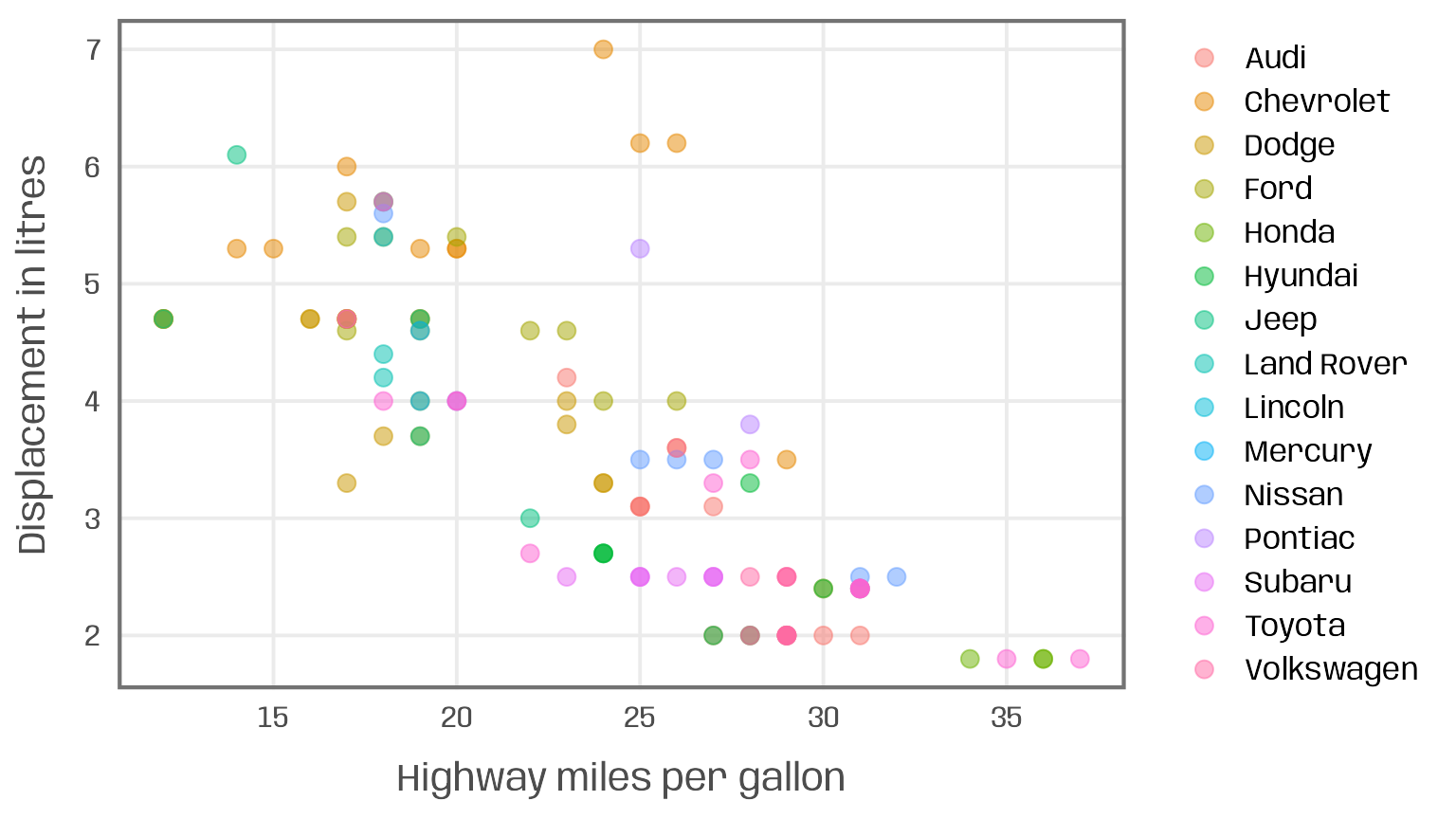
Two issues arise here:
- too many categories: the use of color encoding is not useful given the large number of manufacturers (a usual recommended limit of categorical colors is 5-8)
- too many data points: the number of observations, especially with identical value combinations, leads to* overplotting and color mixing
A common solution to circumvent these issues are small multiples:
 g +
  geom_point(alpha = .5, size = 2) +
  facet_wrap(~ manufacturer, ncol = 3)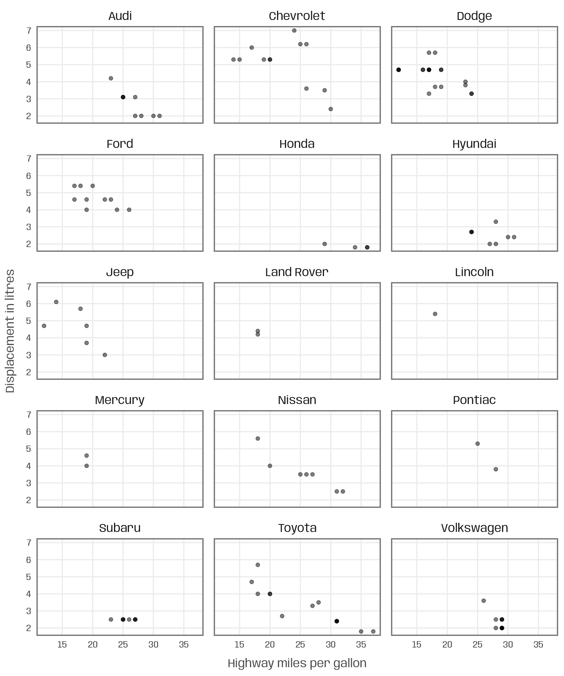
While it solves the mentioned issues, the resulting small multiple is likely too dense to effectively communicate the relationships for each manufacturer. Due to the large number of manufacturers, each plot also becomes rather small.
To focus on a single manufacturer, we may decide to create a plot for a subset of the data. To allow for comparison, we also plot all other car models as smaller, grey circles.
g +
  ## filter for manufacturer of interest
  geom_point(data = filter(mpg, manufacturer == "Audi"),
             color = "#007cb1", alpha = .5, size = 4) +
  ## add shaded points for other data
  geom_point(data = filter(mpg, manufacturer != "Audi"),
             shape = 1, color = "grey45", size = 2) +
  ## add title manually
  ggtitle("Audi")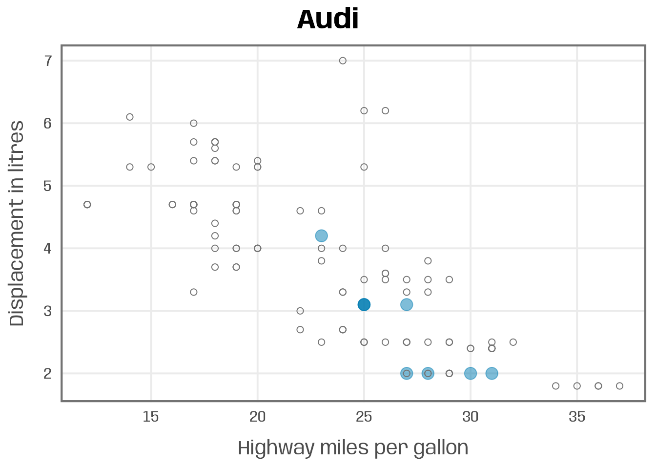
To communicate the relationship for all manufacturers, e.g. a dedicated section for each in a report or revealing the results step by step in a presentation, we now need to repeat the same code 15 times and replace the filter conditions and title. Or we iterate the process.
The Function
The first step is to create a custom function that takes the subset condition as an input and creates the plot with the filtered data. The code inside the user-defined function below is basically the same as the one to create the Audi chart. The only difference is that we do not specify Audi but create a placeholder, here called group, to control the filtering condition and title: In the geom_point() calls, we subset our data based on group; in the labs() function we use this string as the plot title.
plot_manufacturer <- function(group) {

  ## check if input is valid
  if (!group %in% mpg$manufacturer) stop("Manufacturer not listed in the data set.")

  ggplot(mapping = aes(x = hwy, y = displ)) +
    ## filter for manufacturer of interest
    geom_point(data = filter(mpg, manufacturer %in% group),
               color = "#007cb1", alpha = .5, size = 4) +
    ## add shaded points for other data
    geom_point(data = filter(mpg, !manufacturer %in% group),
               shape = 1, color = "grey45", size = 2) +
    scale_x_continuous(breaks = 2:8*5) +
    ## add title automatically based on subset choice
    labs(x = "Highway gallons", y = "Displacement",
         title = group, color = NULL)
}
Now we can run the function manually for each manufacturer featured in the data set:
## run function for specific subsets
plot_manufacturer("Audi")
plot_manufacturer("Chevrolet")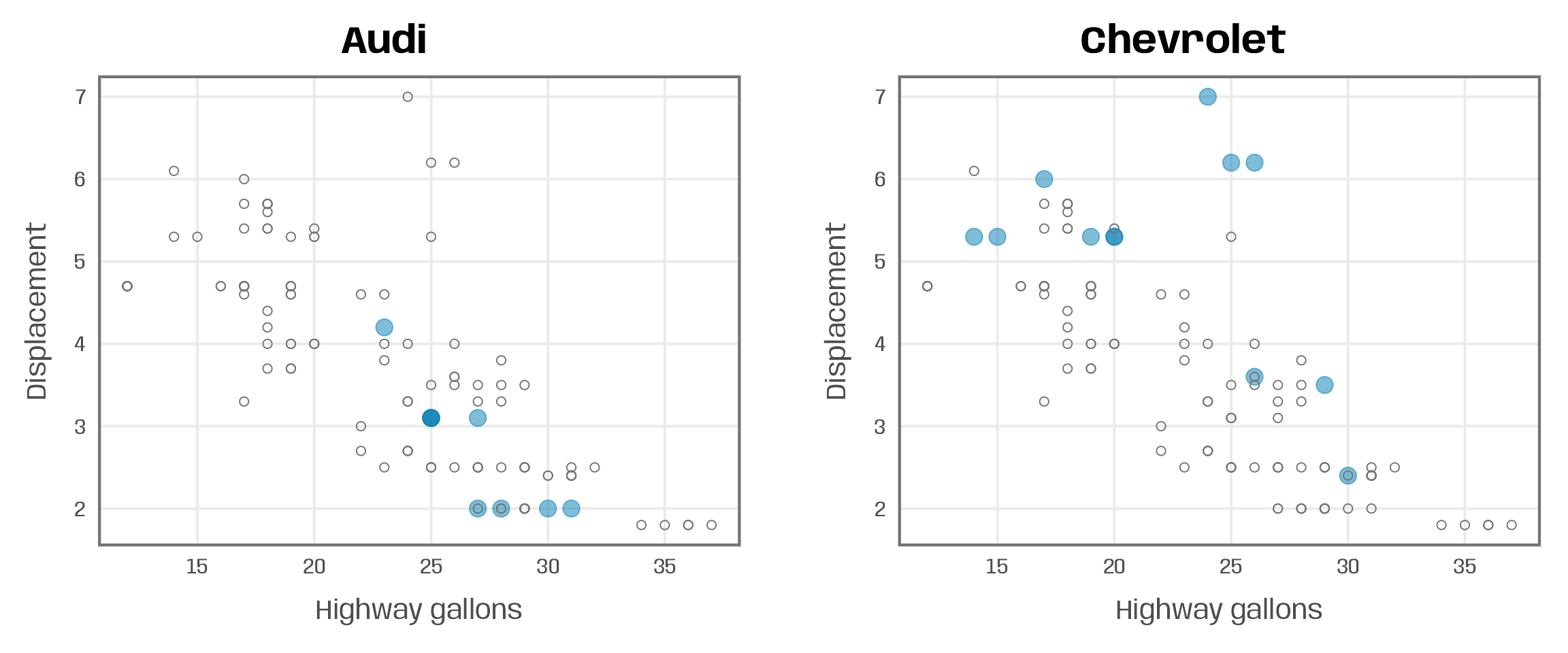
The Automation
The final step is simple: we use the map() function from the {purrr} package to iterate over a vector of manufacturers and pass the elements to our plot_manufacturer() function:
groups <- unique(mpg$manufacturer)
map(groups, ~plot_manufacturer(group = .x))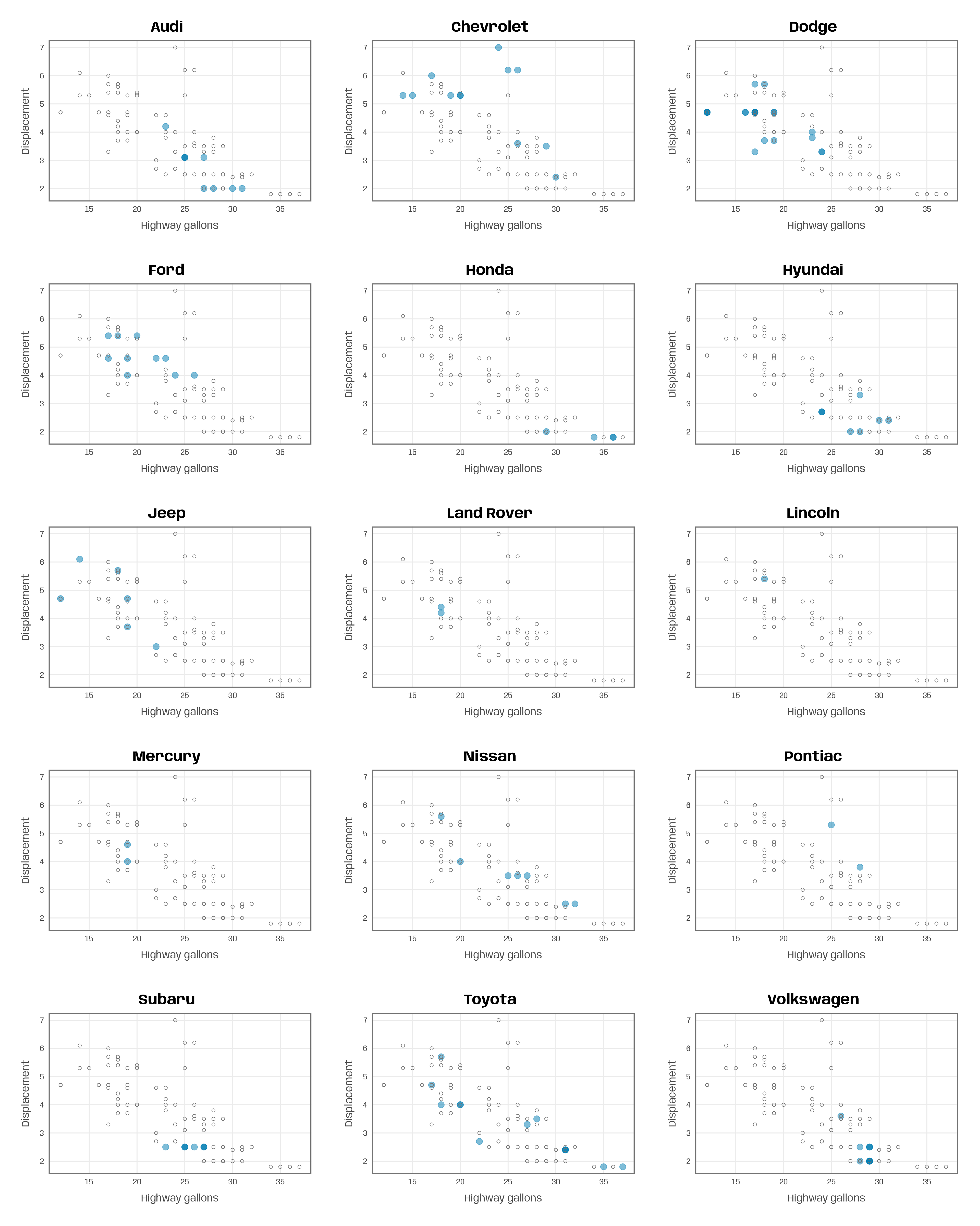
A More Complex Example
Let’s consider a more complex visualization which consists of multiple plots. As before, we first check the input and filter the data. Afterwards, we create three plots and combine them with the help of the {patchwork} package.
The main plot is again a scatter plot of displacement versus highway miles per gallon. This time, we do not add the other car models to our plot. To ensure that the plots cover the full range of the data, I set the axis limits based on the variable ranges of the full data set (lims_x and lims_y in scale_x_continuous() and scale_y_continuous(), respectively). The color of the points is mapped to the car type. To avoid inconsistent coloring of the points due to different car types listed per manufacturer, I create a named color vector (pal) to match the colors by class (scale_color_manual()).
To both axes, I add marginal box plots showing the 1-D summary statistics of the variables. Again, I am applying the limits based on the full data set to match the axis ranges of the scatter plot. I also remove all non-data elements (theme_void()) and the axis guides (guide = "none" in the positional scales).
Another function argument allows to control whether the plot is saved to disk (save = TRUE) or not (save = FALSE).
plot_manufacturer_marginal <- function(group, save = FALSE) {

  ## check if input is valid
  if (!group %in% mpg$manufacturer) stop("Manufacturer not listed in the data set.")
  if (!is.logical(save)) stop("save should be either TRUE or FALSE.")

  ## filter data
  data <- filter(mpg, manufacturer %in% group)

  ## set limits
  lims_x <- range(mpg$hwy)
  lims_y <- range(mpg$displ)

  ## define colors
  pal <- RColorBrewer::brewer.pal(n = n_distinct(mpg$class), name = "Dark2")
  names(pal) <- unique(mpg$class)

  ## scatter plot
  main <- ggplot(data, aes(x = hwy, y = displ, color = class)) +
    geom_point(size = 3, alpha = .5) +
    scale_x_continuous(limits = lims_x, breaks = 2:8*5) +
    scale_y_continuous(limits = lims_y) +
    scale_color_manual(values = pal, name = NULL) +
    labs(x = "Highway miles per gallon", y = "Displacement") +
    theme(legend.position = "bottom")

  ## boxplots
  right <- ggplot(data, aes(x = manufacturer, y = displ)) +
    geom_boxplot(linewidth = .7, color = "grey45") +
    scale_y_continuous(limits = lims_y, guide = "none", name = NULL) +
    scale_x_discrete(guide = "none", name = NULL) +
    theme_void()

  top <- ggplot(data, aes(x = hwy, y = manufacturer)) +
    geom_boxplot(linewidth = .7, color = "grey45") +
    scale_x_continuous(limits = lims_x, guide = "none", name = NULL) +
    scale_y_discrete(guide = "none", name = NULL) +
    theme_void()

  ## combine plots
  p <- top + plot_spacer() + main + right +
    plot_annotation(title = group) +
    plot_layout(widths = c(1, .05), heights = c(.1, 1))

  ## save multi-panel plot
  if (isTRUE(save)) {
    ggsave(p, filename = paste0(group, ".pdf"),
           width = 6, height = 6, device = cairo_pdf)
  }

  return(p)
}
Now we can apply the function to manufacturers line by line:
plot_manufacturer_marginal("Dodge")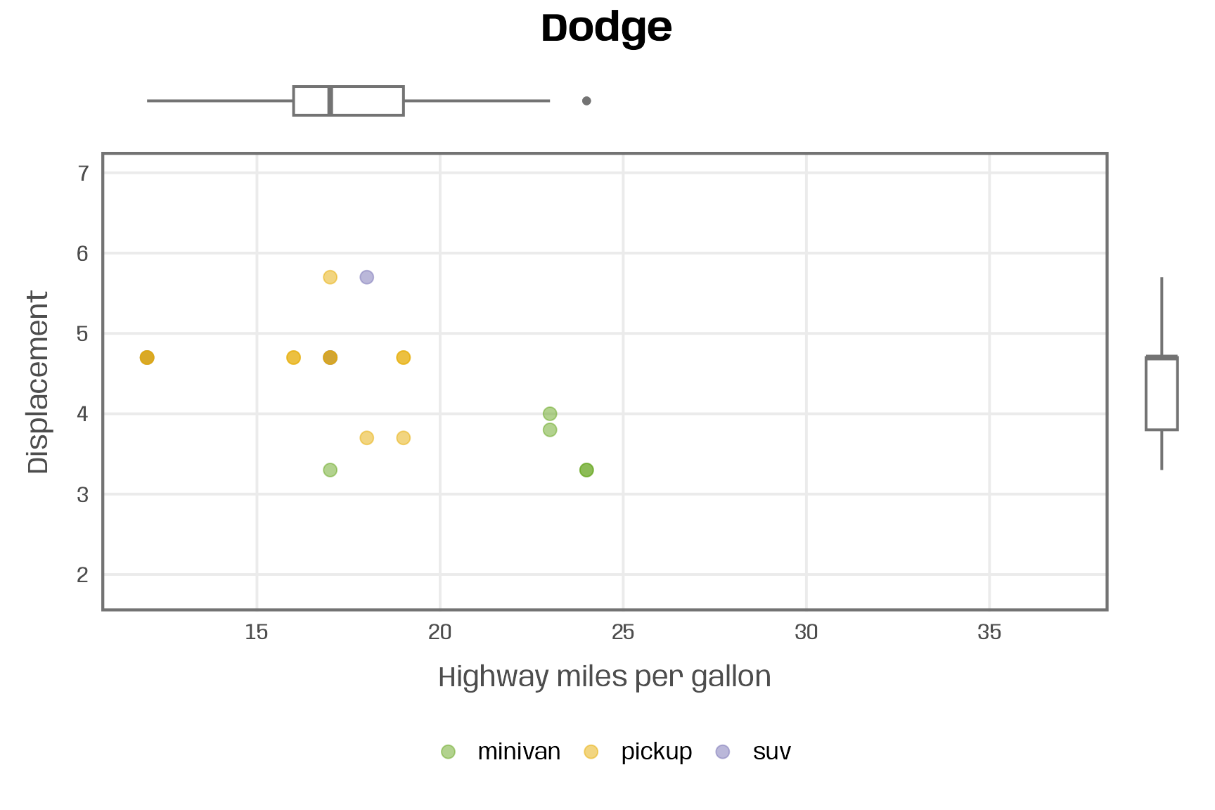
plot_manufacturer_marginal("Nissan") 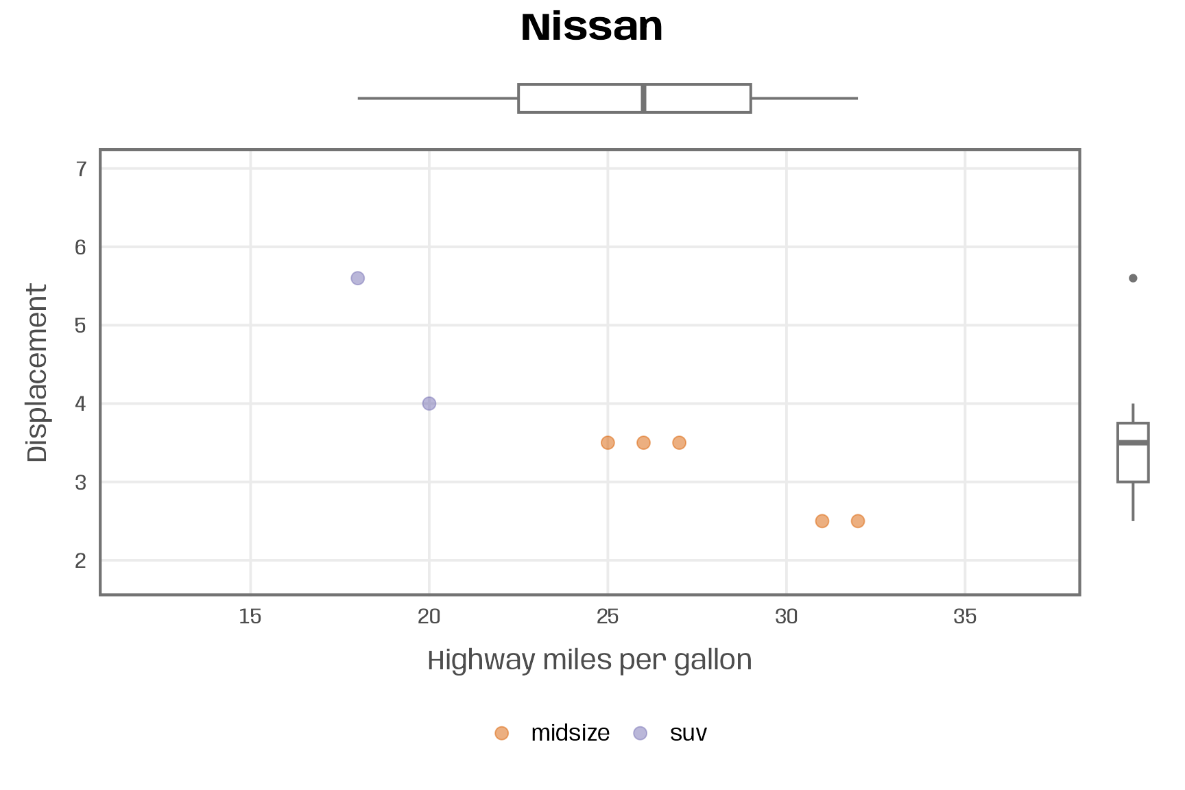
Or we iterate over the vector of manufacturers with the {purrr} package.
map(groups, ~plot_manufacturer_marginal(.x))If you wish to only save the visualizations but not plot them, use the walk() function:
walk(groups, ~plot_manufacturer_marginal(.x, save = TRUE))An Example with Variables as Inputs
To wrap up, let’s consider the use case of exploring the data set. We create a general function that works with any data set and two numeric variables. Based on these three inputs, the function generates a scatter plot with a linear fitting.
In addition, we allow to define a variable to encode points by color as well as to control the size and transparency of the points. If the user passes a column for color encoding, we either use (i) a categorical palette and linear fittings for each group for qualitative variables or (ii) a sequential palette with a single smoothing line for quantitative variables.
plot_scatter_lm <- function(data, var1, var2, pointsize = 2, transparency = .5, color = "") {

  ## check if inputs are valid
  if (!exists(substitute(data))) stop("data needs to be a data frame.")
  if (!is.data.frame(data)) stop("data needs to be a data frame.")
  if (!is.numeric(pull(data[var1]))) stop("Column var1 needs to be of type numeric, passed as string.")
  if (!is.numeric(pull(data[var2]))) stop("Column var2 needs to be of type numeric, passed as string.")
  if (!is.numeric(pointsize)) stop("pointsize needs to be of type numeric.")
  if (!is.numeric(transparency)) stop("transparency needs to be of type numeric.")
  if (color != "") { if (!color %in% names(data)) stop("Column color needs to be a column of data, passed as string.") }

  g <-
    ggplot(data, aes(x = !!sym(var1), y = !!sym(var2))) +
    geom_point(aes(color = !!sym(color)), size = pointsize, alpha = transparency) +
    geom_smooth(aes(color = !!sym(color), color = after_scale(prismatic::clr_darken(color, .3))),
                method = "lm", se = FALSE) +
    theme_minimal(base_family = "Roboto Condensed", base_size = 15) +
    theme(panel.grid.minor = element_blank(),
          legend.position = "top")

  if (color != "") {
    if (is.numeric(pull(data[color]))) {
      g <- g + scale_color_viridis_c(direction = -1, end = .85) +
        guides(color = guide_colorbar(
          barwidth = unit(12, "lines"), barheight = unit(.6, "lines"), title.position = "top"
        ))
    } else {
      g <- g + scale_color_brewer(palette = "Set2")
    }
  }

  return(g)
}
Because I want (better have to) pass the aesthetics as strings with {purrr}, I first turn the input into symbols by using the sym() function and then those get evaluated with !! (so-called “bang-bang”). Note that, in case you just want to use the function without iteration, you can also use {{ }} (so-called embracing) to pass unquoted variables.
Unfold to see {{ }} example
plot_scatter_lm_embraced <- function(data, var1, var2, color = NULL) {

  v1 <- deparse(substitute(var1))
  v2 <- deparse(substitute(var2))
  v3 <- deparse(substitute(color))

  ## check if inputs are valid
  if (!exists(substitute(data))) stop("data needs to be a data frame.")
  if (!is.data.frame(data)) stop("data needs to be a data frame.")
  if (!v1 %in% names(data)) stop("Column var1 needs to be a column of data.")
  if (!v2 %in% names(data)) stop("Column var2 needs to be a column of data.")
  if (!is.numeric(pull(data[v1]))) stop("Column var1 needs to be of type numeric.")
  if (!is.numeric(pull(data[v2]))) stop("Column var2 needs to be of type numeric.")
  if (!v3 %in% c(names(data), "NULL")) stop("Column color needs to be a column of data.")

  g <-
    ggplot(data, aes(x = {{ var1 }}, y = {{ var2 }})) +
    geom_point(aes(color = {{ color }}), alpha = .5) +
    geom_smooth(aes(color = {{ color }}), method = "lm", se = FALSE) +
    theme_minimal(base_family = "Roboto Condensed", base_size = 15) +
    theme(panel.grid.minor = element_blank(),
          legend.position = "top")

  if (v3 != "NULL") {
    if (is.numeric(pull(data[v3])))  {
      g <- g + scale_color_viridis_c(direction = -1, end = .85) +
        guides(color = guide_colorbar(
          barwidth = unit(12, "lines"), barheight = unit(.6, "lines"), title.position = "top"
        ))
    } else {
      g <- g + scale_color_brewer(palette = "Set2")
    }
  }

  return(g)
}
plot_scatter_lm_embraced(data = mpg, var1 = displ, var2 = hwy)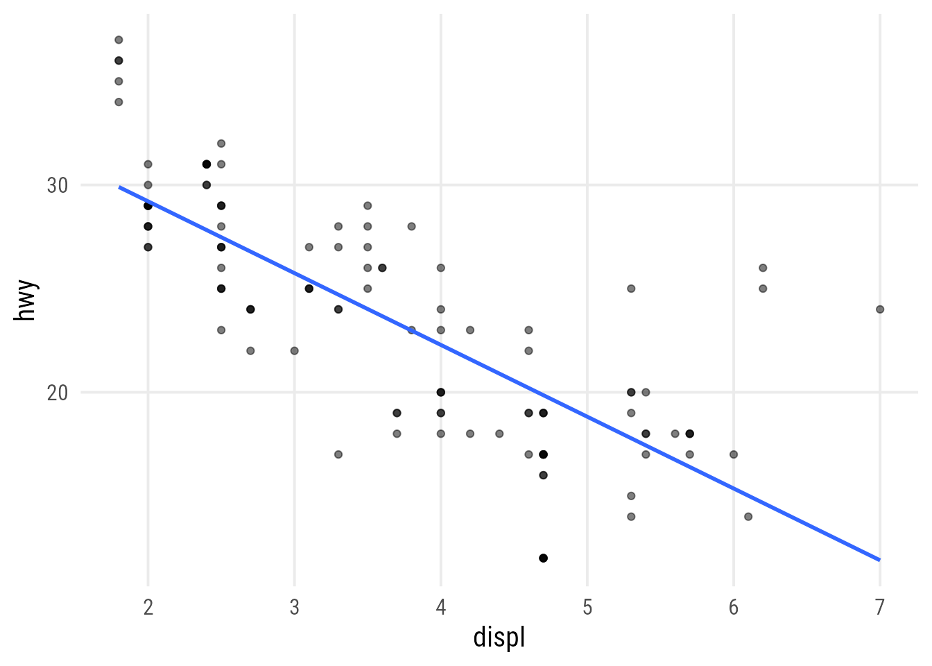
plot_scatter_lm_embraced(data = mpg, var1 = displ, var2 = hwy, color = cyl)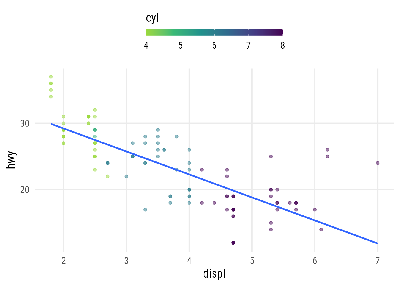
plot_scatter_lm_embraced(data = mpg, var1 = displ, var2 = hwy, color = class)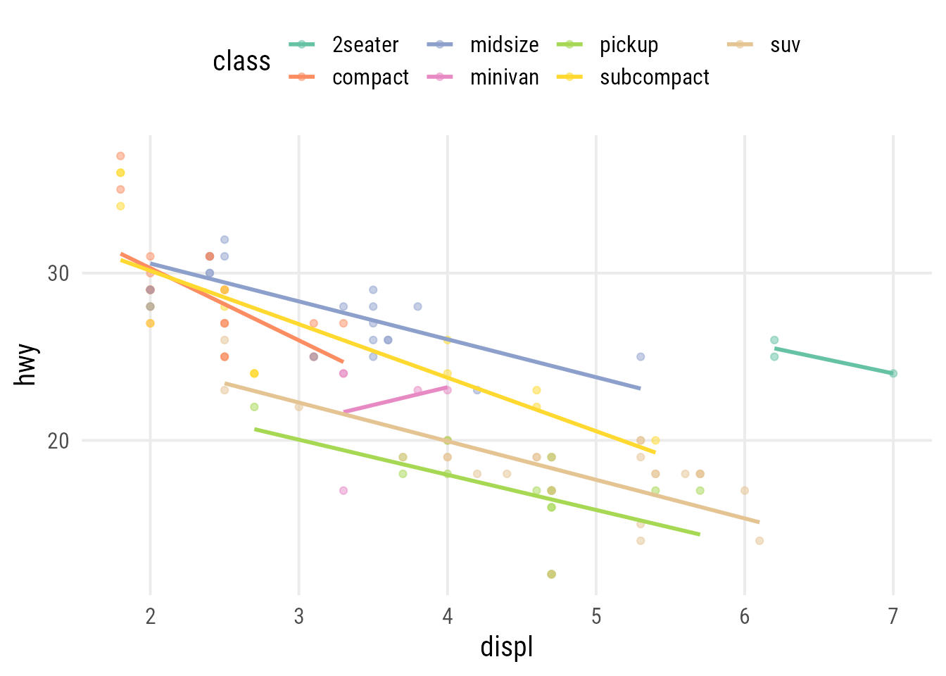
To iterate over the function, we have two options:
- we can fix one variable and pass the other as vector with
map() - we can pass two variables as vectors to
var1andvar2withmap2()
Let’s consider an example in which we vary both positional variables, using the 2008 car fuel data:
map2(
  c("displ", "displ", "hwy"),
  c("hwy", "cty", "cty"),
  ~plot_scatter_lm(
    data = mpg, var1 = .x, var2 = .y,
    color = "cyl", pointsize = 3.5
  )
)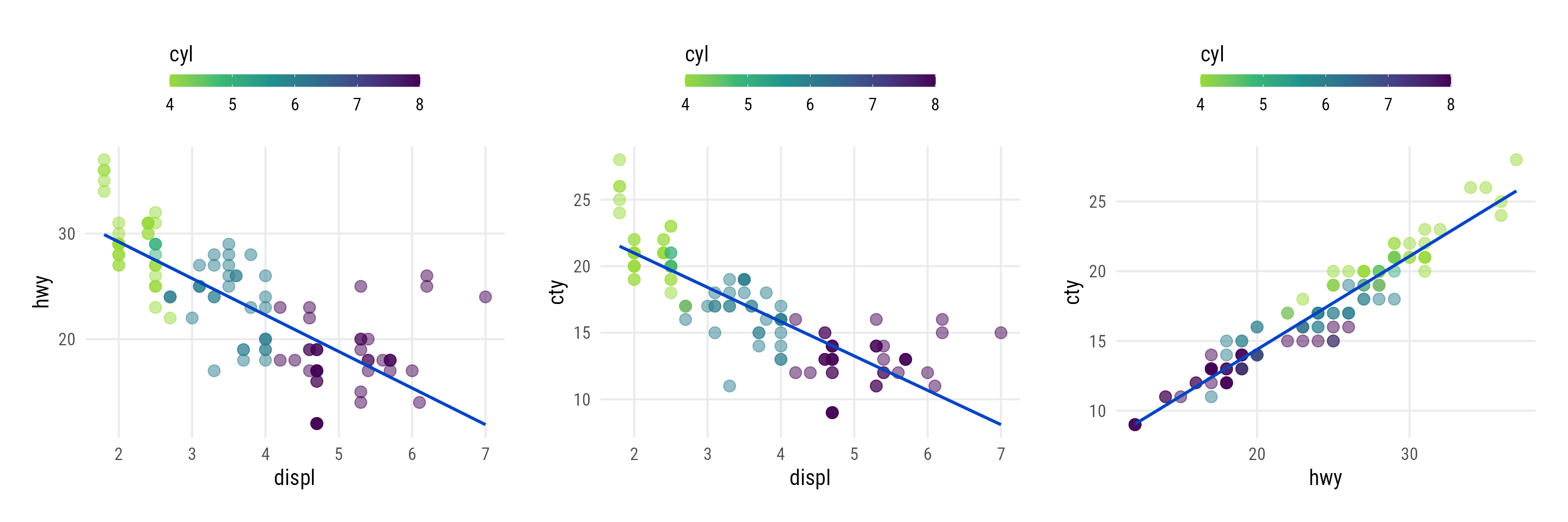
displ, cty, and hwy for the 2008 car fuel data. As the number of cylinders is encoded as numeric, the sequential green-purple viridis scale is applied to the points.
Now we are going to apply our function to a different data set, the Palmer penguins to visualize x-y relationships per species. We automatically iterate over all combinations of a set of chosen numeric variables: we first generate a vector containing the column names of interest (names) and then create a data frame with all possible combinations (names_set) with the help of expand_grid() from the {tidyr} package.
## set up variables of interest
names <- c("bill_length_mm", "bill_depth_mm", "flipper_length_mm", "body_mass_g")
## ... and create all possible combinations
names_set <- tidyr::expand_grid(names, names)
Using another mapping function from the {purrr} package called pmap(), we can map over multiple arguments simultaneously:
library(palmerpenguins)

pmap(
  names_set, ~plot_scatter_lm(
    data = penguins,
    var1 = .x, var2 = .y, color = "species"
  )
)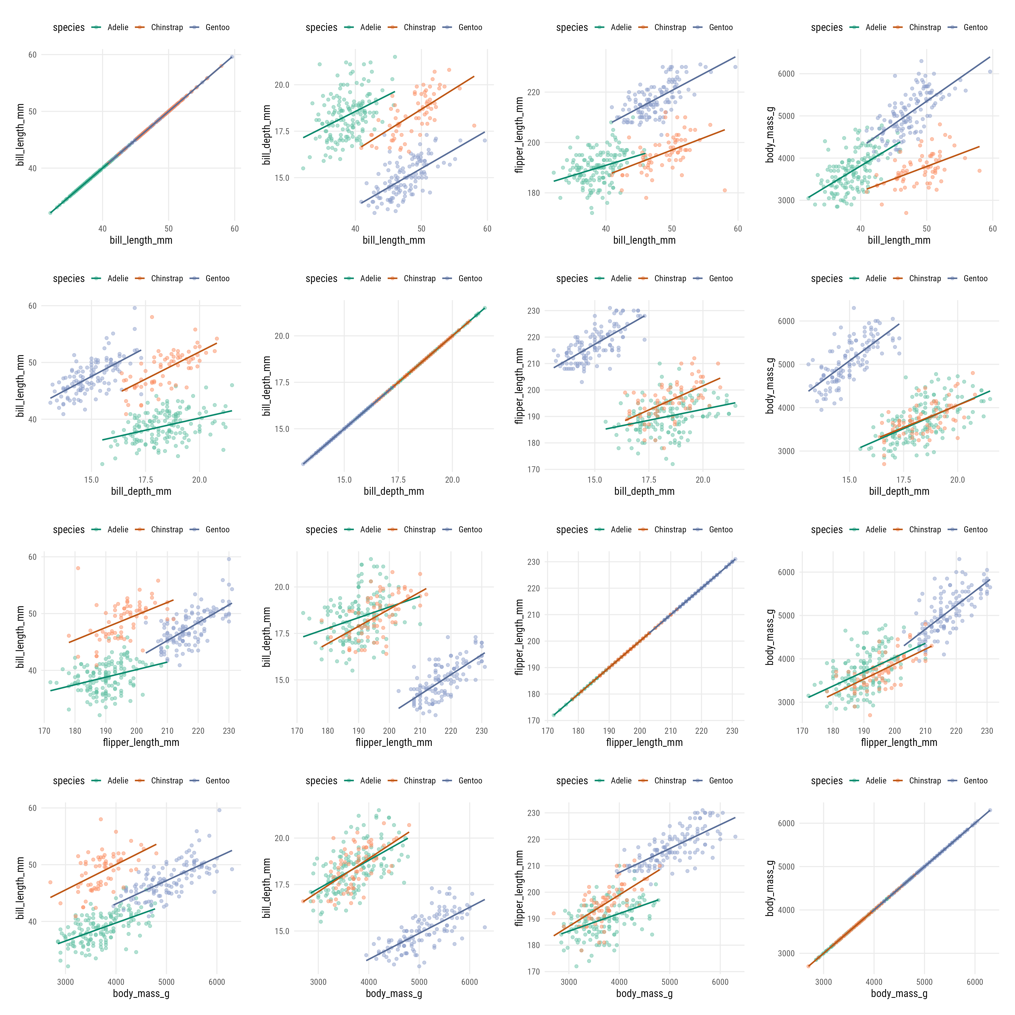
color in our custom function returns linear smoothing lines for each of the three groups which are encoded with a categorical palette from the ColorBrewer project.
Shortcuts for Explorative Plots
plot()
I am not a fan of base R plots but one big advantage is the behavior when applying the plot() function to a full data set. The output is a grid of plots showing the relationship of all variable combinations:
plot(penguins)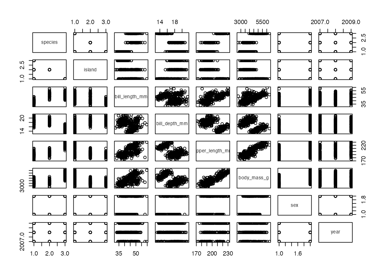
plot() on a data frame returns a grid of scatter plots visualizing the x-y relationships of all possible combinations of variables.
facet_matrix()
A similar, and more flexible take on this idea is the facet_matrix() functionality from the {ggforce} package. Instead of passing variable names in the aesthetics, we specify placeholders called .panel_x and .panel_y. We then create our ggplot as usual by adding layers and scales.
Finally, we specify the variables to use in the facet inside the facet_matrix() component. You can also specify specific layers for different areas (upper, diagonal, lower) inside facet_matrix():
ggplot(penguins, aes(x = .panel_x, y = .panel_y)) +
  geom_point(aes(color = species), alpha = .5) +
  geom_smooth(aes(color = species), method = "lm") +
  ggforce::geom_autodensity(aes(color = species, fill = after_scale(color)), alpha = .7) +
  scale_color_brewer(palette = "Set2", name = NULL) +
  ggforce::facet_matrix(vars(names), layer.lower = 2, layer.diag = 3)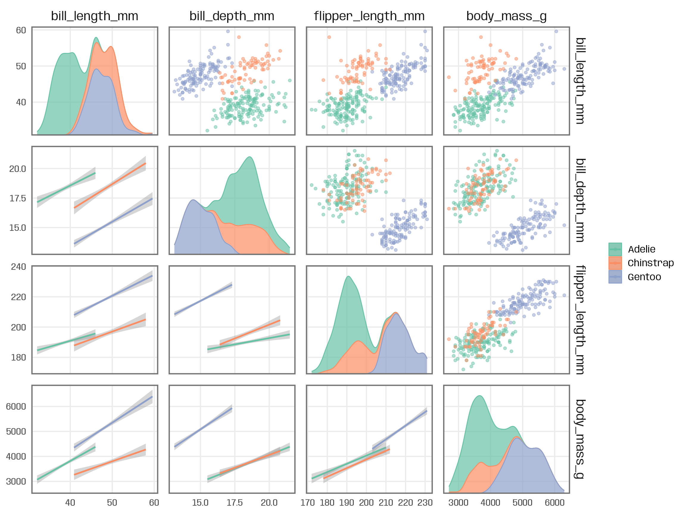
facet_matrix() from the {ggforce} package offers a great way to generate similar grids with {ggplot2}, allowing for the usual flexibility in terms of fine-tuning and polishing. By specifying different layers for the three areas , we can combine all kind of chart types to visualize the relationships of the variables.
R Session Info
## R version 4.2.3 (2023-03-15)
## Platform: x86_64-apple-darwin17.0 (64-bit)
## Running under: macOS Big Sur ... 10.16
##
## Matrix products: default
## BLAS:   /Library/Frameworks/R.framework/Versions/4.2/Resources/lib/libRblas.0.dylib
## LAPACK: /Library/Frameworks/R.framework/Versions/4.2/Resources/lib/libRlapack.dylib
##
## locale:
## [1] en_US.UTF-8/en_US.UTF-8/en_US.UTF-8/C/en_US.UTF-8/en_US.UTF-8
##
## attached base packages:
## [1] stats     graphics  grDevices utils     datasets  methods   base
##
## other attached packages:
## [1] palmerpenguins_0.1.1 patchwork_1.1.2      dplyr_1.1.2          purrr_1.0.1          ggplot2_3.4.2
##
## loaded via a namespace (and not attached):
##  [1] tidyselect_1.2.0   xfun_0.39          bslib_0.5.0        splines_4.2.3      lattice_0.20-45    colorspace_2.1-0   vctrs_0.6.2        generics_0.1.3
##  [9] htmltools_0.5.4    viridisLite_0.4.1  yaml_2.3.7         mgcv_1.8-42        utf8_1.2.3         rlang_1.1.1        jquerylib_0.1.4    pillar_1.9.0
## [17] glue_1.6.2         withr_2.5.0        tweenr_2.0.2       RColorBrewer_1.1-3 lifecycle_1.0.3    stringr_1.5.0      munsell_0.5.0      blogdown_1.18
## [25] gtable_0.3.1       ragg_1.2.5         evaluate_0.20      labeling_0.4.2     knitr_1.42         fastmap_1.1.1      fansi_1.0.4        highr_0.10
## [33] Rcpp_1.0.10        scales_1.2.1       cachem_1.0.7       jsonlite_1.8.4     farver_2.1.1       systemfonts_1.0.4  textshaping_0.3.6  ggforce_0.4.1
## [41] digest_0.6.31      stringi_1.7.12     bookdown_0.34      polyclip_1.10-4    grid_4.2.3         cli_3.6.0          tools_4.2.3        magrittr_2.0.3
## [49] sass_0.4.5         tibble_3.2.1       tidyr_1.3.0        pkgconfig_2.0.3    MASS_7.3-58.2      Matrix_1.5-3       rmarkdown_2.20     rstudioapi_0.14
## [57] R6_2.5.1           prismatic_1.1.1    nlme_3.1-162       compiler_4.2.3