End of July, I had the honor to teach a 2-day, in-person workshop on “Graphic Design with ggplot2” at the rstudio::conf(2022) in Washington DC. Invited by RStudio (now named Posit), I developed a new course that covers the most important steps and helpful tips to create visually appealing, engaging and complex graphics with ggplot2. The course focused on the main concepts of the grammar of graphics and used hands-on examples to explore ggplot2’s utility to create multi-layered, more complex graphs. All course resources are available as open-source material on the course page.
The course webpage as well ass the slidedecks and the exercises and solutions were developed with the new open-source scientific and technical publishing system Quarto. The new workshop development was a perfect opportunity to give it a try and the experience was overall wonderful—the reveal.js integration for the slides works perfect and allows for a lot of customization. Thanks to Marco Sciaini for helping me setting up the course webpage which was, after learning about a few quirks, a smooth experience as well.
The workshop is structured in 9 sessions, covering both ggplot2 techniques and general data visualization recommendations:
- Introduction
- Concepts of the ggplot2 Package Pt. 1
- Concepts of the ggplot2 Package Pt. 2
- Data Communication
- Working with Labels & Annotations
- Colorful Graphics
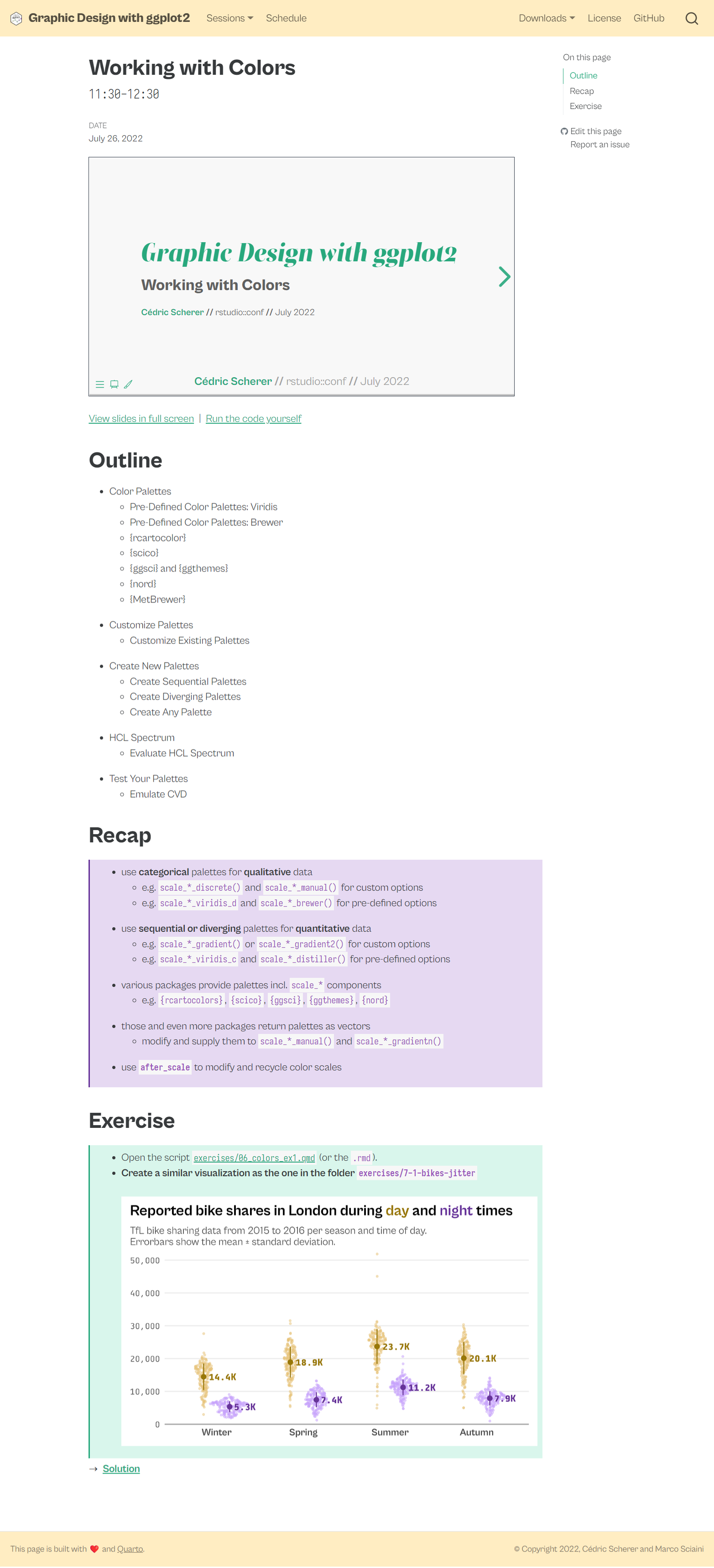
- Working with Colors
- Working with Layouts and Composition
- Group Projects
The session pages contain not only the slides but also hands-on R codes, recap notes, exercises including prepared scripts (either as Quarto or Rmarkdown reports) and step-by-step solutions.
Here is an overview of all recaps:
Concepts of the {ggplot2} Package Pt. 1
{ggplot2}is a powerful library for reproducible graphic design- the components follow a consistent syntax
- each ggplot needs at least data, some aesthetics, and a layer
- we set constant propeties outside
aes() - … and map data-related properties inside
aes() - local settings and mappings override global properties
- grouping allows applying layers for subsets
- we can store a ggplot object and extend it afterwards
- we can change the appearance for all plots with
theme_set()andtheme_update()
Concepts of the {ggplot2} Package Pt. 2
facet_*()functions allow to create small multiplesscale_*()functions translate between aesthetics and properties- use
*_continuous()for numerical data - … and
*_discrete()for categorical data - use
scale_color|fill_*()to customize data-related colors coord_*()functions interpret the positional aesthetics, e.g. create polar plots or work with spatial projections- be careful when adjusting axis limits:
scale_*_continuous(limits)removes the data outside the rangecoord_*(*lim)keeps the data and zooms into the range
Data Communication
- Visualizing data is helpful to gain insights and discover anomalies
- The design process of data visualizations can be broken down to 4 levels:
- Information: understand the data and be accurate
- Story: be clear about the message of the visualization
- Goal: select charts that successfully transport the story
- Visual form: follow design rules and data visualization principles
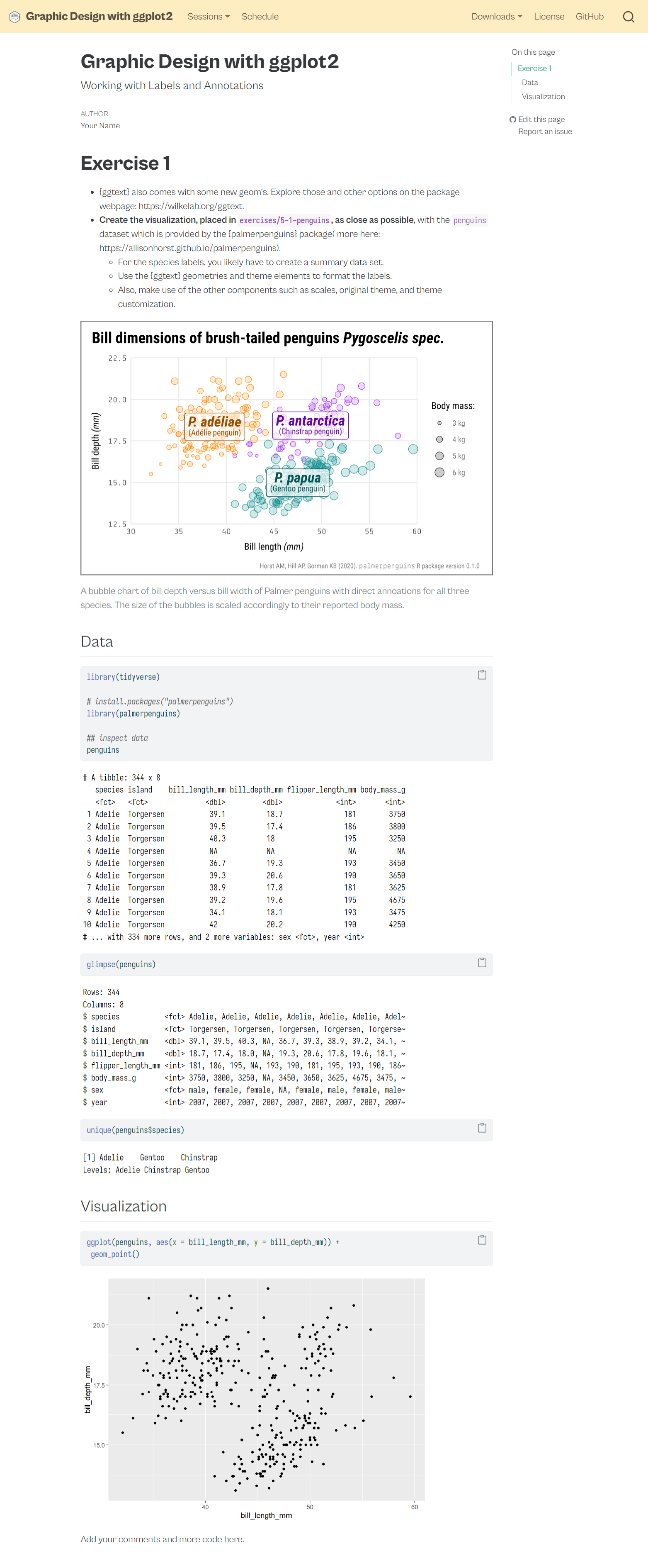
Working with Annotations & Labels
- style labels such as title, axis and legend texts with
theme() - format data-related labels with the
labelsargument ofscale_*() - adjust strip text with the
facet_*(labeller)functionality - add data-related annotations with
geom_text|label() - … and data-unrelated annotations with
annotate() annotation_custom(rasterGrob())is a basic way to add images{ggtext}allows to render labels with markdown and basic html{ggtext}also allows to add dynamic linebreaks and images{ggrepel}ensures clever placement of annotationsggforce::geom_mark_*()provide a set of advanced annotations
Colorful Graphics
- Pick the right palette type for your visualization
- use sequential to encode numerical information with order
- use diverging to encode numerical information with a critical midpoint
- use qualitative to encode categorical information
- map the color with the highest contrast of a sequential palette to the most important value
- for categories use a maximum of 6-8 colors
- test for color blindness using a CVD simulator
- check the contrast of your data and text colors
- avoid rainbow palettes!
Working with Colors
- use categorical palettes for qualitative data
- e.g.
scale_*_discrete()andscale_*_manual()for custom options - e.g.
scale_*_viridis_dandscale_*_brewer()for pre-defined options
- e.g.
- use sequential or diverging palettes for quantitative data
- e.g.
scale_*_gradient()orscale_*_gradient2()for custom options - e.g.
scale_*_viridis_candscale_*_distiller()for pre-defined options
- e.g.
- various packages provide palettes incl.
scale_*components- e.g.
{rcartocolors},{scico},{ggsci},{ggthemes},{nord}
- e.g.
- those and even more packages return palettes as vectors
- modify and supply them to
scale_*_manual()andscale_*_gradientn()
- modify and supply them to
- use
after_scaleto modify and recycle color scales
Working with Layouts & Composition
- guides are the combination of scales and legends
- legends can be either modified with the
guide_*function inscale_*()orguides()and with thetheme()component qualitative - … while quantitative guides are
colorbar,colorstepsorbins {patchwork}is the most modern and simplest way to compose plots- use
+,/and|to combine plots - use
plot_layout()to adjust the layout, widths and heights - use
plot_annotation()to add tags and general labels - use
inset_element()to add inset graphics
- use