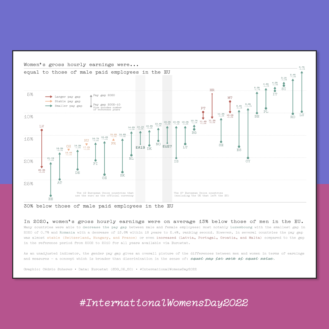
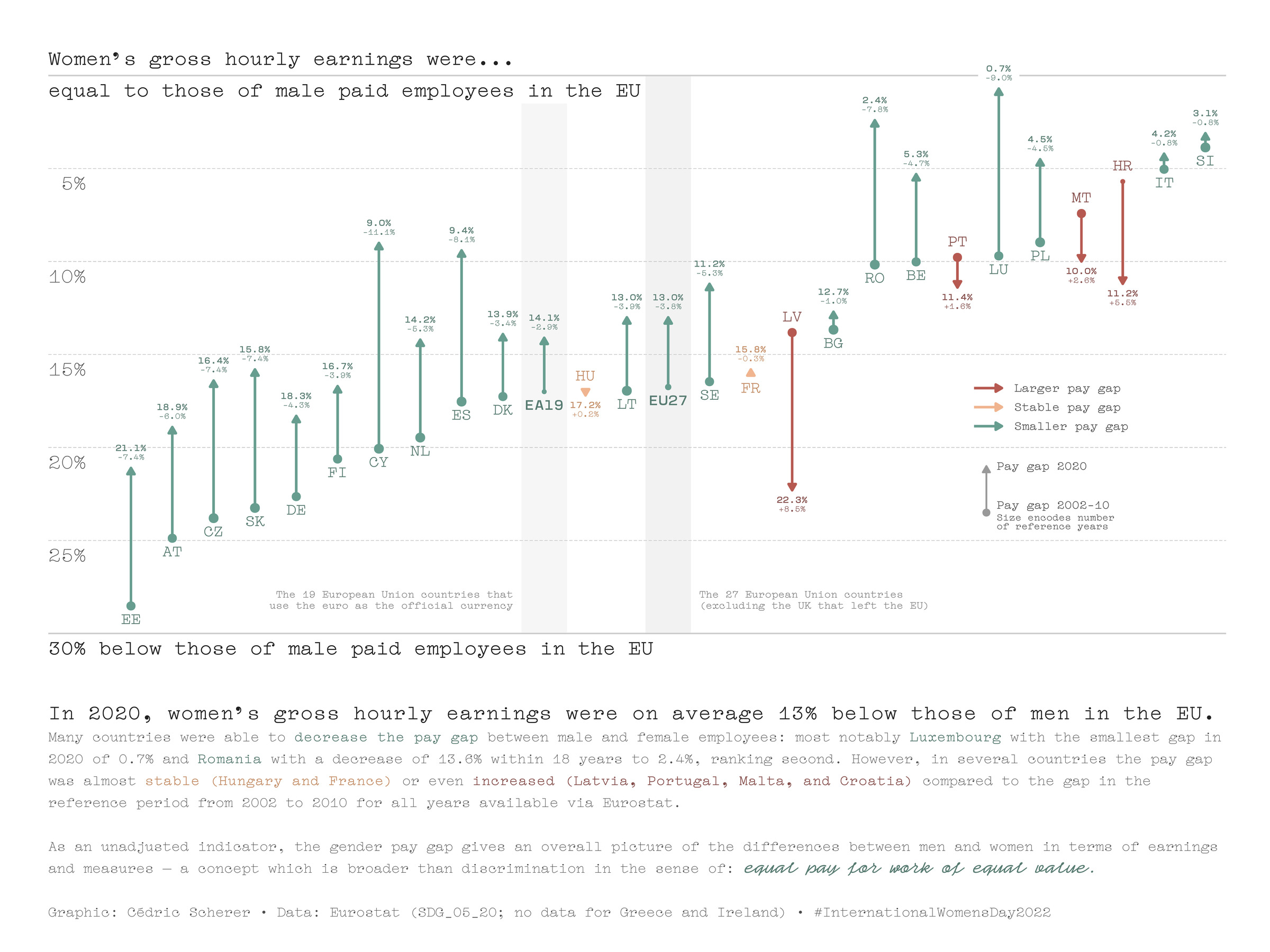
Sadly, inequality between women and men is still an issue. A metric that is one of the most used to illustrate the inequality is the pay gap. In its simplest, unadjusted form, the pay gap shows the difference between the average gross hourly earnings of men and women, expressed as a percentage of the average gross hourly earnings of men.
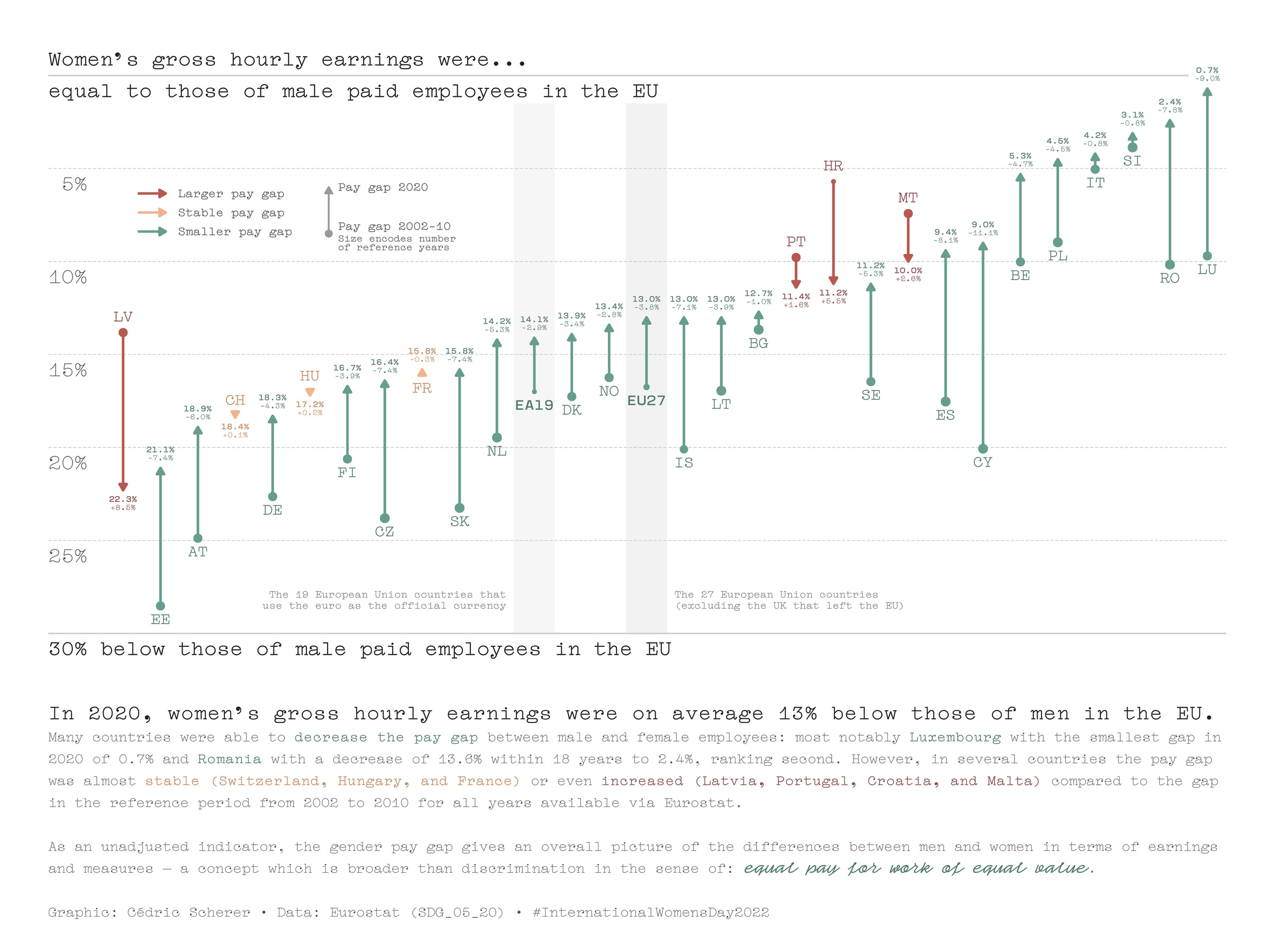
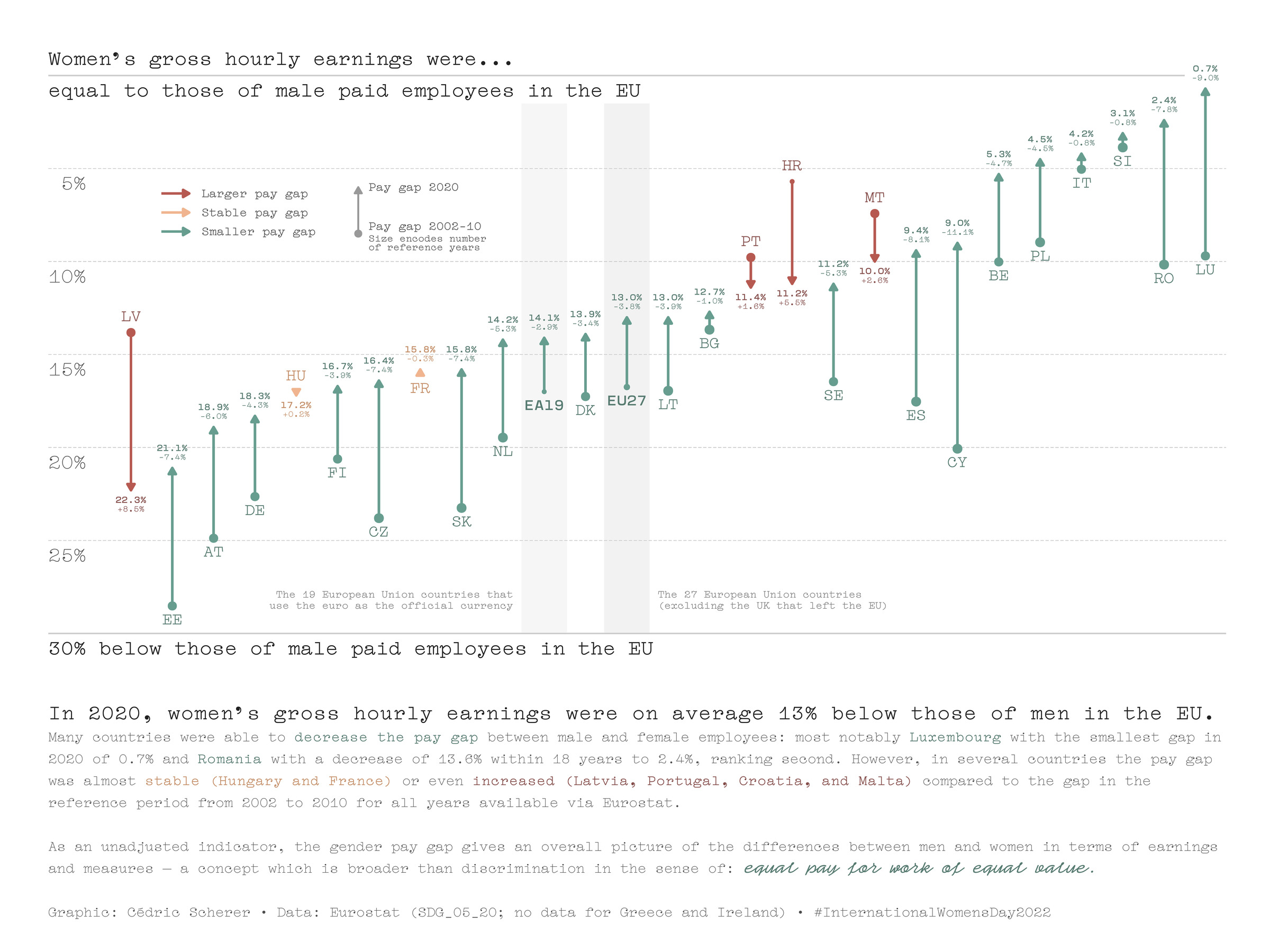
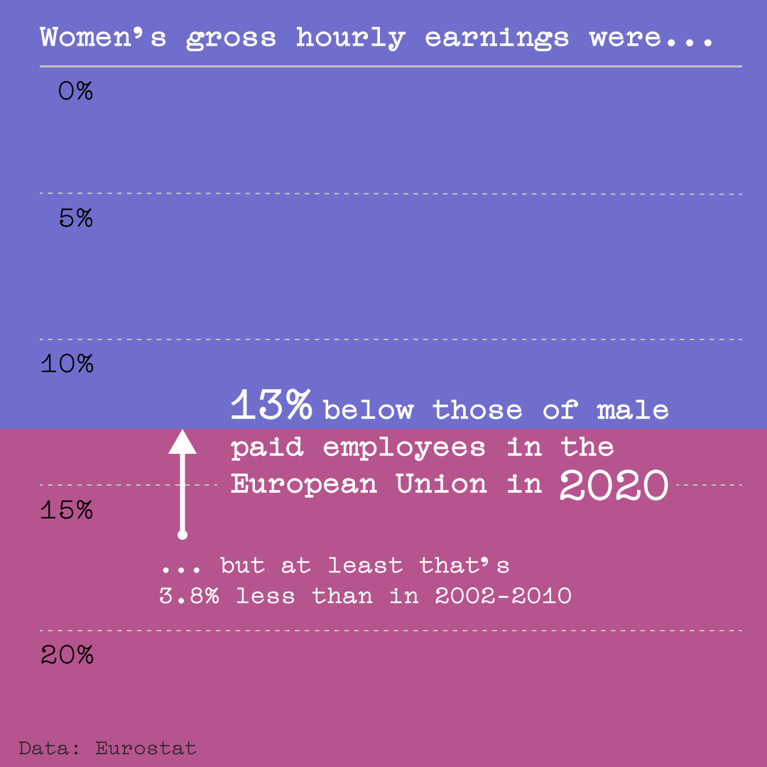
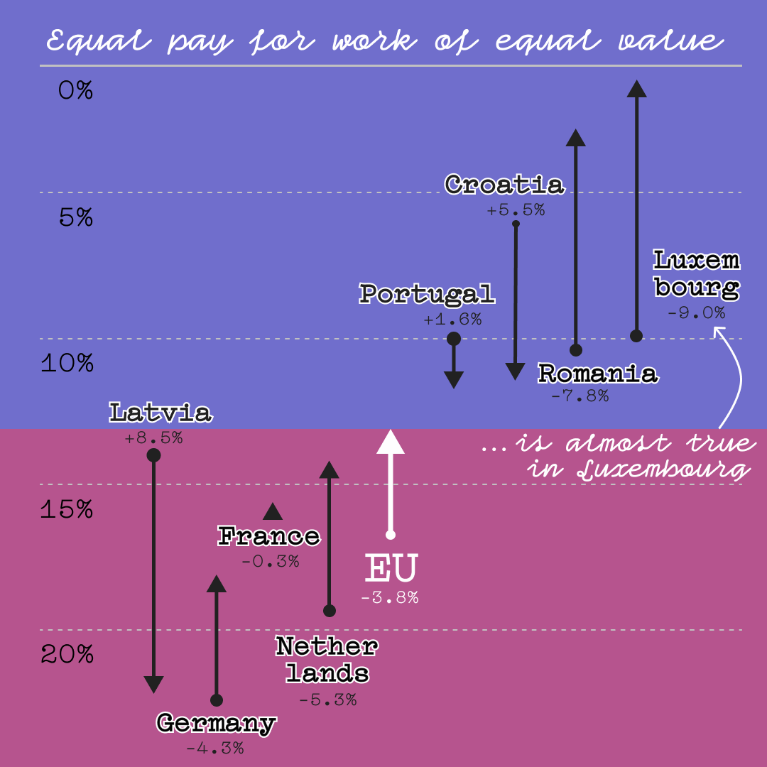
In 2020, women’s gross hourly earnings were on average 13.0 percentage point (pp) below those of male paid employees in the European Union. This is still a significant gap, but at least it was decreasing over the last years. Unfortunately, this is not the case for all countries in the EU: Latvia, Portugal, Croatia, and Malta have decreasing trends compared to the average pay gap from 2002–2010. Disappointingly, only five out of the 28 EU countries Eurostat provides data for have a pay gap that is smaller than 5 pp (Luxembourg, Romania, Slovenia, Italia, and Poland) with Luxembourg being closest to zero (0.7 pp).
Eurostat provides the metric for all EU countries except Iceland and Greece between 2002 and 2020 (but number of years included differ per country). It also provides gropuped metrics for all EU countries and for the 19 countries of the Euro area. The indicator includes all employees working in firms with ten or more employees, without restrictions for age and hours worked. Samples contain about 12 million employees EU-wide and the gross hourly earnings are estimated with high precision at total economy level (sampling error below 1%).
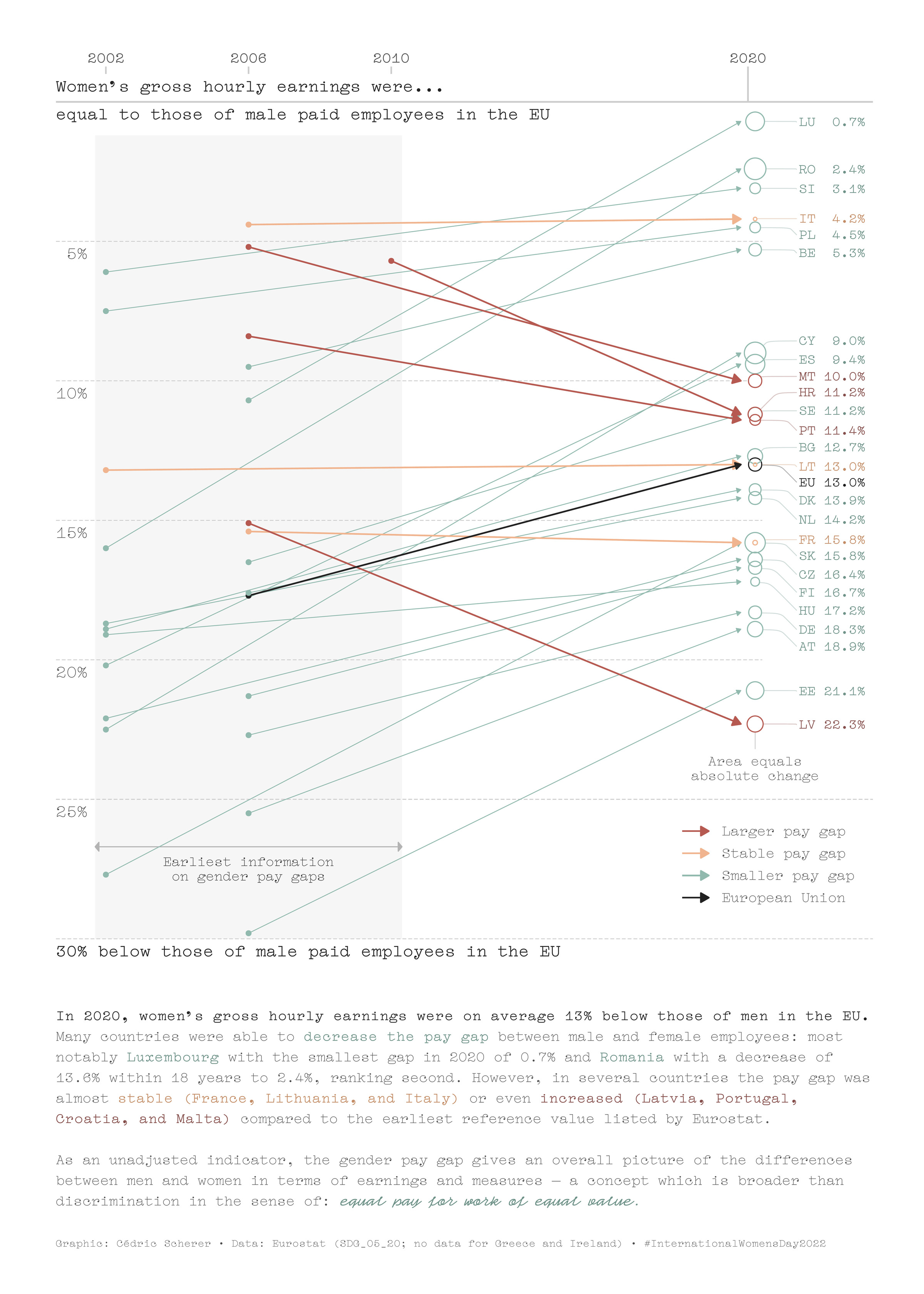
My aim was to make a comparison instead of showing the 2020 metric alone. From the beginning, it was clear to me that a typical time series would not work due to irregular data entries and too many countries. The initial idea was to create a slope chart (see alternative versions below). However, I quickly realized that it is difficult to pick one particular year for comparison as multiple countries were always missing. So I thought of an unusual slope chart in which the starting points on the left are not aligned vertically but placed according to the first year data is provided. Actually, it is a hybrid of a slope chart and a time series as it only compares two values, connected by a line, with a continuous date axis.
As the slope chart was very difficult to read due to the many overlapping lines (an interactive version may be better), I decided to create a dumbbell chart with the drawback that I had to aggregate the data as showing all the data points made the graphic too overloaded. I decided to choose a reference period by averaging the values provided between 2002 and 2010 and to encode the sample size in the dot size.
For the first time, I also created a colorful, eye-catching version with larger fonts and less detail to share it on my Instagram:
Project Type
- Personal Project
Motivation
- International Women’s Day 2022
- EuroStat shared data set on gender pay gaps in the EU on Twitter
Design Choices
- A dumbbell chart to allow for direct comparison per country and across countries.
- Ranking of countries by the pay gap in 2020 (original version; ranking by pay gap during the reference period as alternative version).
- A colorblind-safe traffic-light colors for the three different trends: larger (red), stable (orange), and smaller (green) pay gap in 2020.
- Chart title serves as axis title as well.
- A detailed legend explaining the trend colors and dumbbell.
- Annotations to explicitly state the percentages and in addition the change plus explaining what the the abbreviations EU27 and EA19 represent.
- Highlighting EU27 and EA19 as aggregated metrics by adding a grey box to them and using a different font with a higher weight of the same typeface (actually, it I use only one typeface in the chart!).
- To focus on the women, I wanted to show how much less the earning is compared to men. This becomes a bit tricky as the percentage is actually positive but shows a gap (it is "+13 percentage points below"). In the end, I decided to flip the axis as it feels much more intuitive to me. By adding big axis text I guide the reader how to interpret the y axis.
- Unfortunately, I had to use the country abbreviations due to space issues. Long labels made the chart way too busy.
Data Source
- EuroStat data set SDG_05_20 “Gender pay gap in unadjusted form”
Tools
- Data Preparation:
{dplyr},{stringr}, and{janitor} - Graphics:
{ggplot2};{ggtext}for advanced text styling;{colorspace}for color manipulation;{ggrepel}for label positions in alternative slope chart - Colors: Picked with palettte.app and colorblind–tested with Viz Palette
- Code available for both the dumbbell and slope graph
Methods
- For each country and the two aggregated groups, I summarized all years available in the period between 2002 and 2010 (as this was the period that covered all countries) as average. I also kept track of the sample size per group. Afterwards, I calculated the difference from the averaged reference value to the value in 2020.
- Plotting was done completely in R (for a list of packages see “Tools”).
Alternative Versions
Slope Chart x Time Series Hybrid
Dumbbell Chart sorted by Pay Gap 2002–2010
Dumbbell Chart for All Countries Listed