Header image by Richard Strozynski
Uff, what a year! 366 days ago, most people did not expect 2020 to be that exhausting, emotionally and physically (and let’s hope for a better 2021—happy new year to you!). COVID19 was literally everywhere, whether in the media or affecting your personal life, and made it hard to focus and keep social contacts. Plus all the other things that were happening: starting off with the bushfires in Australia, the massive series of police brutality protests after the shocking death of George Floyd, tiring and everlasting Brexit negotiations, Trump’s madness reaching new levels, and all the news and uncertainty around COVID19 mutations circulating at the end of 2020.
Consequently, many people let the year end with a more or less cheerful
“F*CK 2020!”
But that would be too easy and also ignorant. Even though it was a crazy and exhausting year, there were also some good and exiting things happening (I hope for you as well!). So I take a short break on New Year’s Day and look back at some of the positive moments of 2020 by focusing on my personal data visualization journey.
- Freelance Work: I started working as a freelancing data visualization designer and workshop instructor and was creating visualizations for several clients and gave three workshops.
- Challenge Contributions: I managed to contribute to 41 data visualization challenges, won the CorrelAid X Challenge with the Local Chapter Berlin and received an Honorable Mention in the RStudio Table Contest.
- Personal Projects: I started (and abandoned) a range of personal projects of which the
{ggplot2}tutorial, my COVID19 visualization series, and my first appearance on YouTube were the highlights this year.
Freelance Work
Data Visualization Design (and Data Science)
Begin of 2020, a time most people haven’t heard of COVID19 yet, I started to work as a freelancing data visualization designer. And sooner as expected, I had the chance to work in the data analysis and visualization business.
Back in October 2019, FrontPage Data I applied for a Data Scientist role to support with data analysis and visualization and they picked me to create data-centric content for a variety of clients. Ultimately, this meant that my 3-month “sabbatical” at the begin of the year was canceled—but it also made it possible to focus mainly on my first freelancing projects. Perfect! (However, this also means that d3 is still on my list of tools I want to learn since I didn’t find time for it yet.) All analyses were done in R, sometimes in combination with SQL, and all visualizations with the help of {ggplot2} plus some with {plotly}.
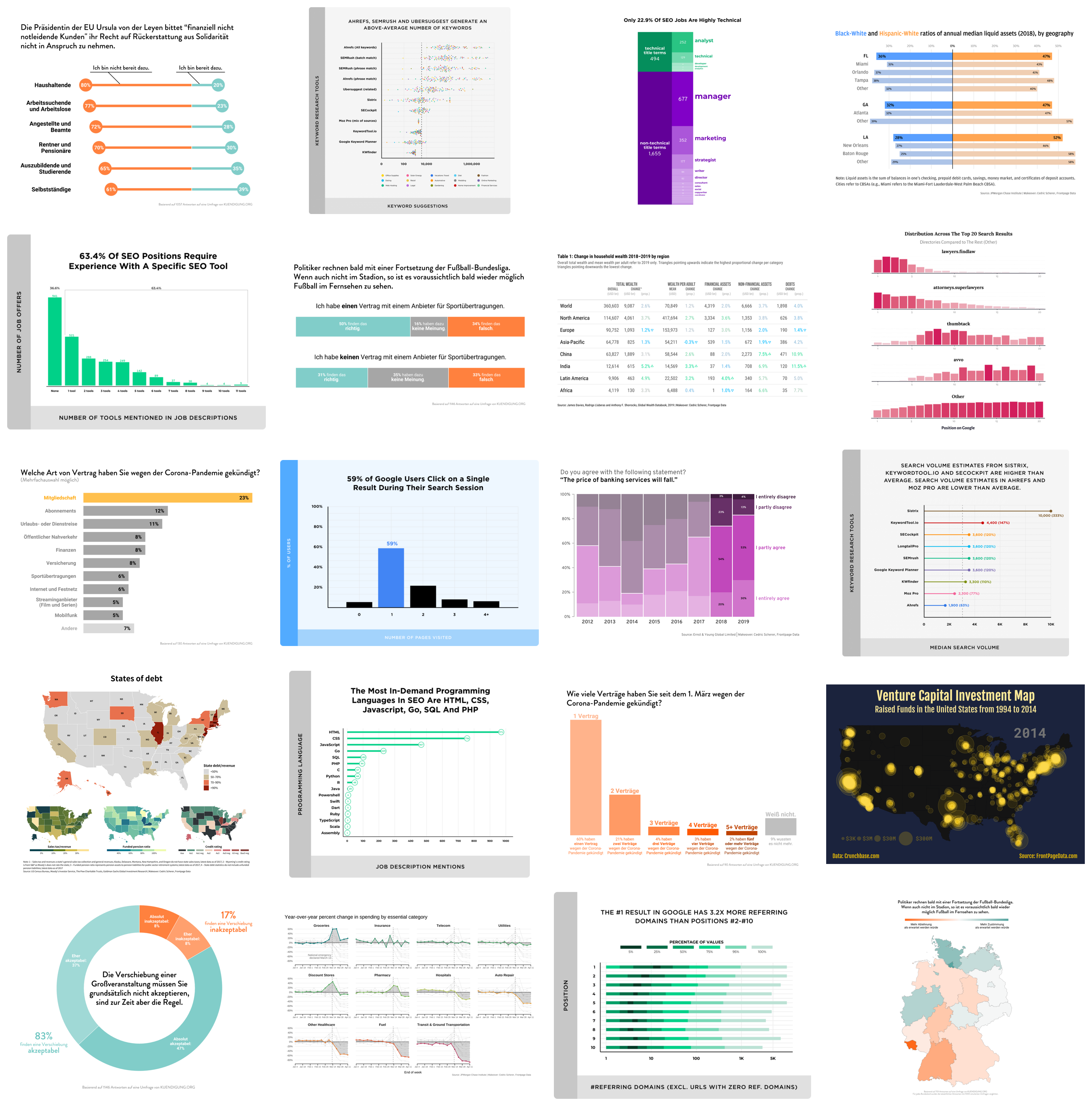
Some of the data visualizations I created for FrontPage Data in 2020.
Ownership of the visualizations by FrontPage Data, Backlinko, rankings.io, and kuendigung.org.
The full list of all published projects I created visualizations for:
- How Data From Popular Keyword Research Tools Compare by Backlinko
- We Analyzed 11.8 Million Google Search Results: Here’s What We Learned About SEO by Backlinko
- SEO Data Science: A Study of 112K Personal Injury Law Firms by rankings.io
- The 2020 SEO Jobs Report by Backlinko
- Consumer survey on contracts during the COVID19 crisis (German)
- How People Use Google Search (New User Behavior Study) by Backlinko
- How Better Aesthetics can Help to Transport your Stories by FrontPage Data
- We Analyzed 306M Keywords—Here’s What We Learned About Google Searches by Backlinko
- Google My Business Ranking Study of Injury Attorneys in 426 U.S. Cities by rankings.io
I also have some other running and upcoming client projects, hopefully I am able to share more with you next year!
Workshop Coaching
In 2020, I also gave my first data visualization and {ggplot2} workshops, two of them for Physalia Courses and the other for the NC3 Collaborative Research Centre.
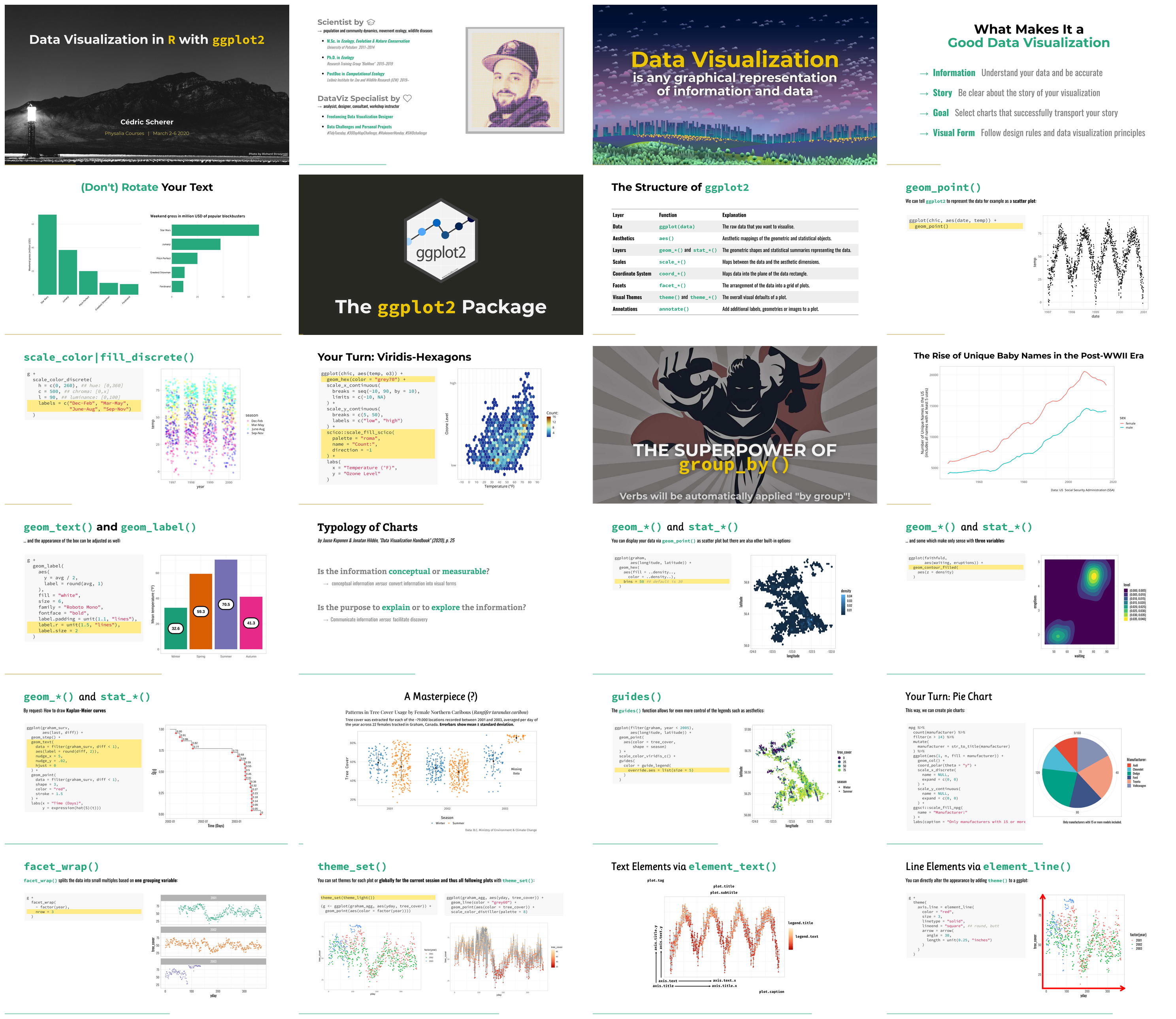
Some slides of the data visualization ✕ ggplot2 workshops I gave in 2020.
The first Physalia workshop happened in March—still in person while the university was discussing how to proceed given the rising numbers of COVID19 infections in the south of Germany—and was a five-day workshop called “Data Visualization in R with {ggplot2}”. I used the same data as in the “A Tutorial for Beautiful Plotting in R”, namely four years of environmental variables in Chicago from the National Morbidity and Mortality Air Pollution Study (NMMAPS). It was a great experience and we did run the same workshop with updated materials roughly half a year later—remotely since COVID19 now had become a pandemic and the second wave was hitting Germany. While I like teaching in direct contact (and also to walk around a lot), the new virtual setup made it possible for people all over the world to join. (Btw, even for the first in-person workshop two participants were coming from the US.) The workshop for NC3 was a compressed 2-day version using Caribou movement data from Movebank which was a #TidyTuesday challenge in 2020.
Challenge Contributions
While I missed to fulfil my resolution of contributing to all 52 #TidyTuesday challenges in 2020 (yeah, life gets complicated during a pandemic) I collected a bunch of personal visualizations and contributions to several challenges this year.
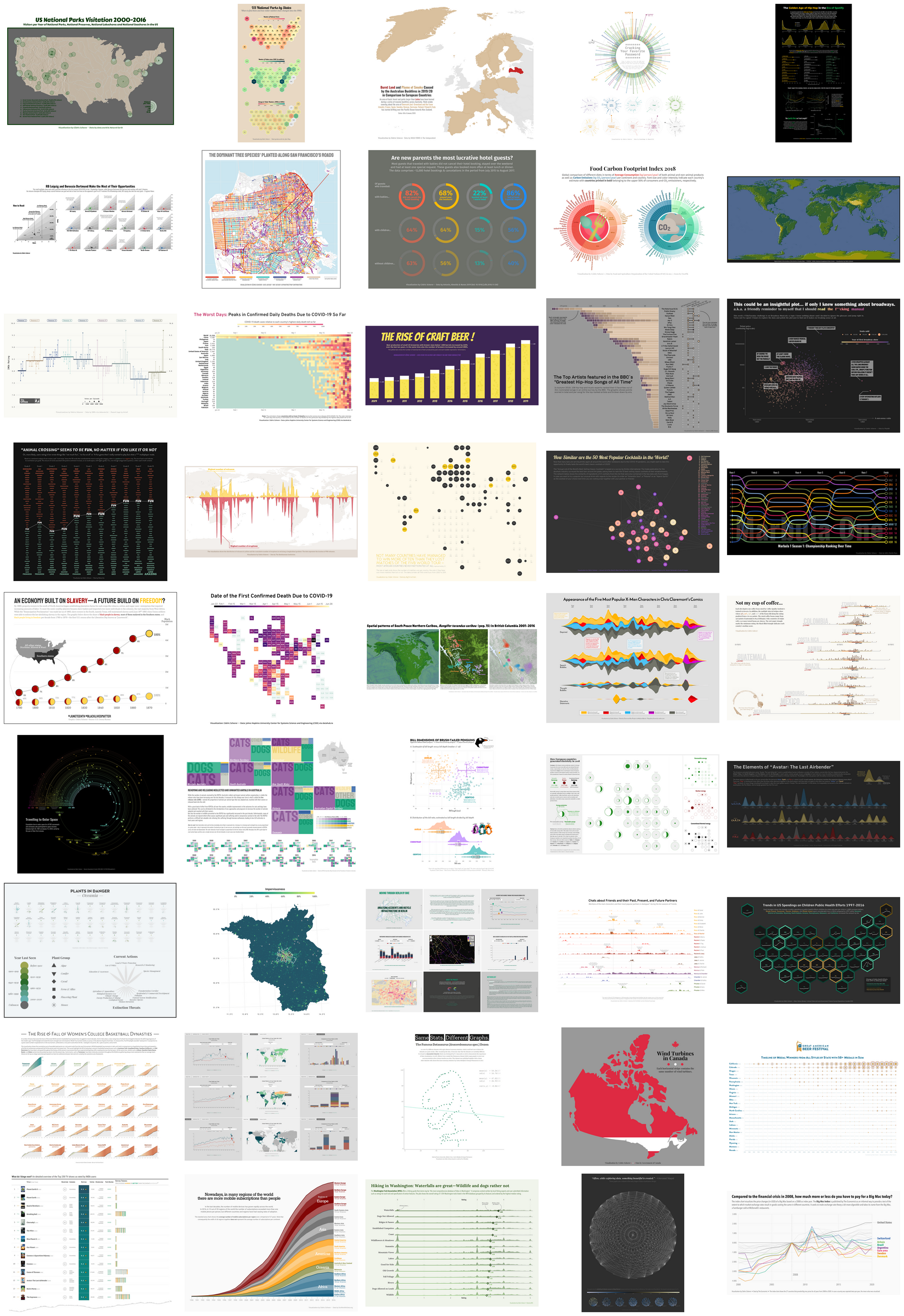
A collection of all main plots of my personal projects and challenge contributions in 2020.
TidyTuesday Challenge
Of course, still high on the priority list—#TidyTuesday. In the end, I managed to finish 39 out of 52 (plus two old ones I did in 2020)!
My Top 5 #TidyTuesday contributions in 2020 (measured in likes on Twitter) are:
- “Not My Cup of Coffee”
- “Bill-Dimensions of Brush-Tailed Penguins”
- “Travelling to Outer Space”
- “The Golden Age of Hip Hop in the Era of Spotify”
- “Appearance of the Five Most Popular X-Men Characters”
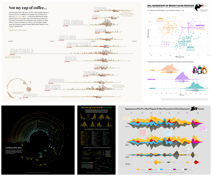
Some contributions received more attention—here are a few highlights:
- “Not My Cup of Coffee” was highlighted by Andy Kirk in his “Best of Visualization Web… September 2020” collection and was featured on the “BeanPoet” blog including an interview.
- “The Golden Age of Hip Hop in the Era of Spotify” got 15k karma points and 14 awards on Reddit.
- The waterfall/lollipop plot combination showing IMDb ratings of “The Office” got resembled many times (e.g. by Andrew Mott, Jared Braggins, Isabella Benabaye, Jack Davison, Surbhi Bhatia, Pedro Toledo, and Kaustav Sen).
The Reddit post (left), the feature on BeanPoet (middle), and my IMDb rating plot (top right) and some of the replicates (bottom right).
SWD Challenge
Unfortunately, there was not much spare time left to participate in the “Storytelling with Data” challenge. I only managed to contribute two times before the pandemic changed priorities and the motivation, creativity and time to dive into challenges and personal projects.
My contribution showing shot-goal ratios of all Bundesliga teams for the challenge in January with the topic "small mutliples".
My contribution showing reported deaths due to COVID19 for the challenge in March wit the topic "Get animated!".
Also, the second contribution kept me busy on a daily basis from March to July and turned into the “Worst Day of the Coronavirus Pandemic” visualization series which I kept up-to-date until end of June (see below).
CorrelAid X Challenge
I was part of CorrelAid, a non-profit network of data science enthusiasts, from 2019 on but got involved for the first time in Summer 2020 when participating in the Berlin group of the CorrelAid X challenge. Initially planned as a Python exercise, we quickly moved to R and Shiny since no one of us was experienced in Python. We built this interactive slideshow with Shiny, fullpage, echarts and tmap investigating reported bike accidents in Berlin and Germany. We focused on the interplay of available cyclist infrastructure and bike accidents in 2019 but still want to include a risk map that allows to compare accidents proportional to bike lane type and not simply in absolute numbers.
The landing page of our Shiny app and the title slide of my workshop at the CorrelCon 2020.
We won the challenge 🎉 and were invited to present our app and potential future steps to a broader audience at the CorrelCon, at which I also gave a short workshop on “Building a modularized Shiny app with {golem} and html widgets” in the “Data Visualization” session.
RStudio Table Contest
First I was not very hyped about the new trend of tables but the amazing examples by FiveThirtyEight and the blog posts on {gt} by Thomas Mock changed my mind—so I decided to participate as well. I modified a Python script to scrape the rating data for all episodes of the Top 250 TV Shows as rated by IMDb users. With the {gt} package, I created a looong table that focused on displaying the details I and my friends care the most about: of course the ranking and overall rating but additionally the runtime per episode, genres, number of seasons and episodes, ID of the best episodes. But most importantly—the trend of ratings as the TV show progresses, visualized in a similar way as the famous “warming stripes” by Ed Hawkins.
My contribution to the RStudio Table Contest 2020, here showing all animation series in the Top 250.
At the end participants contributed more then 80 tables of which many were great examples of R’s versatility when it comes to tables. First of all, congrats to Niels van der Velden who has won the challenge with his table tutorial! My static IMDb table(s) made it into the “Honourable Mentions” along with my #TidyTuesday companions Georgios Karamanis, Kyle Cuilla and Bill Schmid.
Personal Projects
Over the year, I collected a range of project ideas. Most of them are still in the drafting phase (and some of them likely get abandoned) but I managed to finish at least some of them.
COVID19 Visualizations
The #SWDchallenge contribution led into a series of animations and plots with showing the progress of the COVID19 spread on a country level. I hesitated for a while to create any Corona-related visualizations (read more here) but felt confident enough with the knowledge and data at the end of March. Unfortunately, I had to stop the updates for some reasons: the chart type became unsuitable for the long period and the data cleaning became labor-intense given the many revisions of the actual numbers.
The last versions of my COVID19-related visualizations from June 28 2020. Heatmaps with various rankings (top row) plus grid maps and traditional trajectories (bottom row).
ggplot2 Tutorial
From August on, I started reworking the complete “A ggplot2 Tutorial for Beautiful Plotting in R” which I uploaded on December 2. The new version does not only include reworked texts with more extensive descriptions of the principals and technical details but also a ton of new examples and topics. It received a lot of attention on Twitter and the blog post attracted more than 10,000 page visits! Among many feedback, Alberto Cairo and Jon Schwabisch shared the tutorial and Jon decided to use the turoial for his R Learning Sprint. I joined for an hour and showed some motivating examples as a kick-off. Thanks again Jon for that opportunity!
Some exemplary plots included in the ggplot2 tutorial.
Invited Talk at bespokeDS x Heureka Labs
In September, Matthew Hirschey—who is currently building the Heureka Labs community—invited me to give a talk about data visualization principles and some hands-on coding with {ggplot2}. More than 250 people tuned in and you can watch the recording on YouTube (btw my first YouTube ever) and check the slides and codes here.
Final Thoughts
Puh, that was a lot but nice if you made it to the end—thank you! I did not intend to make it that long but the more I was looking back, the more positive highlights I found. I still have some on-going and planned client work, personal projects, workshops, conference talks, and a ton of unfinished blog posts so stay tuned for an exciting 2021 that hopefully allows us to focus more on the joy of life and to meet our dear family and friends. Stay safe and stay healthy!