In consequence, I decided to visualize the top 250 TV shows according to IMDb users as a more helpful table then the original one on IMDb as my contribution to the ongoing RStudio table contest:
Tables are a fantastic way to communicate lists of quantitative and qualitative information. Sometimes, tables can fall very short of their potential for greatness. But that was the past: we now have some excellent R packages at our disposal to generate well-designed and functional presentation tables. And because of this renaissance of table-making in R, we’re announcing a contest: The 2020 RStudio Table Contest!
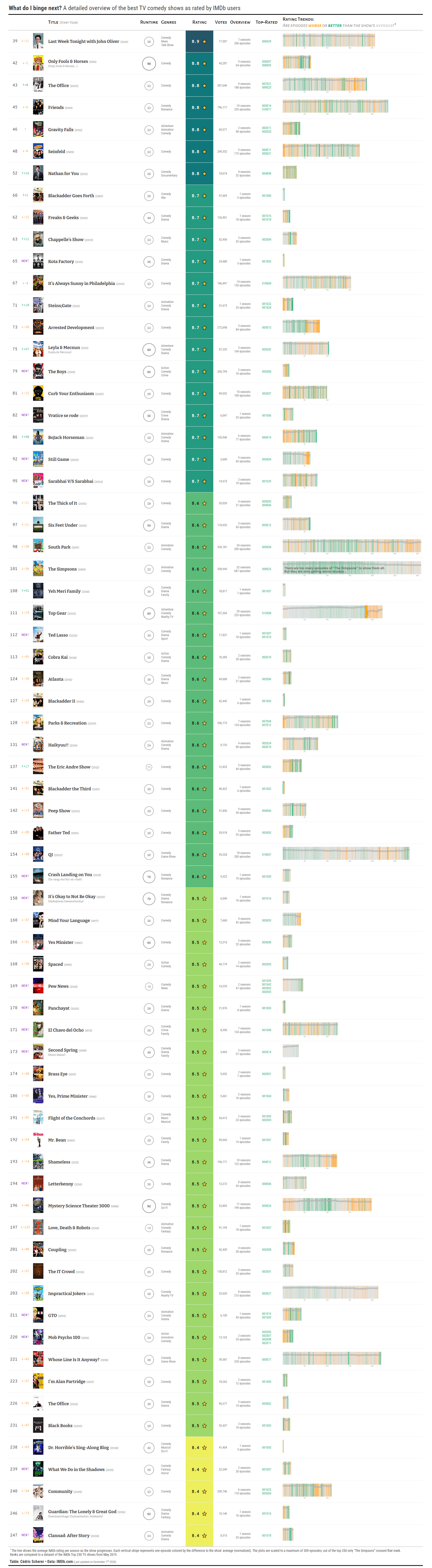
What’s shown?
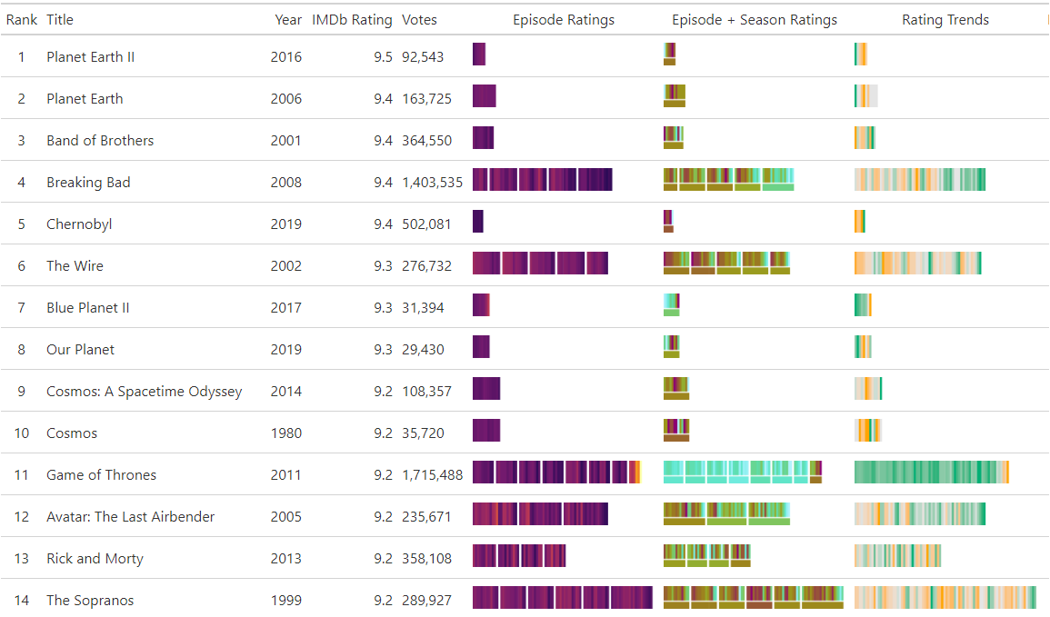
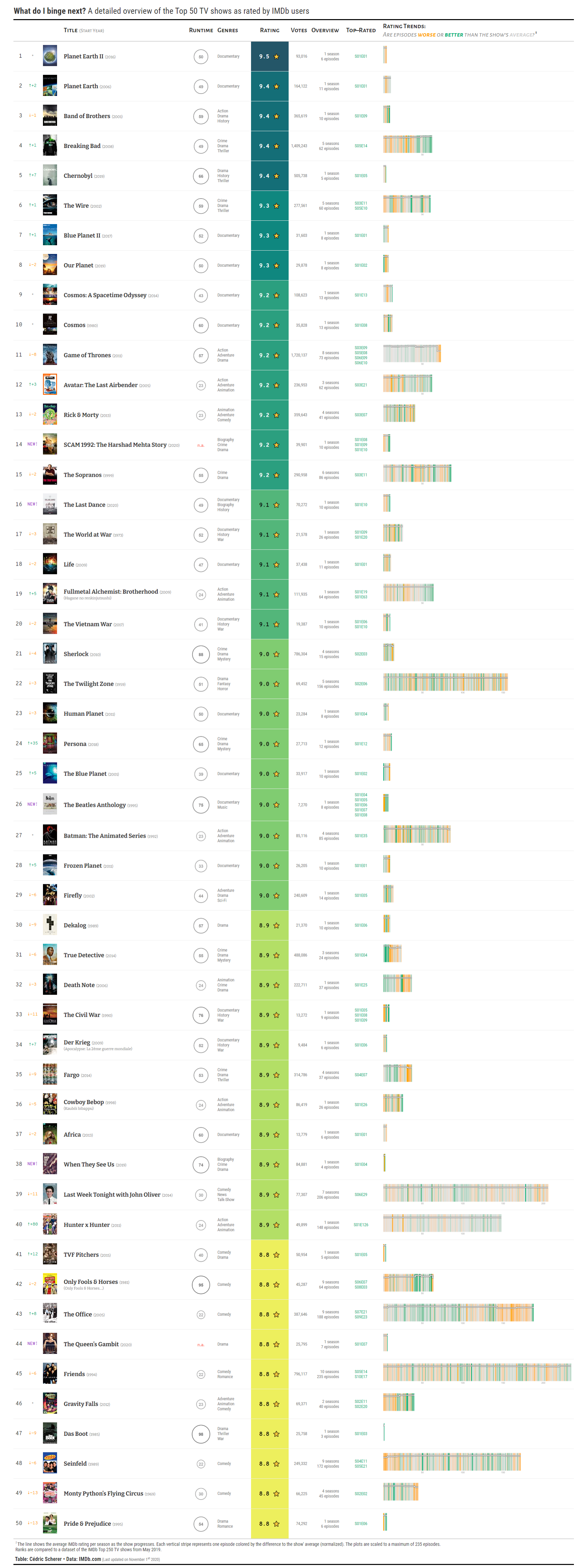
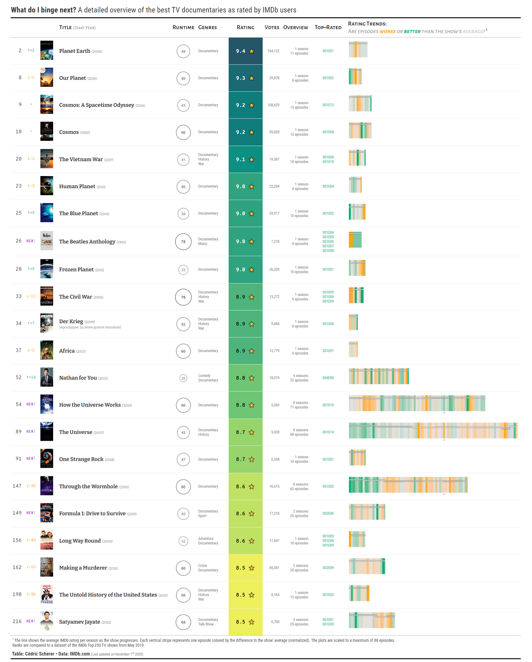
The table shows relevant details of the top 250 TV shows as rated by IMDb users. I focused on displaying the details I and my friends care about: of course the ranking and overall rating but additionally the runtime per episode, genres, number of seasons and episodes, ID of the best episodes. But most importantly—the trend of ratings as the TV show progresses.
To visualize the runtime I decided to use a restrained, grey-toned, area-scaled circle. The normalized trends in episode ratings are visualized as stripes similar to the famous “warming stripes” by Ed Hawkins:
In addition, a line indicates the average rating per season on a range from 1 to 10:
How does this help? Here are two more examples showing the dramatic (and completely deserved) fall of ratings for the last season of “Game of Thrones” as well as the brilliant “Bojack Horseman” that got better and better over time:
While the line shows the absolute decrease or increase in rating across seasons, the colored stripes gives an idea how each episode performed relative to the series’ average. Also, from the color intensity one can see that the worst episodes were far more off from the average rating than the best episodes in “Game of Thrones”, while there was not that much variation across episodes in “Bojack Horseman”.
The idea is built upon a personal project that I started in March 2020 after visualizing IMDb ratings of “The Office” as contribution to #TidyTuesday but I never had the drive to finish. Here is a visualization from back then that served as inspiration:
![]()
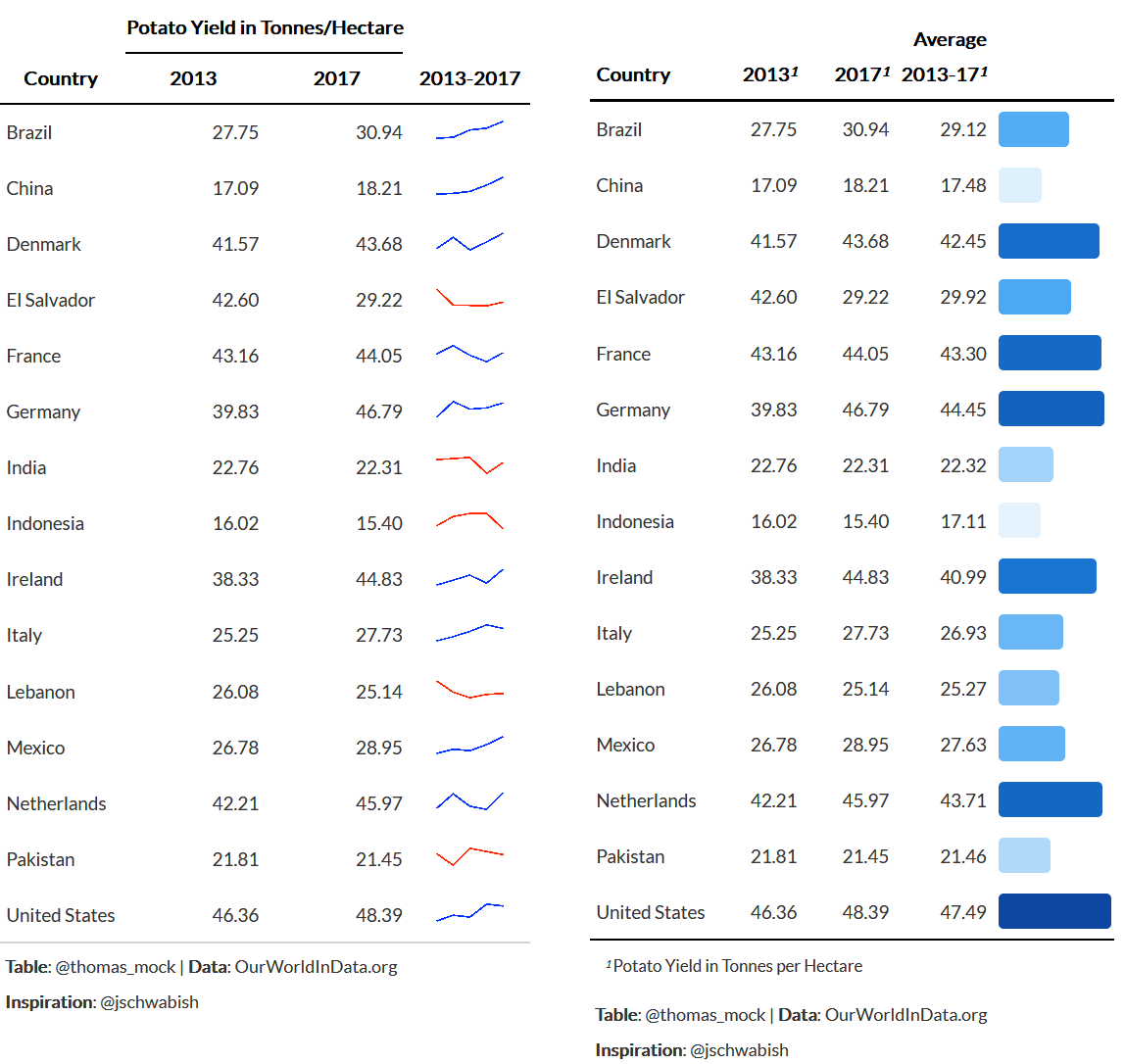
During the development of the table, I tried different versions showing either rating trends scaled across or per show, absolute versus relative changes and a version where each season and its average rating is indicated below the episode ratings:
Data Source and Preparation
The data is a mixture of scraped data using a modified Python script (ranks, ratings, votes, year of release) and data downloaded from the IMDb dataset interface (title basics: original title, genre, runtime). The data was cleaned (e.g. correct wrong runtimes, title spellings etc.) and missing entries filled. (However, some series are returned as having 1 season only but have several actually and I didn’t find a good workaround yet.)
R Packages Used
I used the {gt} package which allows to generate static tables in R. It also allows adding visualizations created with {ggplot2} as in-line plots such as simple sparkline or bar charts as demonstrated in Thomas Mock’s great {gt} tutorial that helped me along the way:
In addition, I used several {tidyverse} packages ({dplyr}, {tidyr}, {readr}, {magrittr}) for data preparation as well as {reticulate} o run the Python scrapping script, {here} for easy handling of paths, {glue} for string pasting and {pkgconfig} to deal with header names. The code to generate the table is available on GitHub.
Varieties
Since the Top 250 TV Shows table is quite long (by definition), I also created versions for the Top 100 and Top 50, respectively. I also found it interesting to look at particular genres in isolation and provide exemplary versions for the genres Documentary, Animation, Comedy, Drama, and Action.
Here are is the full top 100 as well as all comedy series contained in the top 250:
All tables and the source codes are available on GitHub.