Table of Content
- Introduction
- Aim of this Tutorial 🏁
- Box plots: The Reviewer’s Dream
- We Can Do Better: Add Raw Data
- Violin Plots: The Reviewer’s Nightmare?
- Raincloud Plots: A Great Alternative
- Let Your Plot Shine
Introduction
A few weeks ago, I came across this tweet:
Quickly, people settled that (a) violin plots are not novel at all but were introduced 23 years ago and (b) providing an overview of the summary statistics and even the raw data itself might be a good addition. A suitable chart hybrid, consisting of a combination of box plots, violin plots, and jittered points, is called a raincloud plot.
Raincloud plots were presented in 2019 as an approach to overcome issues of hiding the true data distribution when plotting bars with errorbars—also known as dynamite plots or barbarplots—or box plots. Instead, raincloud plots combine several chart types to visualize the raw data, the distribution of the data as density, and key summary statistics at the same time.
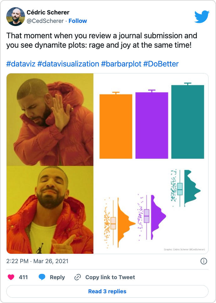
Since I am still working (part–time) as a researcher, I also regularly review scientific articles myself. And in contrast to the reviewer above, I argue completely opposite and always share my concerns in case bar charts or box plots are not suited to convey the study results. Here is a fun meme I made a few months ago when I encountered so–called “dynamite plots” in a paper I was reviewing (plus here is a reworked version with Shrek instead):
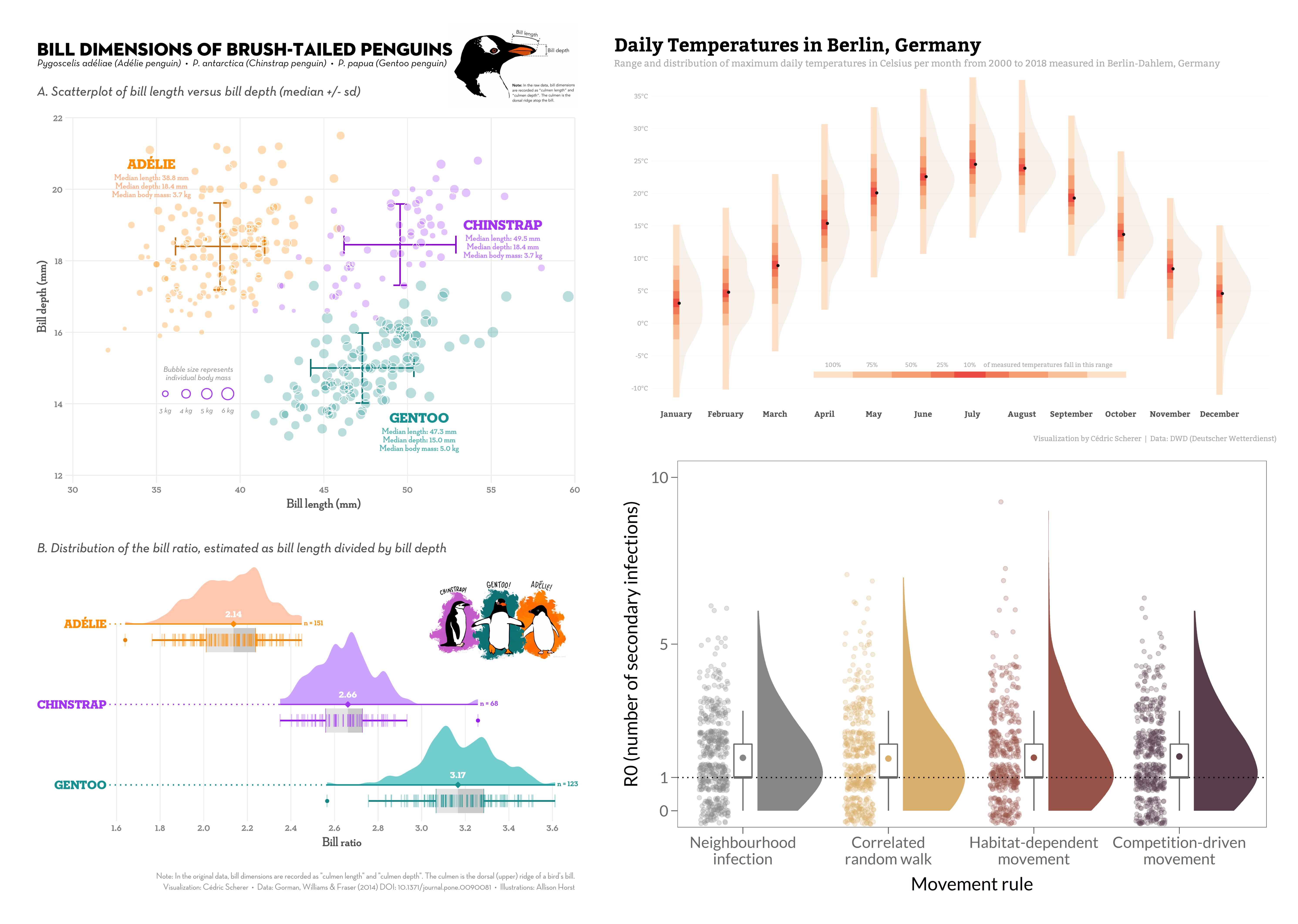
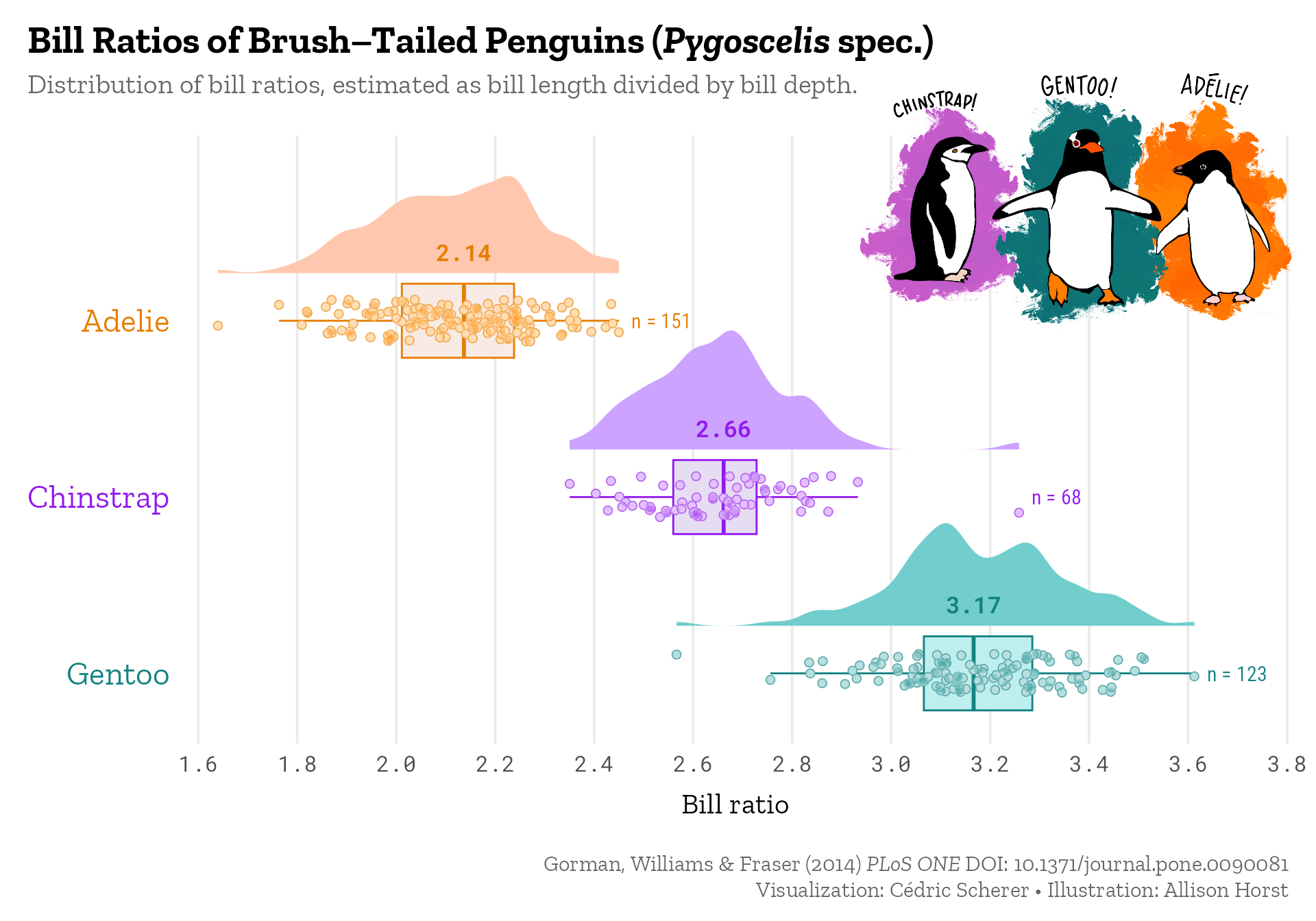
The use of other chart types such as violin and raincloud plots to show the distribution or even the raw data is a topic I am since years pretty passionate about. I always cover the topic in detail during my workshops and sometimes even specific sessions on the topic and I have regularly used raincloud plots for various occasions: during my PhD to show that the model fitting was appropriate across simulations (code), as contribution to the #SWDchallenge to illustrate differences in temperatures in Berlin across months (code), or as contribution to #TidyTuesday to visualize the distribution of bill ratios in brush–tailed penguins (code and code):
The paper itself that introduces raincloud plots comes with a “multi-platform tool for robust data visualization” which consists of a collection of codes and tutorials to draw raincloud plots in R, Python, or Matlab. In January 2021, a revised version was submitted together with a “fully functional R-package” called {raincloudplots}.
However, there may be two drawbacks: First, the package wraps ggplot functionality into one function instead of adding a geom_ and/or stat_ layers (and I definitely prefer to be able to adjust every detail of my plot in traditional ggplot habit). Secondly, the package is (not yet?) on CRAN and needs to be installed from GitHub (which can be problematic in a work context); it is also not available for R version 4 yet. Because of that I also don’t provide examples here, but you might want to check the tutorial of that package.
Here, I show you numerous other ways to create violin and raincloud plots in {ggplot2}. The tutorial is based on a collection of code snippets I shared with the author of the above mentioned tweet.
Aim of this Tutorial 🏁
Visualizing distributions as box-and-whisker plots is common practice, at least for researchers. Even though box plots are great in summarizing the data, an issue is that the underlying data structure is hidden. In this short tutorial I show you why box plots can be problematic, how to improve them, and alternative approaches that can be used to show both, summary statistics as well as the true distribution of the raw data.
I show you how to plot different version of violin-box plot combinations and raincloud plots with the {ggplot2} package. Some use functionality from extension packages (that are hosted on CRAN): two of my favorite packages (1, 2) namely {ggforce} and {ggdist}, plus the packages {gghalves} and [`{ggbeeswarm}.
Expand to see the preparation steps.
## INSTALL PACKAGES ----------------------------------------------
## install CRAN packages if needed
pckgs <- c("ggplot2", "dplyr", "systemfonts", "ggforce",
           "ggdist", "ggbeeswarm", "devtools")
new_pckgs <- pckgs[!(pckgs %in% installed.packages()[,"Package"])]
if(length(new_pckgs)) install.packages(new_pckgs)

## install gghalves from GitHub if needed
if(!require(gghalves)) {
  devtools::install_github('erocoar/gghalves')
}

## LOAD PACKAGES -------------------------------------------------
library(ggplot2) ## plotting
library(systemfonts) ## custom fonts
library(dplyr) ## data handling

## CUSTOM THEME --------------------------------------------------
## overwrite default ggplot2 theme
theme_set(
  theme_minimal(
    ## increase size of all text elements
    base_size = 18,
    ## set custom font family for all text elements
    base_family = "Roboto Condensed")
)

## overwrite other defaults of theme_minimal()
theme_update(
  ## remove major horizontal grid lines
  panel.grid.major.x = element_blank(),
  ## remove all minor grid lines
  panel.grid.minor = element_blank(),
  ## remove axis titles
  axis.title = element_blank(),
  ## larger axis text for x
  axis.text.x = element_text(size = 16),
  ## add some white space around the plot
  plot.margin = margin(rep(8, 4))
)
Box plots: The Reviewer’s Dream
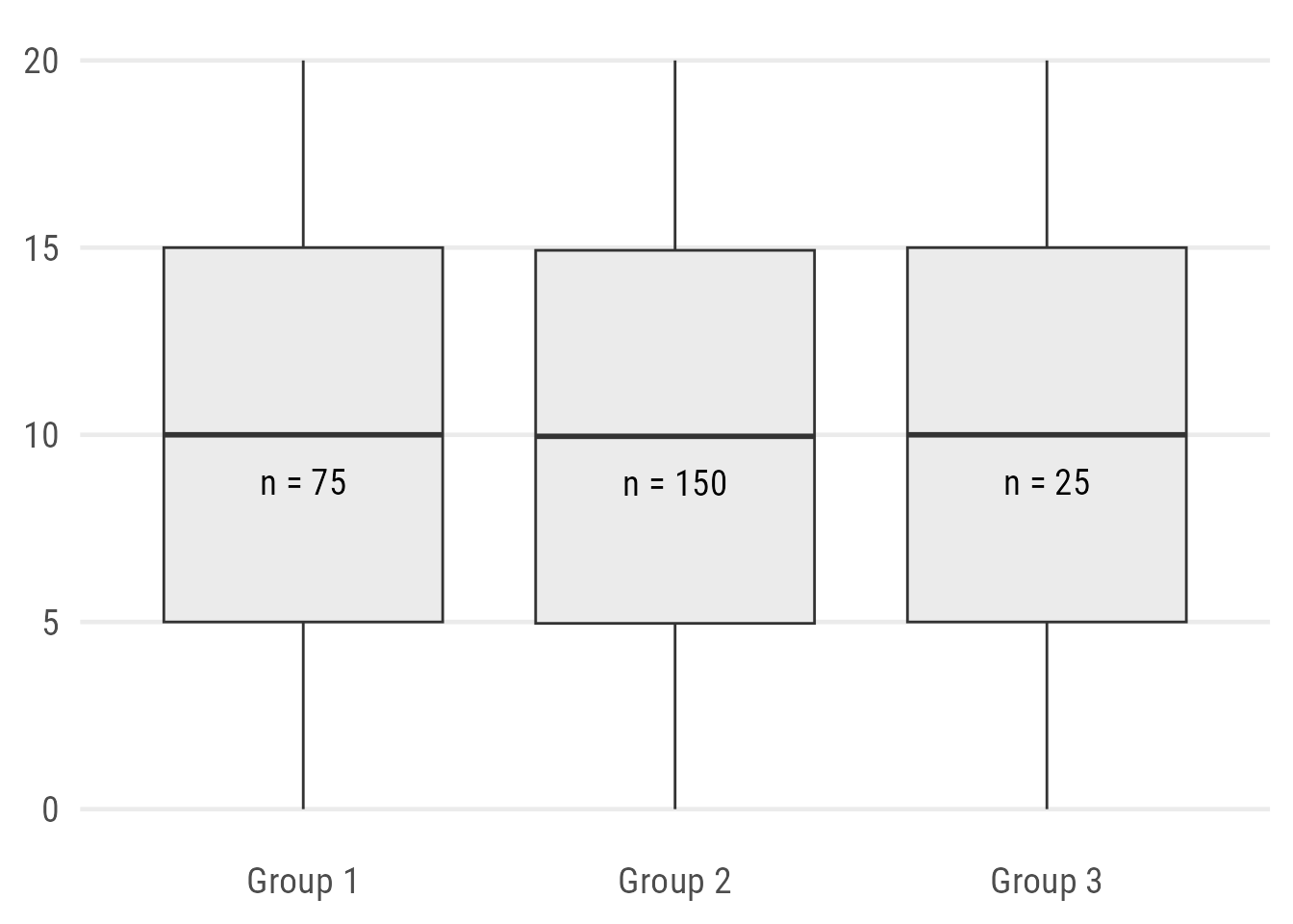
Thanks to my “Evolution of a ggplot” blogpost, I am already known as someone who is not a fan of box plots. And before that impression settles, that’s not correct. Box plots are great! Box plots are an artwork combining many summary statistics into one chart type. But in my opinion they are not always helpful1. They also have a high potential of misleading your audience—and yourself. Why? Let’s plot some box-and-whisker plots:
ggplot(data, aes(x = group, y = value)) +
  geom_boxplot(fill = "grey92")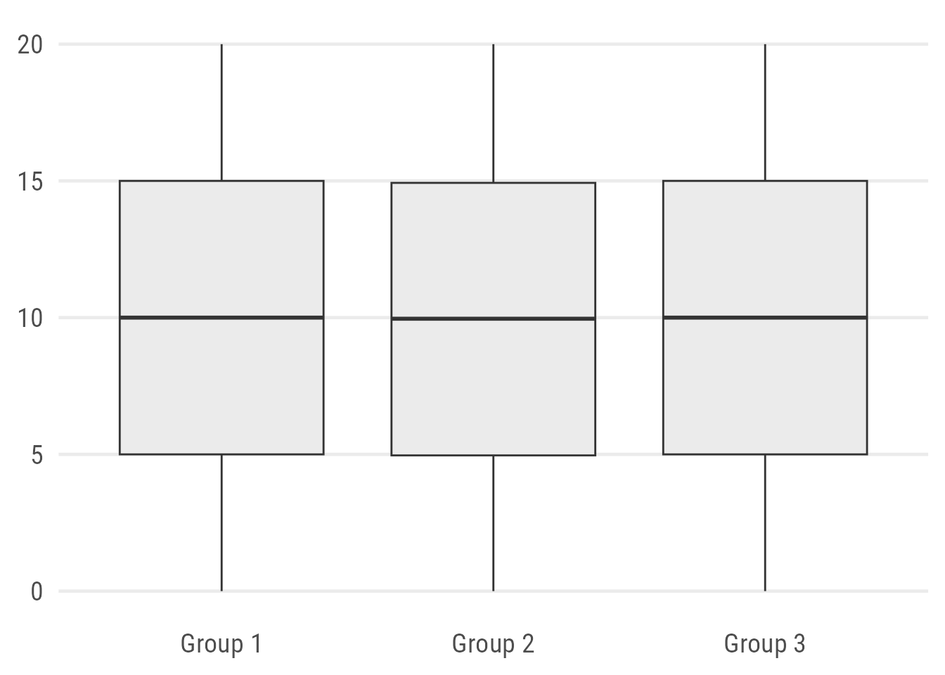
Expand to generate same sample data.
set.seed(2021)

grp1 <- tibble(value = seq(0, 20, length.out = 75),
               group = "Group 1")

grp2 <- tibble(value = c(rep(0, 5), rnorm(20, 2, .2), rnorm(50, 6, 1),
                         rnorm(50, 14.5, 1), rnorm(20, 18, .2), rep(20, 5)),
               group = "Group 2")

grp3 <- tibble(value = rep(seq(0, 20, length.out = 5), 5),
               group = "Group 3")

data <- bind_rows(grp1, grp2, grp3)
So tell me:
How big is the sample size?
Are there underlying patterns in the data?
Difficult to answer.
Sure, adding a note on the sample size might be considered good practice but it still doesn’t tell you much about the actual pattern.
Expand to show code.
## function to return median and labels
n_fun <- function(x){
  return(data.frame(y = median(x) - 1.25,
                    label = paste0("n = ",length(x))))
}

ggplot(data, aes(x = group, y = value)) +
  geom_boxplot(fill = "grey92") +
  ## use summary function to add labels
  stat_summary(
    ## plot text labels...
    geom = "text",
    ## ... using our custom function...
    fun.data = n_fun,
    ## ... with custom typeface and size
    family = "Roboto Condensed",
    size = 5
  )
Alternatively, one can “map” the width of the box to the sample size which indicates difference in the sample size but the exact numbers and distributions are still hidden:
ggplot(data, aes(x = group, y = value)) +
  geom_boxplot(fill = "grey92", varwidth = TRUE)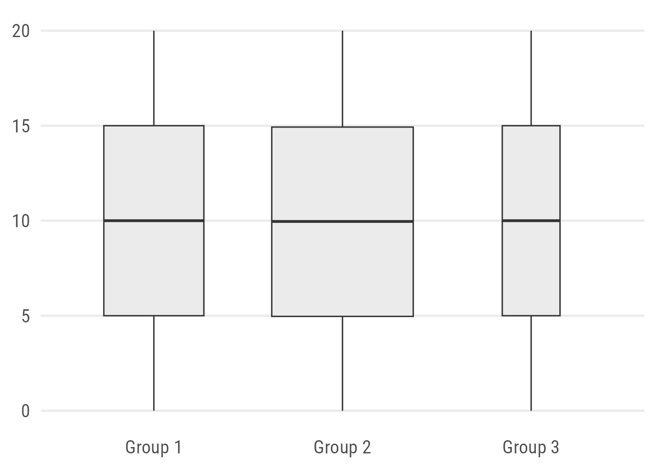
We Can Do Better: Add Raw Data
An obvious improvement is to add the data points. Since we know already that Group 2 consists of 150 observations, let’s use jitter strips instead of a traditional strip plot:
ggplot(data, aes(x = group, y = value)) +
  geom_boxplot(fill = "grey92") +
  ## use either geom_point() or geom_jitter()
  geom_point(
    ## draw bigger points
    size = 2,
    ## add some transparency
    alpha = .3,
    ## add some jittering
    position = position_jitter(
      ## control randomness and range of jitter
      seed = 1, width = .2
    )
  )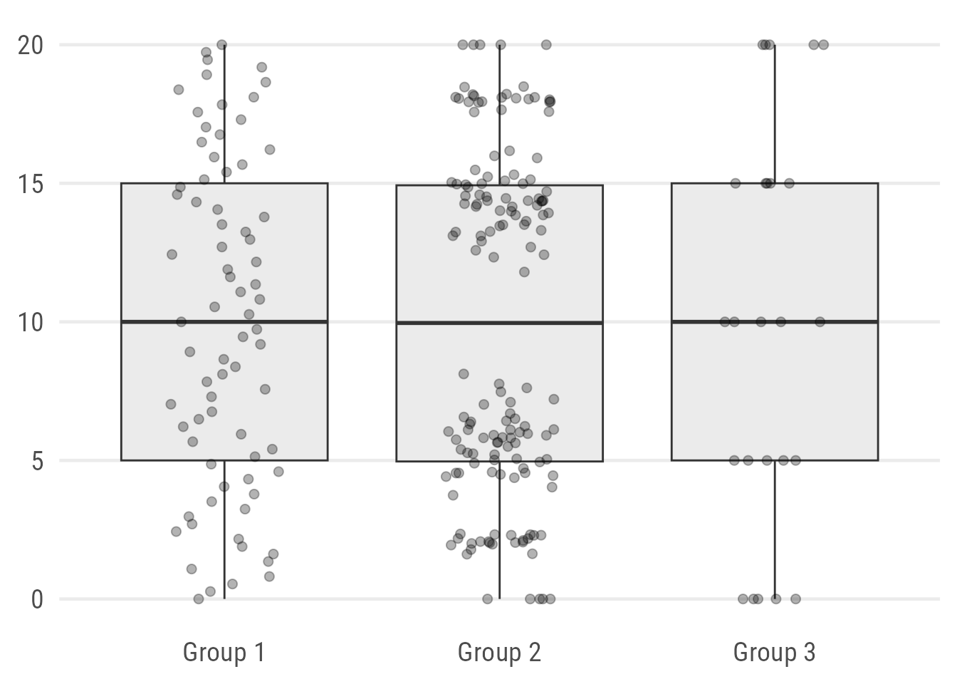
Oh, the patterns are very different! Values of Group 1 are uniformly distributed. The values in Group 2 are clustered with a distinct gap around the group’s median! And the few observations of Group 3 are all integers.
We can improve the look a bit further by plotting the raw data points according to their distribution with either ggbeeswarm::geom_quasirandom() or ggforce::geom_sina():
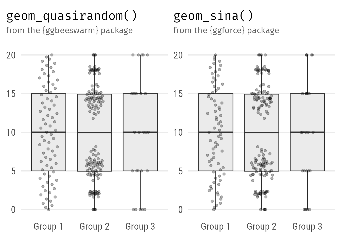
Expand to show codes.
ggplot(data, aes(x = group, y = value)) +
  geom_boxplot(fill = "grey92") +
  ggbeeswarm::geom_quasirandom(
    ## draw bigger points
    size = 1.5,
    ## add some transparency
    alpha = .4,
    ## control range of the beeswarm
    width = .2
  )

ggplot(data, aes(x = group, y = value)) +
  geom_boxplot(fill = "grey92") +
  ggforce::geom_sina(
    ## draw bigger points
    size = 1.5,
    ## add some transparency
    alpha = .4,
    ## control range of the sina plot
    maxwidth = .5
  )
Violin Plots: The Reviewer’s Nightmare?
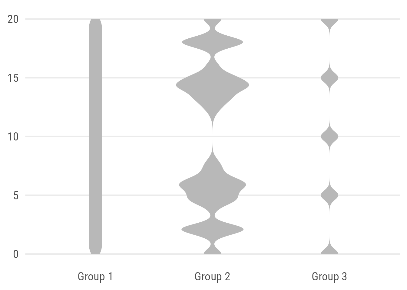
Violin plots can be used to visualize the distribution of numeric variables. It’s basically a mirrored density curve, representing the number of data points along a continuous axis.
ggplot(data, aes(x = group, y = value)) +
  geom_violin(fill = "grey92")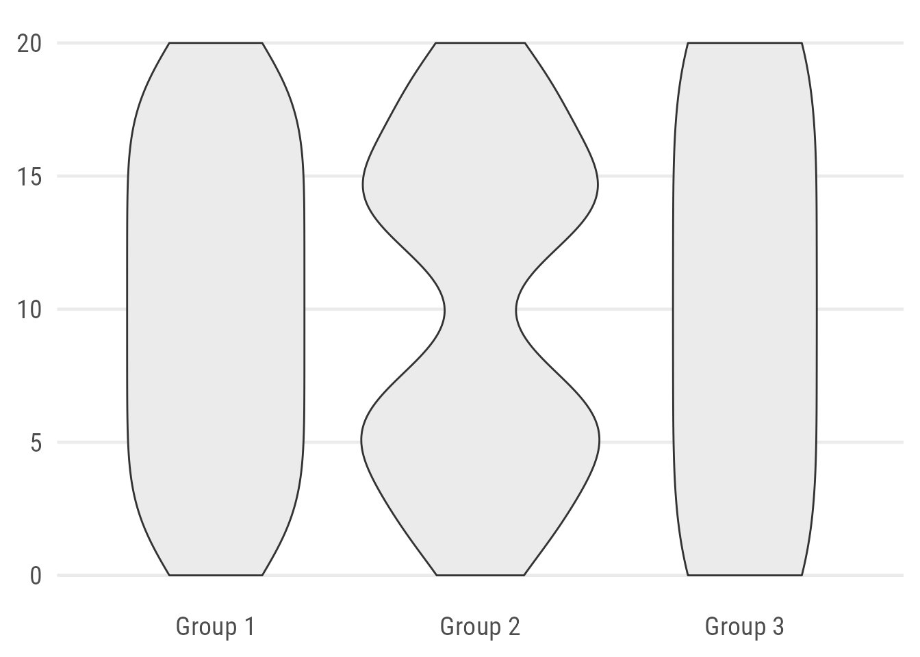
By default, the violin plot can look a bit odd. The default setting (scale = "area") is misleading. Group 1 looks almost the same as Group 3, while consisting of four times as many observations. Also, the default standard deviation of the smoothing kernel is not optimal in our case since it hides the true pattern by smoothing out areas without any data.
We can manipulate both defaults by setting the width to the number of observations via scale = "count" and adjusting the bandwidth (bw). Aesthetically, I prefer to remove the default outline:
Expand to show code.
ggplot(data, aes(x = group, y = value)) +
  geom_violin(
    fill = "grey72",
    ## remove outline
    color = NA,
    ## width of violins mapped to # observations
    scale = "count",
    ## custom bandwidth (smoothing)
    bw = .4
  )
The violin plot allows an explicit representation of the distribution but doesn’t provide summary statistics. To get the best of both worlds, it is often mixed with a box plot—either a complete box plot with whiskers and outliers or only the box indicating the median and interquartile range (IQR):
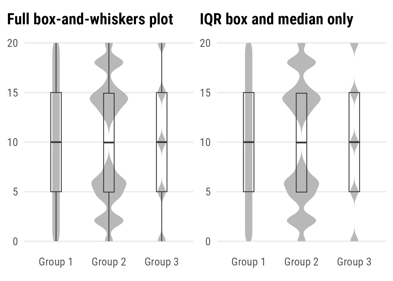
Expand to show codes.
ggplot(data, aes(x = group, y = value)) +
  geom_violin(
    fill = "grey72",
    color = NA,
    scale = "count",
    bw = .5
  ) +
  geom_boxplot(
    ## remove white filling
    fill = NA,
    ## reduce width
    width = .2
  )

ggplot(data, aes(x = group, y = value)) +
  geom_violin(
    fill = "grey72",
    color = NA,
    scale = "count",
    bw = .5
  ) +
  geom_boxplot(
    ## remove white filling
    fill = NA,
    ## reduce width
    width = .2,
    ## remove whiskers
    coef = 0,
    ## remove outliers
    outlier.color = NA ## `outlier.shape = NA` works as well
  )
You might wonder: why should you use violins instead of box plots with superimposed raw observations? Well, in case you have many more observations, all approaches of plotting raw data become difficult. In terms of readability as well as in terms of computation(al time). Violin plots are a good alternative in such a case, and even better in combination with some summary stats. But we also can combine all three…
Raincloud Plots: A Great Alternative
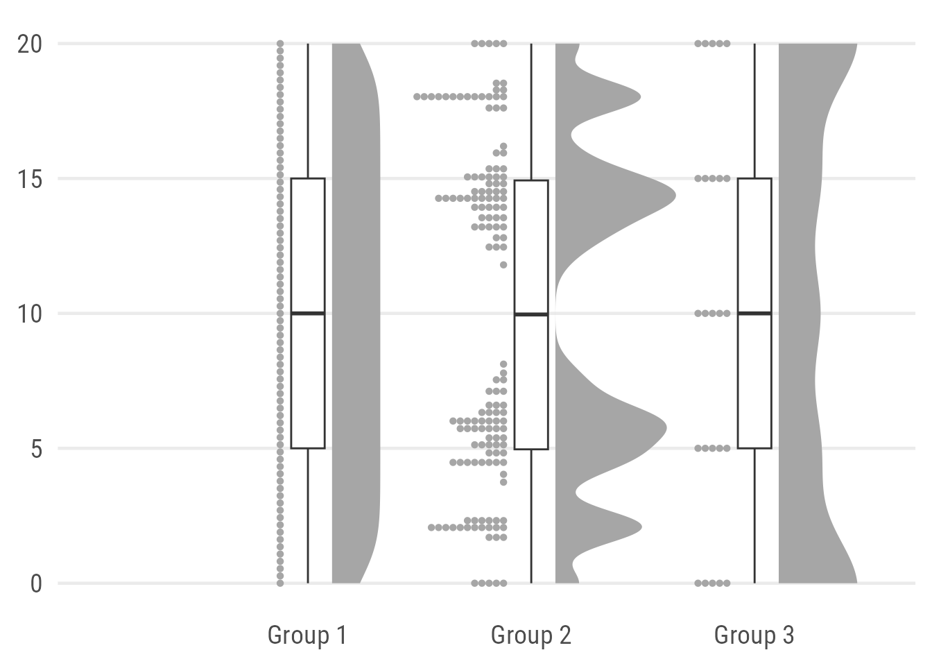
Raincloud plots can be used to visualize raw data, the distribution of the data, and key summary statistics at the same time. Actually, it is a hybrid plot consisting of a halved violin plot, a box plot, and the raw data as some kind of scatter.
ggplot(data, aes(x = group, y = value)) +
  ## add half-violin from {ggdist} package
  ggdist::stat_halfeye(
    ## custom bandwidth
    adjust = .5,
    ## adjust height
    width = .6,
    ## move geom to the right
    justification = -.2,
    ## remove slab interval
    .width = 0,
    point_colour = NA
  ) +
  geom_boxplot(
    width = .15,
    ## remove outliers
    outlier.color = NA ## `outlier.shape = NA` or `outlier.alpha = 0` works as well
  ) +
  ## add dot plots from {ggdist} package
  ggdist::stat_dots(
    ## orientation to the left
    side = "left",
    ## move geom to the left
    justification = 1.12,
    ## adjust grouping (binning) of observations
    binwidth = .25
  ) +
  ## remove white space on the sides
  coord_cartesian(xlim = c(1.3, 2.9))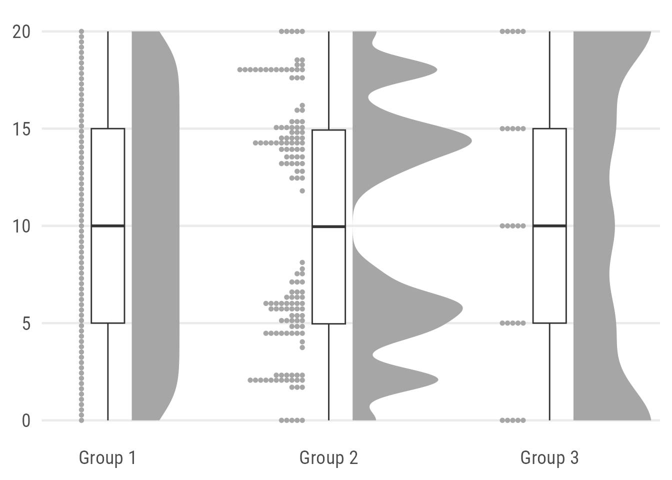
Here, I combine two layers from the {ggdist} package, namely stat_dots() to draw the rain and stat_halfeye() to draw the cloud. Both are plotted with some justification to place them next to each other and make room for the box plot. I also remove the slab interval from the halfeye by setting .width to zero and point_colour to NA. The plot needs some manual styling and the values for justification and the number of bins depends a lot on the data. To get rid of the white space on the left and right, we simply add a limit the x axis.
Expand to show plot without limit adjustment.
One can also solely rely on layers from the {ggdist} package by using the default halfeye which consists of a density curve and a slab interval. The later is replacing the boxplot:
ggplot(data, aes(x = group, y = value)) +
  ggdist::stat_halfeye(
    adjust = .5,
    width = .6,
    ## set slab interval to show IQR and 95% data range
    .width = c(.5, .95)
  ) +
  ggdist::stat_dots(
    side = "left",
    dotsize = .8,
    justification = 1.05,
    binwidth = .5
  ) +
  coord_cartesian(xlim = c(1.2, 2.9))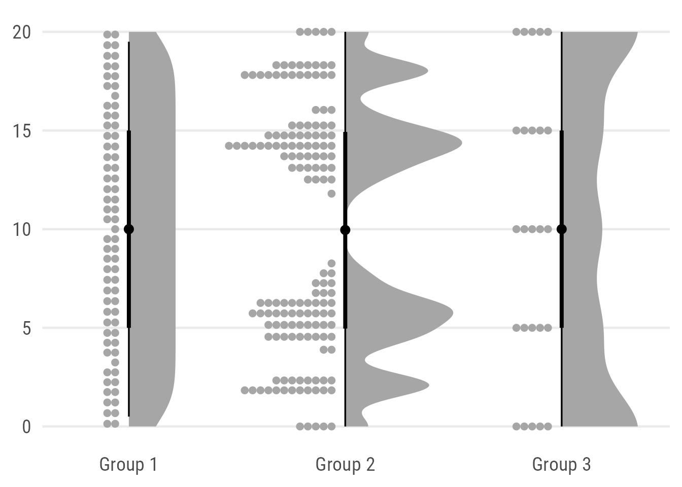
While I love the reduced design and the possibility to indicate two different ranges (here the interquartile range and the 95% quantile) I admit that this alternative is less intuitive and potentially even misleading since they look more like credible intervals than box plots. Maybe a bit like the minimal box plots proposed by Edward Tufte but still I definitely would add a note to be sure the reader understands what the slabs show.
Of course, one could also add a true jitter instead of a dot plot or even a barcode. Now, I use geom_half_dotplot() from the {gghalves} package. Why? Because it comes with the possibility to add some justification which is not possible for the default layers geom_point() and geom_jitter():
ggplot(data, aes(x = group, y = value)) +
  ggdist::stat_halfeye(
    adjust = .5,
    width = .6,
    .width = 0,
    justification = -.2,
    point_colour = NA
  ) +
  geom_boxplot(
    width = .15,
    outlier.shape = NA
  ) +
  ## add justified jitter from the {gghalves} package
  gghalves::geom_half_point(
    ## draw jitter on the left
    side = "l",
    ## control range of jitter
    range_scale = .4,
    ## add some transparency
    alpha = .2
  ) +
  coord_cartesian(xlim = c(1.2, 2.9), clip = "off")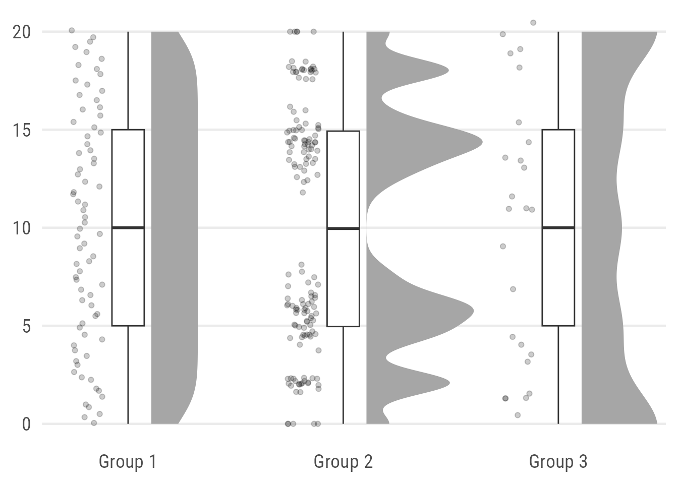
Note that the {gghalves} packages adds also some jitter along the y axis which is far from optimal. This becomes especially obvious in group 3 with its usually integer values.
The packages provides a half–box plot alternative as well but I personally will never consider or recommend these as an option2. Also, note that the {gghalves} package is not available on CRAN (yet) as well.
A good alternative may to place the jittered points on top of the box plot by using geom_jitter() (or geom_point()):
ggplot(data, aes(x = group, y = value)) +
  ggdist::stat_halfeye(
    adjust = .5,
    width = .6,
    .width = 0,
    justification = -.3,
    point_colour = NA) +
  geom_boxplot(
    width = .25,
    outlier.shape = NA
  ) +
  geom_point(
    size = 1.5,
    alpha = .2,
    position = position_jitter(
      seed = 1, width = .1
    )
  ) +
  coord_cartesian(xlim = c(1.2, 2.9), clip = "off")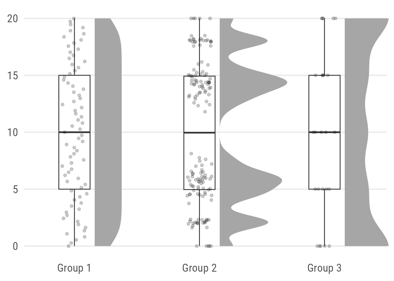
As a last alternative, I also like to use barcode strips instead of jittered points:
ggplot(data, aes(x = group, y = value)) +
  ggdist::stat_halfeye(
    adjust = .5,
    width = .6,
    .width = 0,
    justification = -.2,
    point_colour = NA
  ) +
  geom_boxplot(
    width = .15,
    outlier.shape = NA
  ) +
  geom_point(
    ## draw horizontal lines instead of points
    shape = 95,
    size = 15,
    alpha = .2,
    color = "#1D785A"
  ) +
  coord_cartesian(xlim = c(1.2, 2.9), clip = "off")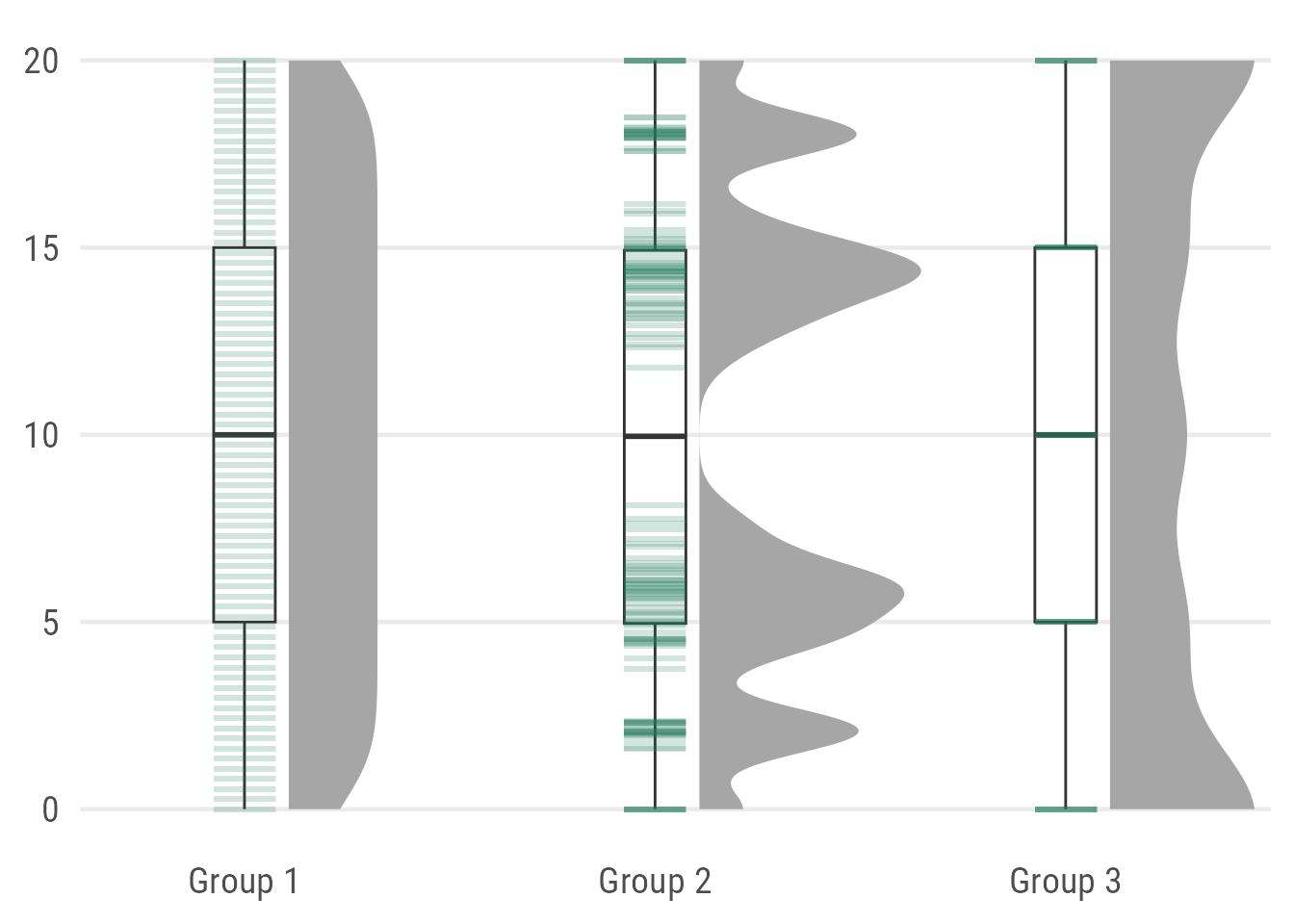
As you can see, it’s not optimal here since the actual values of Group 3 are hard to spot because they fall exactly along the summary stats provided by the box plot. One could use geom_half_point(), however, I want to avoid the added jittering along the y axis.
Expand to show barcode version with {gghalves}.
ggplot(data, aes(x = group, y = value)) +
  ggdist::stat_halfeye(
    adjust = .5,
    width = .6,
    .width = 0,
    justification = -.2,
    point_colour = NA
  ) +
  geom_boxplot(
    width = .15,
    outlier.shape = NA
  ) +
  ## add justified jitter from the {gghalves} package
  gghalves::geom_half_point(
    ## draw bar codes on the left
    side = "l",
    ## draw horizontal lines instead of points
    shape = 95,
    ## remove jitter along x axis
    range_scale = 0,
    size = 15,
    alpha = .2
  ) +
  coord_cartesian(xlim = c(1.2, NA), clip = "off")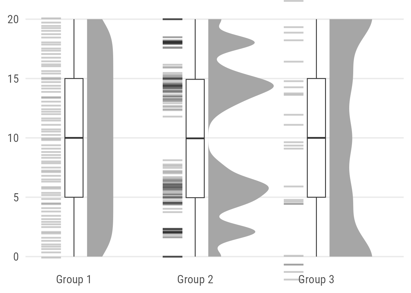
Next: Let Your Plot Shine
Stay tuned, in the upcoming a potential follow-up post I am going to show you how to polish such a raincloud plot and, if you like, how to turn it into a colorful version with annotations and added illustrations:
Note: Due to other duties and shifting priorities, I still haven’t finalized this blog post. Sorry. But you can find the code to create the polished penguins raincloud plot in this gist.
Footnotes
1 In my opinion, in case your audience is not well trained in statistical concepts and visualizations, consider using something else than a box plot. Or make sure to explain it sufficiently.
I personally doubt that the general audience is well aware of how to interpret box plots or how they can be misleading. And even within your institution or university: give it a try, go around (once the lockdown is over or remotly) and ask your colleagues what the thick line in the middle of a box plot represents. Go back ↑
2 Why? Because the box plot itself can be reduced easily in width without you getting into trouble. At the same time, I believe that these “half–box plots” have an uncommon look and thus the potential to confuse readers. Go back ↑
R Session Info
## R version 4.2.3 (2023-03-15)
## Platform: x86_64-apple-darwin17.0 (64-bit)
## Running under: macOS Big Sur ... 10.16
##
## Matrix products: default
## BLAS:   /Library/Frameworks/R.framework/Versions/4.2/Resources/lib/libRblas.0.dylib
## LAPACK: /Library/Frameworks/R.framework/Versions/4.2/Resources/lib/libRlapack.dylib
##
## locale:
## [1] en_US.UTF-8/en_US.UTF-8/en_US.UTF-8/C/en_US.UTF-8/en_US.UTF-8
##
## attached base packages:
## [1] stats     graphics  grDevices utils     datasets  methods   base
##
## other attached packages:
## [1] ragg_1.2.5           colorspace_2.1-0     ggtext_0.1.2         palmerpenguins_0.1.1 patchwork_1.1.2      ggplot2_3.4.2        dplyr_1.1.2
##
## loaded via a namespace (and not attached):
##  [1] Rcpp_1.0.10          digest_0.6.31        utf8_1.2.3           ggforce_0.4.1        R6_2.5.1             evaluate_0.20        highr_0.10
##  [8] blogdown_1.18        pillar_1.9.0         rlang_1.1.1          curl_5.0.0           rstudioapi_0.14      jquerylib_0.1.4      magick_2.7.3
## [15] rmarkdown_2.20       textshaping_0.3.6    labeling_0.4.2       stringr_1.5.0        polyclip_1.10-4      munsell_0.5.0        gridtext_0.1.5
## [22] compiler_4.2.3       vipor_0.4.5          xfun_0.39            pkgconfig_2.0.3      systemfonts_1.0.4    ggbeeswarm_0.7.2     htmltools_0.5.4
## [29] tidyselect_1.2.0     tibble_3.2.1         bookdown_0.34        quadprog_1.5-8       fansi_1.0.4          withr_2.5.0          MASS_7.3-58.2
## [36] commonmark_1.9.0     ggdist_3.3.0         grid_4.2.3           distributional_0.3.2 jsonlite_1.8.4       gtable_0.3.1         lifecycle_1.0.3
## [43] magrittr_2.0.3       scales_1.2.1         cli_3.6.0            stringi_1.7.12       cachem_1.0.7         farver_2.1.1         xml2_1.3.3
## [50] bslib_0.5.0          generics_0.1.3       vctrs_0.6.2          tools_4.2.3          forcats_1.0.0        glue_1.6.2           beeswarm_0.4.0
## [57] markdown_1.7         tweenr_2.0.2         fastmap_1.1.1        yaml_2.3.7           knitr_1.42           sass_0.4.5           gghalves_0.1.4