This blog post originally appeared as a guest post on the “Storytelling with Data” blog as part of the color series. Thanks again to Cole Knaflic and Mike Cisneros for inviting and motivating me as well as for your comments on the draft.
As we continue our exploration of color in data visualization this month, we are happy to share this guest post from notable #SWDchallenge contributor and community member Cédric Scherer. Before becoming a freelance data visualization specialist, Cédric was a trained ecologist, which required a unique combination of responsibilities: in addition to analysing and visualizing tons of animal data, he was also capturing foxes, raccoons, and hares in the wild! Now, he is combining his expertise in analysing and visualizing large data sets with his passion for design to create visualizations across all disciplines, purposes, and styles. We thank Cédric for sharing this post with us, and we hope you enjoy it!
If you are only moved by color relationships, you are missing the point. I am interested in expressing the big emotions. — Mark Rothko
As data visualization practitioners we are both engineers and designers. In our effort to create meaningful visualizations from our data, we transmit our message not only through the particular chart type and title we choose, but also through our choice of colors for the data itself and for any additional design elements. Whether intentional or not, the colors we use in any visualization inevitably spark emotions in our viewers.
Warm city, cold city
When designing my contribution to the #SWDchallenge of September 2019 on the topic “Visualizing Uncertainty”, I depicted the variation in monthly temperatures in my hometown of Berlin.
For me, it was straightforward to use a warm, reddish color palette and to display the temperature range in degrees of Celsius. To make it easily accessible for local people, I also created a version in German—and just for the sake of variety and to make them easily distinguishable at a glance, I created this version in a blue color scale.
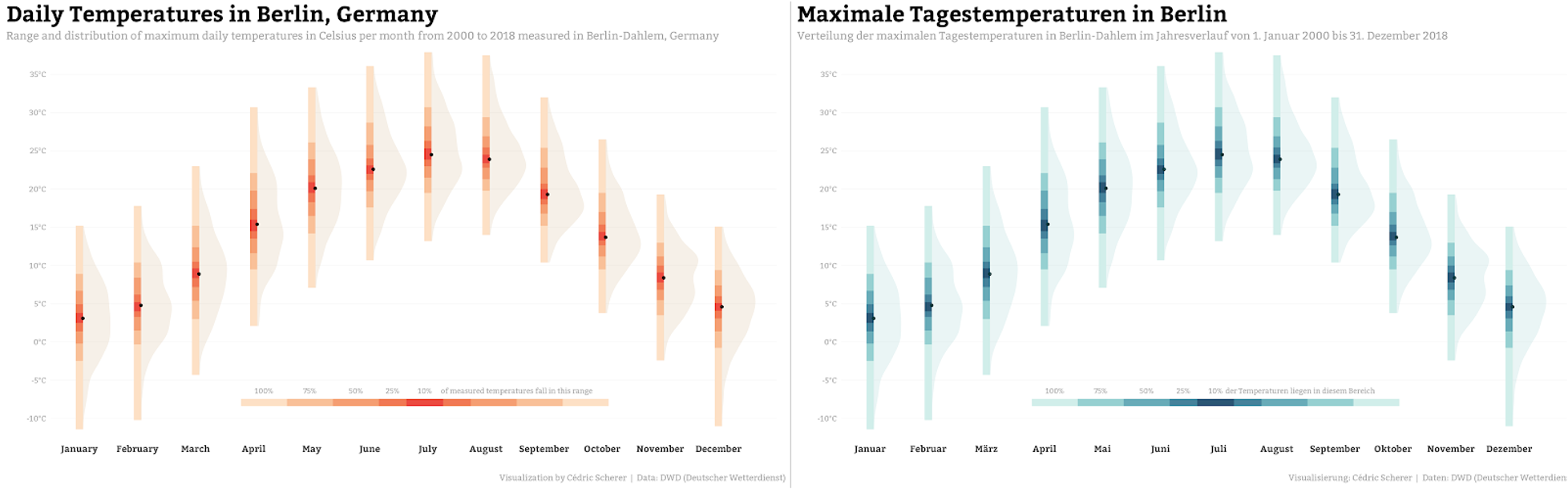
Without any intention, the two variations of my visualization triggered different emotional reactions. While the red chart likely leads you to think “Wow, Berlin summers are quite hot,” the blue version may push you to think of summers as rainy and rather cold.
In general, we should have in mind that different details might spark different emotions and expectations in our viewers. Some of these details will make it easier for them to understand the chart in the manner the designer intended.
In the above example, how people perceive the temperatures in Berlin depends on (at least) two different factors:
- What does the color used in the chart commonly represent in the experience and culture of the reader?
- Which range of temperatures (or temperature scale) is the reader regularly exposed to?
While we cannot account for the last factor, the choice of colors is up to the designer. It is important though, that colors may be perceived differently depending on the audience.
Colors and their associations
Which colors do you associate with temperatures and precipitation?
Which colors do you associate with trees and urban areas?
We are used to attributing certain colors to specific objects and emotions. Most people expect the sea to be colored in blue on a map; a green ocean looks plain wrong to us. Similarly, humans perceive bright colors on elevation maps to represent a high altitude, with darker colors representing naturally low-lying and shady areas like valleys.
Temperatures are regularly displayed as a gradient from blue (cold) to red (hot). A famous example is this “warming stripes” design by Ed Hawkins:
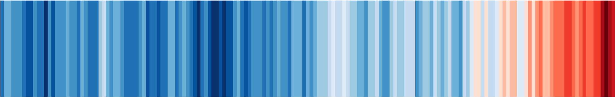
Most people around the globe likely agree on the blue-red gradient when it comes to temperatures, and in first looking at this visual, we naturally translate each stripe into a relative temperature (difference) along this gradient. A legend or annotations explaining the color gradient, while adding specificity and detail, would weaken the minimalist style of the visualization, which is communicating not through the precision of numbers but through the inherent emotional reaction to the rapid change from decades of cool blues to warm, intense reds. (Nevertheless, there is also a version with minimal labeling.)
Colors spark emotions
Which color set comes to your mind when you think about happiness and sadness?
What color would you pick to visualize honesty?
When it comes to emotions, things might get a bit more difficult. In 2007’s “Introduction to Multimodal Analysis”, author David Machin proposed that lightness, brightness, and saturation can communicate the level of seriousness, intensity, and emotional weight in a visual work. Dark and saturated colors are thus perceived as more dramatic and can evoke emotions such as sadness and anger, while bright and flat colors achieve the opposite effect.
Moreover, colors might be perceived differently in different cultures. A fantastic resource in this context is the “Colours in Culture” visualization by David McCandless and AlwaysWithHonor.com:
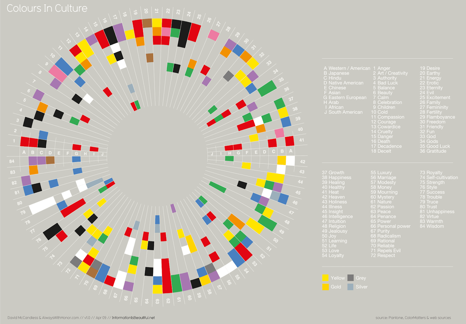
We make use of these emotional values all the time, either with or without attention. Thus, I often come back to the “culture–color wheel” when designing visualizations since Cole showed it to me. We can see that Ed Hawkins’ use of red and blue is an emotionally good choice since the colors are interpreted as heat [41] and cold [10], respectively, in all cultures.
Bloody-red COVID maps
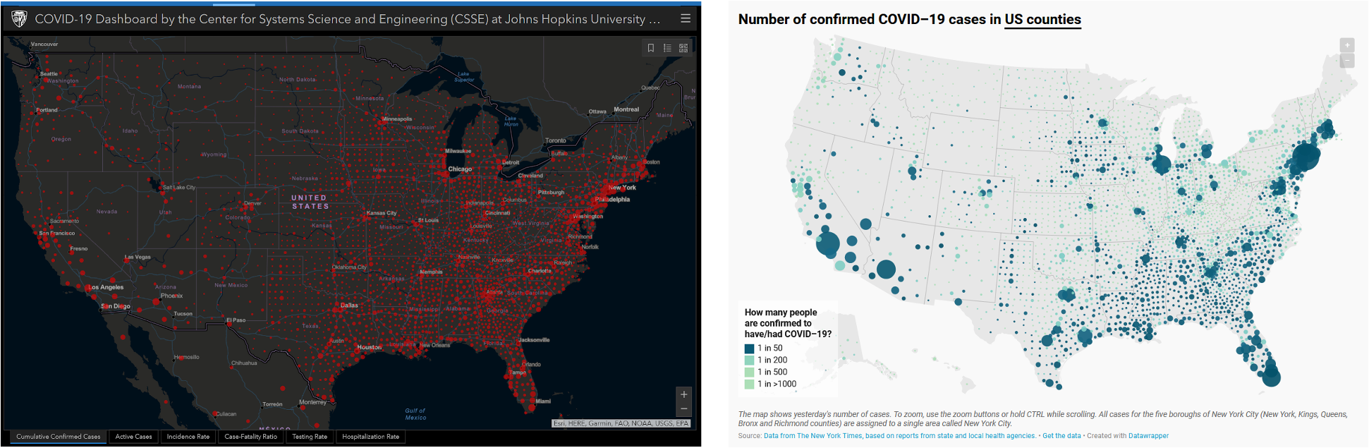
Take, as another example, the famous COVID-19 tracker hosted by Johns Hopkins University that became popular in early 2020. The dark map used bloody red bubbles to display reported infections or deaths due to the novel coronavirus. It’s likely that these color choices elicited anxiety and fear in many of its viewers, thanks to the “alien-death-blood visual identity,” as data visualization consultant Andy Kirk termed it at the time.
While a black map might be attention-grabbing, it likely also sparks panic in some people. In many cultures, black is associated with death and evil, and red is not only associated with love and passion but also blood or anger. As a resource meant to inform the public during the early days of a serious and deadly pandemic, this tracker used colors that, unfortunately, likely inspired additional panic and fear in some of its audience.
Lisa Charlotte Rost and her team of Datawrapper were among several other designers who took different approaches, using less intimidating colors on a light background. (Johns Hopkins University themselves did the same in other COVID graphics they eventually developed.)
Rost explained the reasoning from a very emotional and personal standpoint:
If you’re infected, you want to find yourself on a map as a blue (or orange, or beige, or purple…) dot, not as a “attention, danger, run!”-screaming red dot. Related, we show deaths in black, not red – it feels more respectful.
In general, I try to avoid black backgrounds as often as possible, although I will use dark gray colors in those cases where dark scenery simply looks better. Light colors may in most cases be a better choice since the color represents truce [79], purity [67] and trust [80] — characteristics that we all certainly like to get as feedback on our data visualizations.
Colors of healing: visualizing vaccinations
As of this writing in June 2021, we are in a very different phase of COVID-19 pandemic than we were when those trackers were first launched in early 2020. While we are still collecting data on negative events like infections, hospitalizations, and deaths, our visualizations are now focusing more and more on the positive events: vaccinations and vaccination rates. Many of the charts and maps showing how countries perform on this metric are designed on light backgrounds.
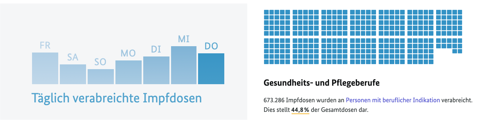
Let’s take a look at the wonderful COVID-19 vaccination dashboard by the German Federal Ministry of Health in collaboration with the Robert Koch-Institute (RKI). This dashboard shows vaccination rates in Germany with moderate blue graphs on a light background. Blue is a versatile color, representing many different values around the world. However, by intention or by chance, the designers’ choice of blue is a very good one: in Western cultures the color is not only attributed to cold but also to values such as healing, freedom and rationality.
Final thoughts
I love colors. Ever since my contribution to the #SWDchallenge, I have learned to take even more care when I choose colors and try to avoid stereotypic colors, especially those that spark certain emotions or are associated with features I actually don’t want to communicate with my visualization.
If you like, creating a suitable emotional setting can be subsumed under the term accessibility: more familiar colors will help the reader to access the visualization and may reduce the guidance needed to explain certain features.
On the contrary, badly chosen colors may in the worst case mislead the reader or put them in the wrong mindset to accept the intended message, which is definitely something I want to avoid as a truthful designer.
Picking suitable colors—not only in terms of accessibility but also based on their emotional values—is an important skill for every designer to practice.